
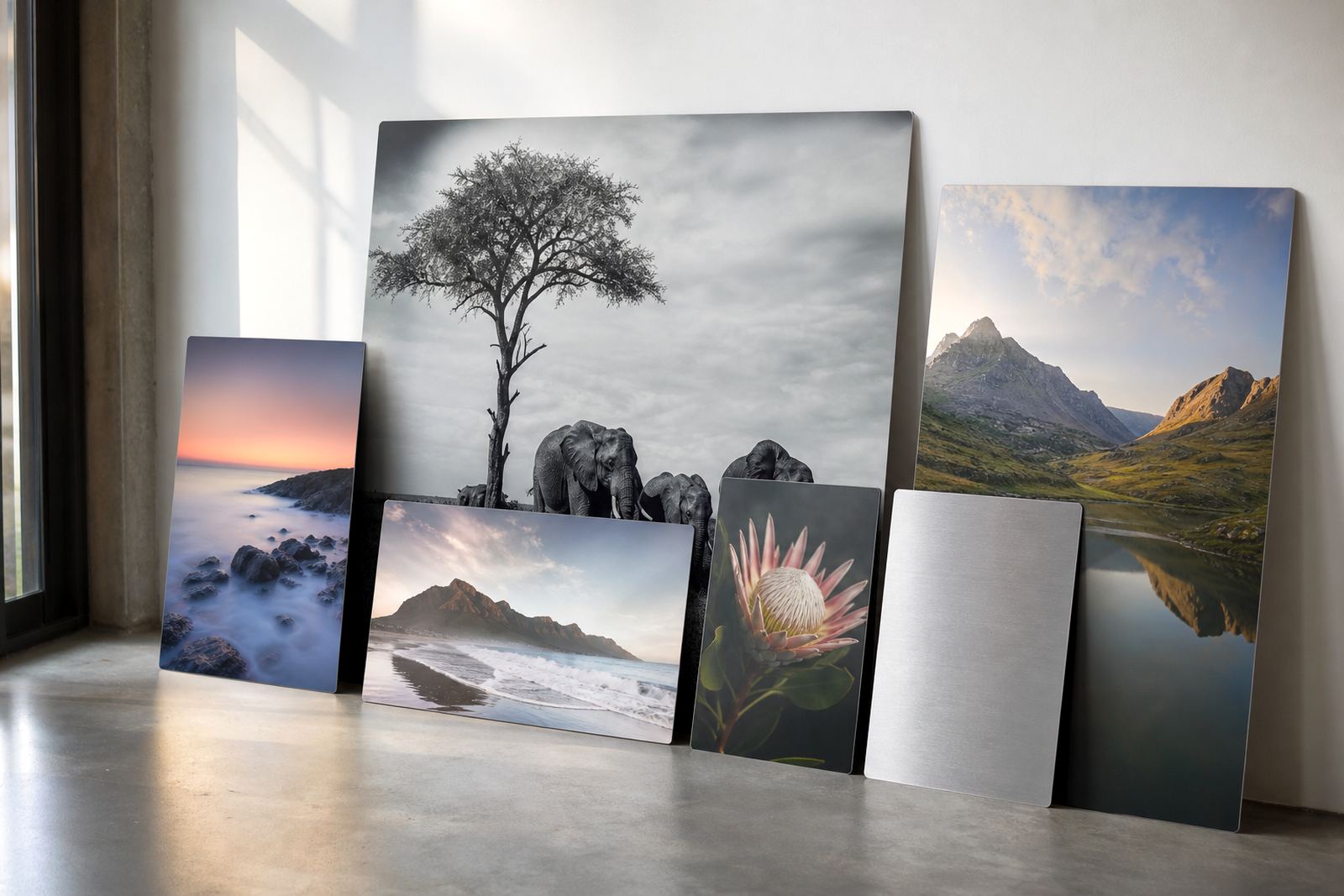
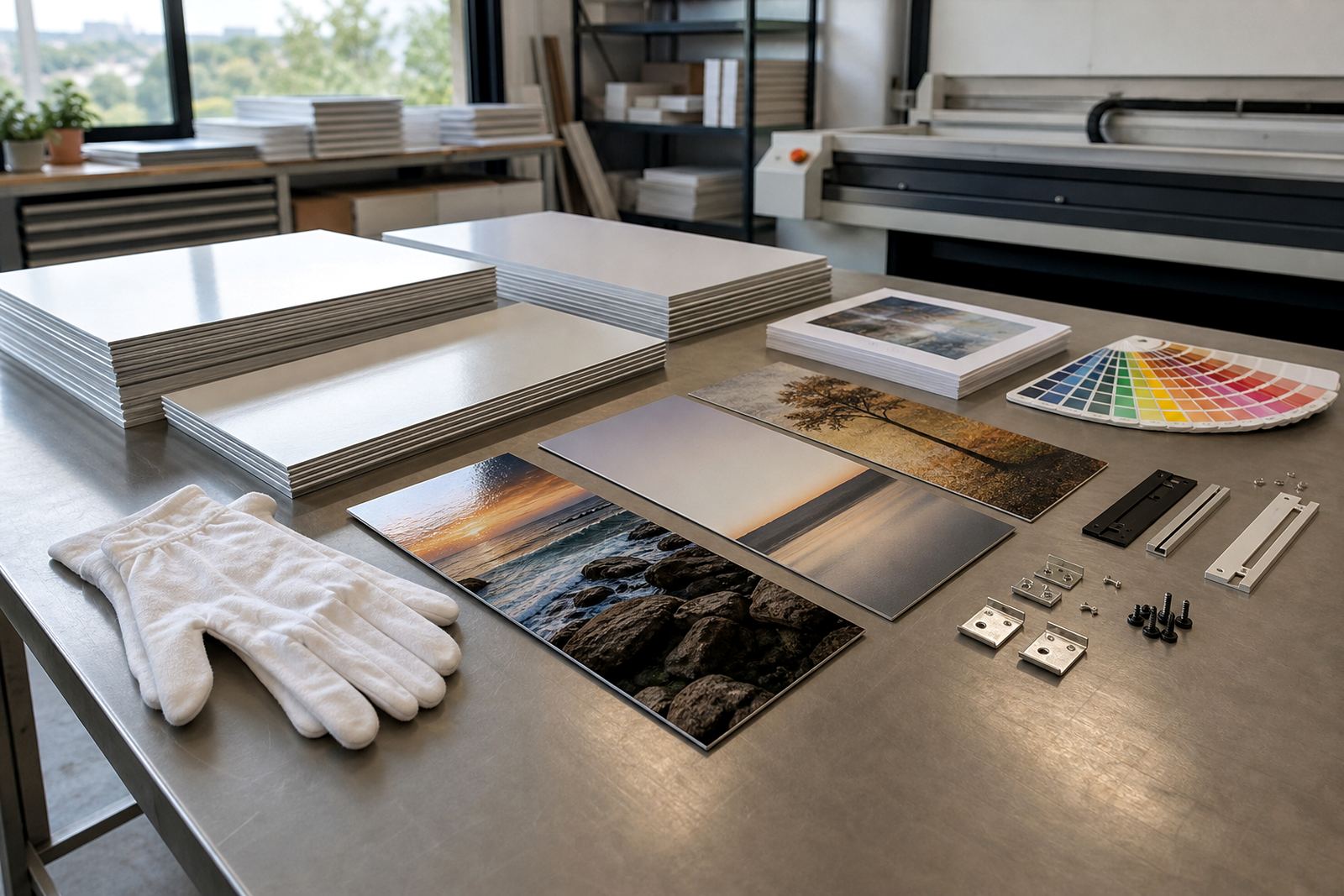
The closer the eye stands, the more the file must hold
Viewing distance is the easiest way to judge whether an image will hold up on a coated aluminium panel. A portrait above a couch, seen from 2 to 3 metres, can tolerate a little less fine detail than a gallery piece that people inspect at arm’s length. If the viewer is close, soft edges, heavy noise and low resolution show up fast.
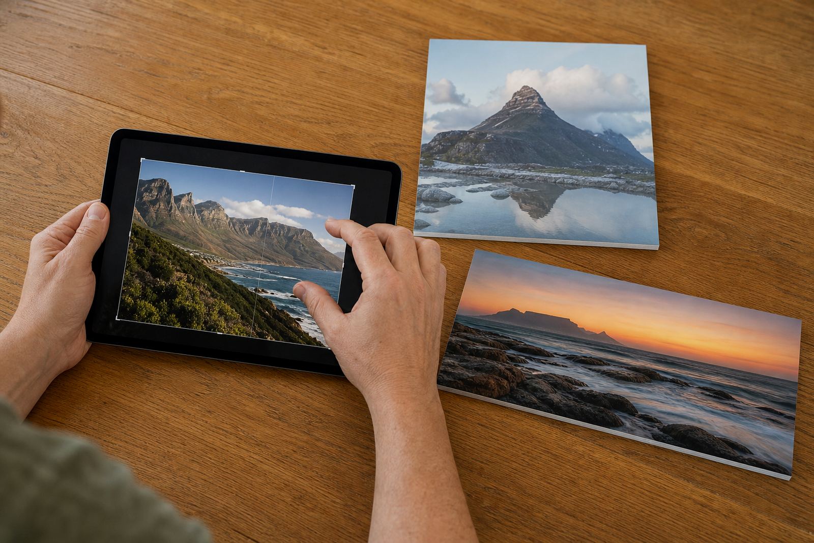
For dye sublimation onto coated aluminium, the print process can carry a lot of colour and tonal depth, but it cannot create detail that was never in the file. A sharp original, clean crop and sensible final size matter more than people expect. This is where file checks and resolution review save a lot of grief.
Room size changes the rulebook
A panel for a Sandton boardroom, a Cape Town showroom or a Durban foyer is usually read from a few metres away. That lets you choose a larger panel and still keep the image looking crisp. A small study or reception counter is different, because people stand close and often notice texture, skin tones and tiny text straight away.
- Close viewing: choose higher pixel density and avoid stretching a small file.
- Mid distance: most family photos and office branding panels work well here.
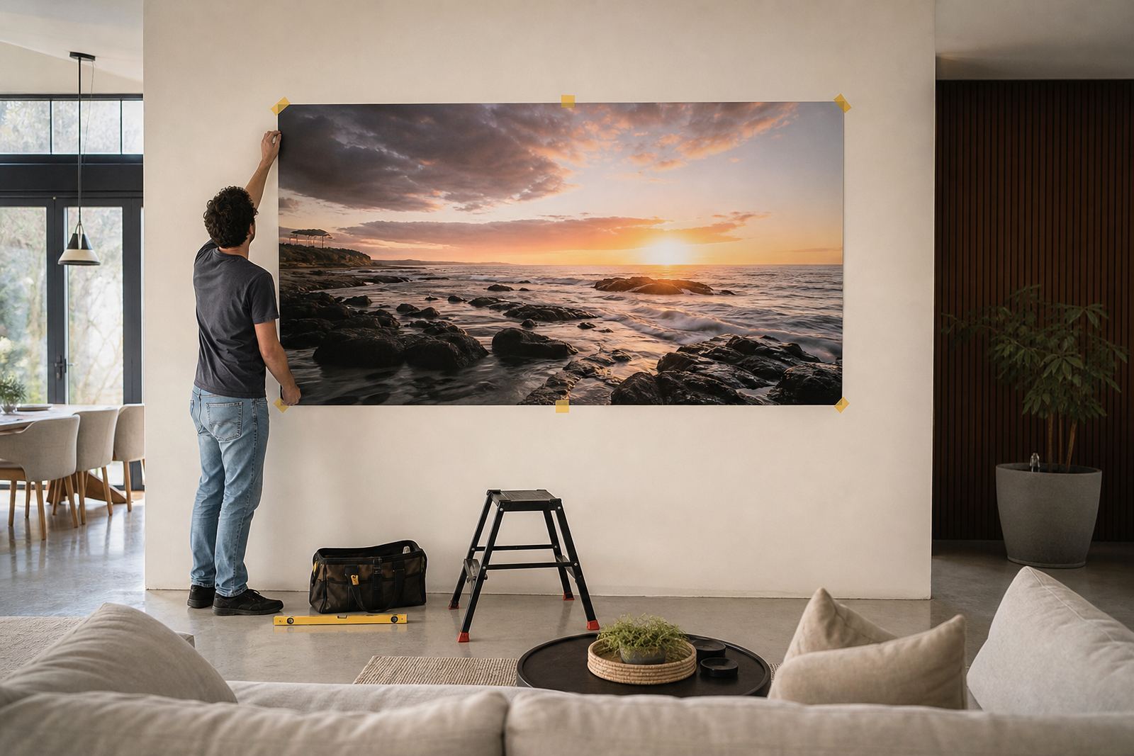
- Long distance: murals and feature walls can use simpler detail without looking thin.
In practice, the same image can work on two different panel sizes if the expected viewing distance changes. A 600 mm panel on a wall and a 1 200 mm panel in an open space do not need the same source file quality.
A Pretoria office wall and a kitchen wall are not the same job
Take a local example. A Pretoria legal office may want a brushed aluminium panel in a passage where staff pass at arm’s length. That calls for careful file preparation, clean type if there is any text, and a finish that does not fight the light. A kitchen wall in Johannesburg, viewed mostly from across the room, gives you more leeway on detail but still needs accurate colour and neat cropping.
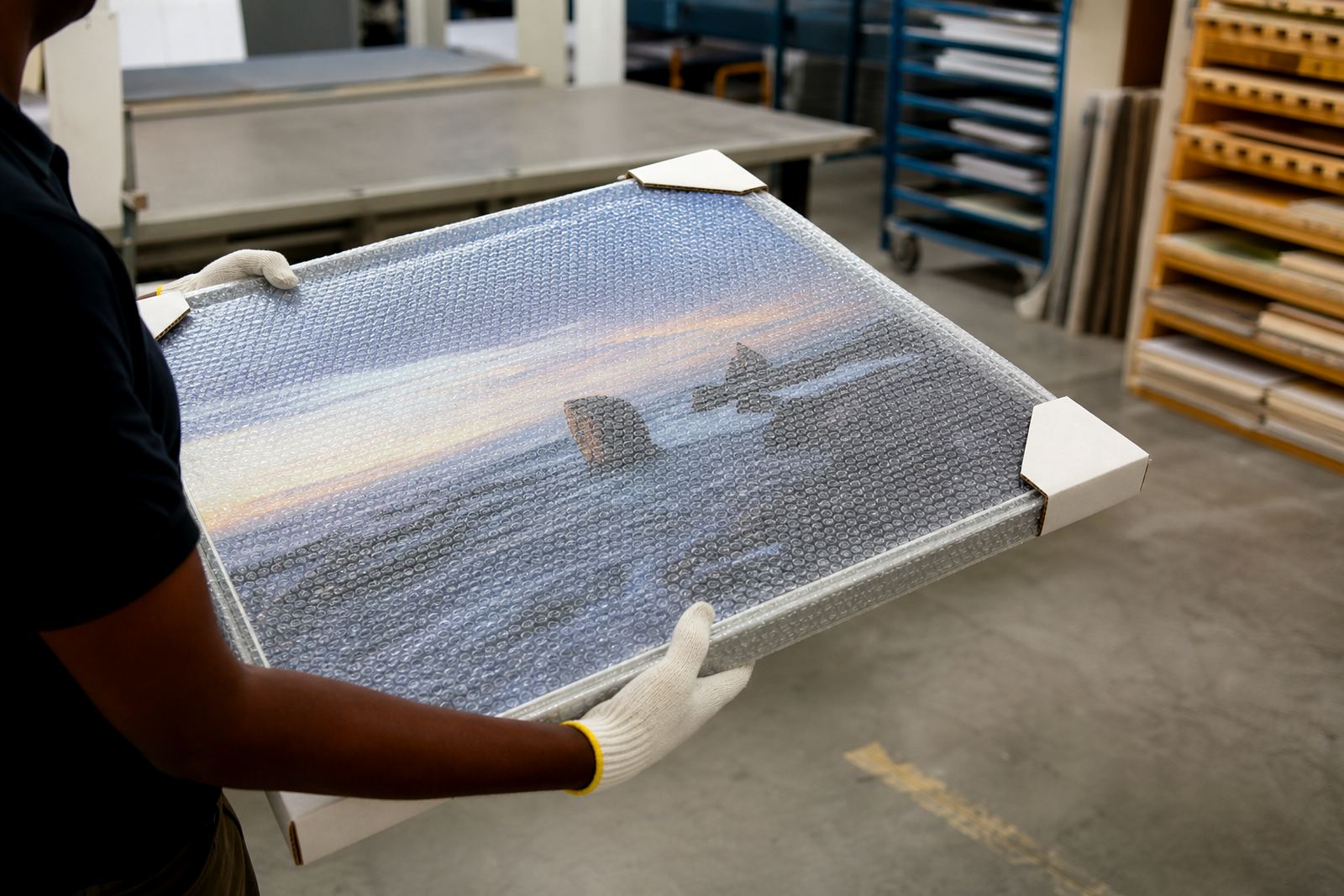
Coastal humidity also matters in places like Gqeberha and Durban, because the panel must be mounted and handled properly so the surface and hardware stay tidy. The image detail still starts with the file, but the final result depends on the whole job, from prep through to mounting.
Finish choice can change how detail reads
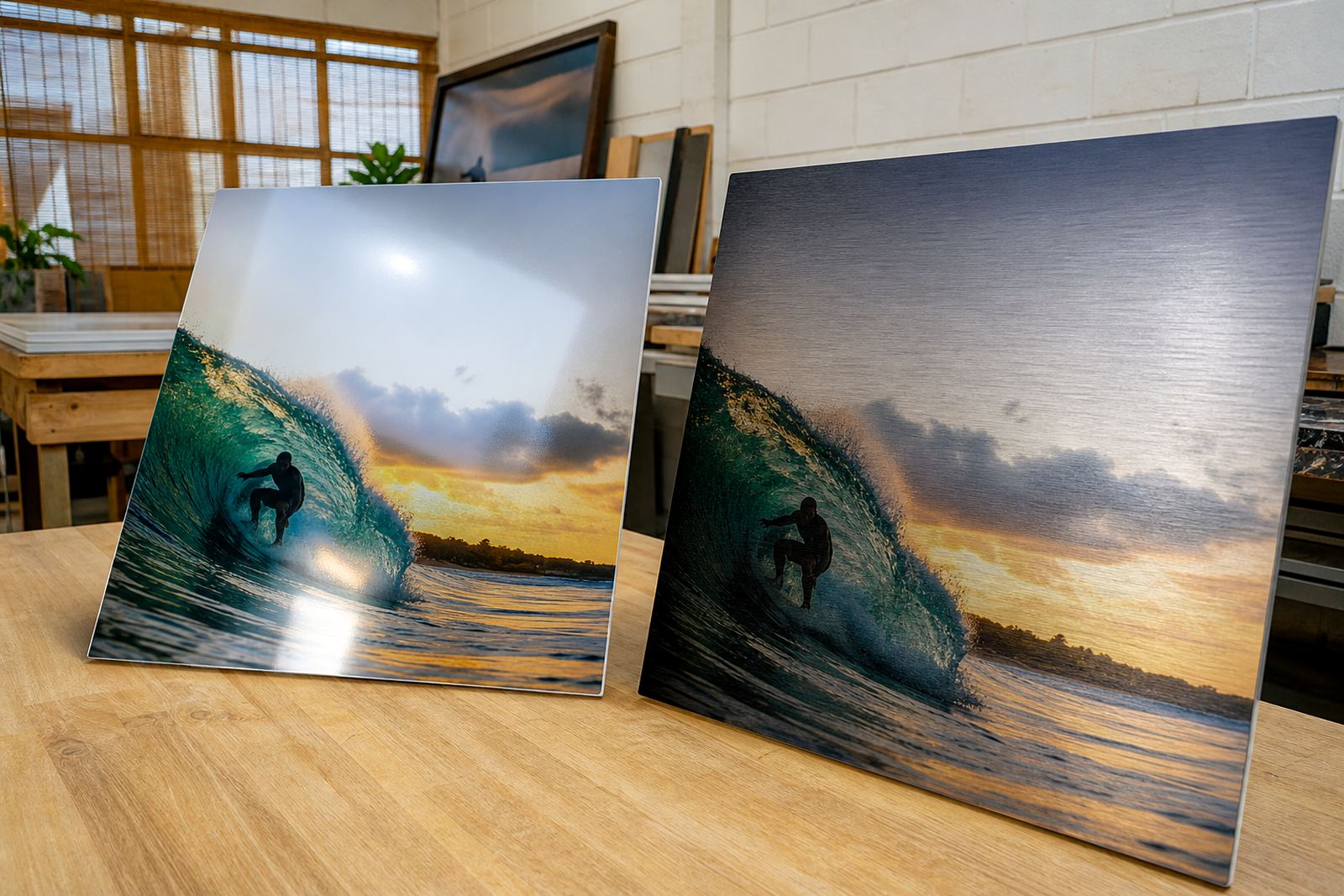
Gloss, matte, white and brushed finishes all affect the way the eye reads a panel. Gloss can make colour pop, but it also reflects windows and downlights, which can hide fine detail if the panel sits opposite a bright source. Matte cuts reflections and is often easier to live with in offices and homes with strong daylight.
- White aluminium gives bright, clean colour and suits full image prints.
- Brushed aluminium can work well where some metal texture is part of the look.
- Matte is practical for spaces with glare from glass or direct lighting.
- Gloss suits high colour images, but placement needs thought.
A finish that looks fine in daylight can read very differently at night.
When text or logos are part of the image
Businesses often send logos, product shots and signage artwork for aluminium panels. If the design includes words, tiny contact details or thin line work, the viewing distance becomes even more important. A logo that sits high on a wall can be bold and simple, while a reception sign that people read from 1 metre needs much cleaner edges and stronger contrast.
Customers must own the image rights or have permission to use the files they send. That applies to photographs, artwork and branded graphics. If the source file is underpowered, the best fix is usually not to enlarge it and hope for the best, but to plan a panel size that suits the file and the room.
The practical checks before a panel goes to print
Before production, it helps to work through a few plain checks. This keeps the panel honest to the space it will live in and avoids disappointment after mounting. In Randburg and across Johannesburg, a lot of repeat jobs are saved by this kind of prepress work.
- How far away will most people stand?
- Will the panel be seen in full daylight, warm indoor light or both?
- Does the image have enough resolution for the final size?
- Is the crop safe, or will important faces and edges be lost?
- Should the finish reduce glare or bring out colour?
At SubAlu, that is where file checks, colour preparation, crop planning and finish selection do real work. The best result is not only about sharpness, it is about matching image detail to the room it will serve.