
Why the square frame feels settled on the wall
A square print asks the eye to stay put. It works well when the subject is central, the lines are balanced, or the image has a strong pattern that does not need extra width to breathe. Photographers use it for portraits, product studies, architectural details and still life because the composition feels deliberate and tidy.
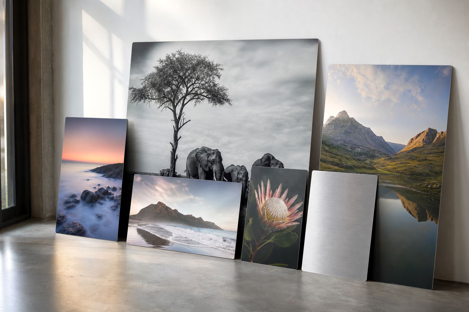
On dye sublimation aluminium panels, square layouts also suit interiors where wall space is limited. A 600 x 600 mm panel can sit neatly above a couch, in a reception area, or in a hallway where a longer panorama would feel awkward. The format gives enough presence without crowding the room.
Centred subjects that hold the eye
The square shape naturally supports centred composition. It lets the subject sit in the middle without looking forced, which is useful for faces, flowers, signage, food photography and product shots. That central placement is not lazy, it is often the clearest way to tell the story.
For strong results, keep an eye on negative space around the subject. If the image is too tight at the edges, the crop can feel breathless. If it is too loose, the subject may lose focus. A useful rule is to leave enough margin for the composition to settle, especially when the panel will be viewed close up.
- Use the centre for portraits, products and single objects
- Keep key details away from the very edge of the crop
- Allow breathing room where the image needs calm, not motion
- Check that text in artwork stays readable after trimming
Series walls work better when the squares match
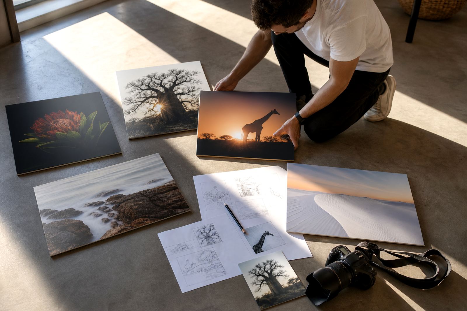
Square panels are easy to repeat in a grid, which makes them a smart choice for series-based display. Three, four or six panels of the same size can create a strong rhythm across a wall. That is why galleries, offices and hospitality spaces often choose square sets for themed collections or repeated branding images.
When building a series, keep the spacing consistent. Even a 30 to 50 mm gap between panels can make the layout feel measured and professional. If the room has a long wall, a repeated square format can be more practical than one oversized print, especially in offices where furniture, doors and windows interrupt the available space.
It also helps to keep the tone and crop style similar across the group. A mix of close crops, wide crops and different borders can look unsettled unless there is a clear reason for the variation.
Finish choices that change how the square reads
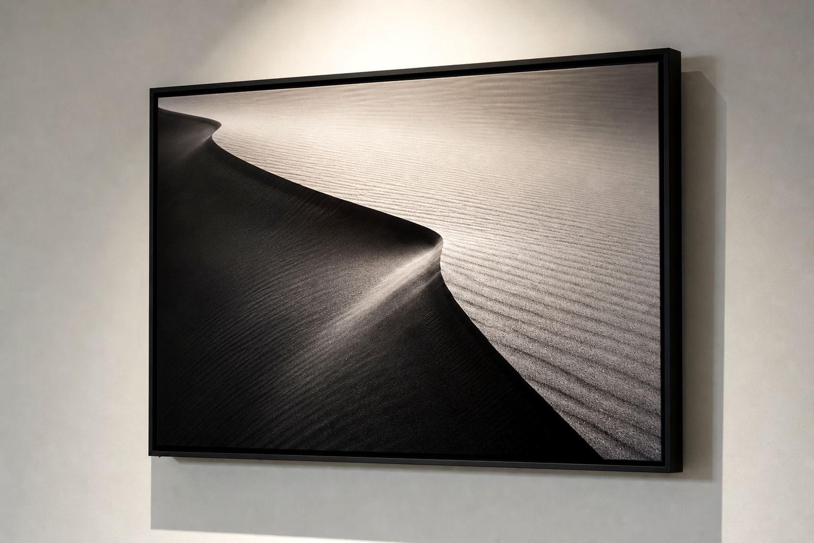
The finish matters as much as the image. Gloss finishes bring out colour and contrast, so they suit bold portraits, bright artwork and images with deep blacks. Matte finishes reduce glare and work better in bright offices, coastal homes, and rooms with lots of direct light. White coated panels give clean, even colour reproduction, while brushed aluminium leaves a visible metallic texture that can suit industrial or monochrome work.
Square compositions are especially sensitive to reflections because the eye tends to scan the whole image evenly. If the room has strong sun or overhead spots, matte is often the safer choice. For a cleaner, high-impact look, gloss can make the image feel sharper, but the hanging position needs to be thought through carefully.
- Gloss: strong colour and shine, best away from direct glare
- Matte: softer reflection control for offices and living rooms
- White: accurate colour and a clean base for most artwork
- Brushed: visible texture for a more industrial feel
Resolution and cropping before anything goes to print
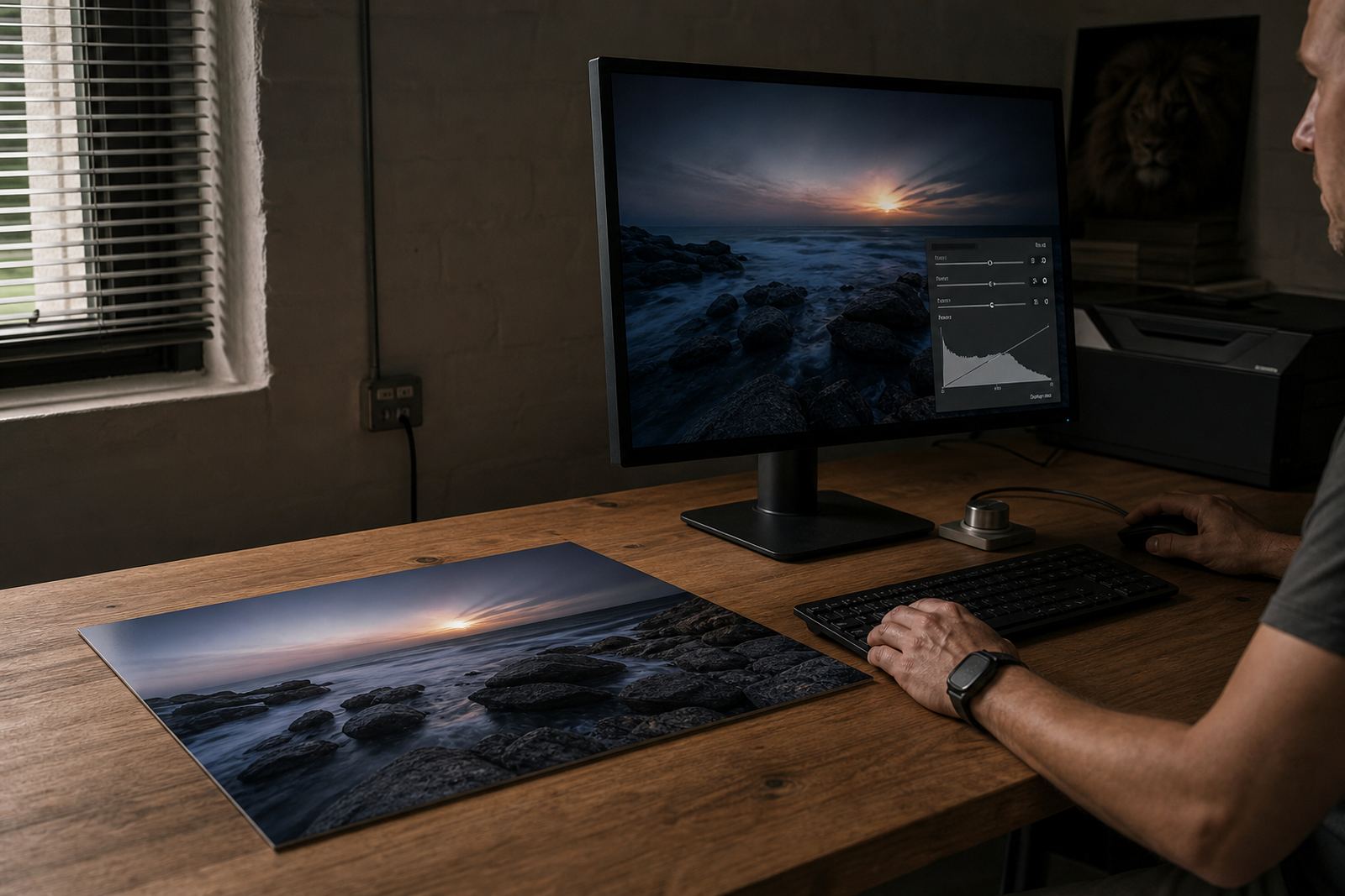
Square artwork demands clean file preparation. A file that looks fine in a rectangle can fall apart once it is cropped into a square, especially if faces, hands or product details sit near the sides. That is why file checks, resolution review and crop planning matter before printing starts.
For best results, send the highest quality file available, preferably with enough pixel count for the final size. Low resolution files may still print, but the edges can soften and fine detail can look flat. If a client wants a large square panel, the artwork should be checked before the print is committed, becuase a generous crop can quickly eat into important detail.
Customers should own the image rights or have permission to use the artwork they submit. That applies to personal photos, commissioned work, commercial images and any artwork supplied for public display.
A Randburg example that still holds its shape in a busy room
A small law office in Randburg wanted a series of square aluminium panels for a waiting area with limited wall space and bright afternoon light. The room had a reception counter, a glass partition and framed certificates, so a wide landscape print would have competed with the rest of the furniture. A set of square panels gave the wall order and kept the visual line tidy.
The images were adjusted for crop balance, then printed with a matte finish so the overhead light did not bounce straight back at visitors. Each panel was mounted with hardware suited to the size and weight of the piece, and the spacing was kept even across the wall. The result felt calm, practical and easy to maintain, which matters in a space that sees traffic all day.
That kind of layout works just as well in Cape Town, Durban, Pretoria or Gqeberha, where humidity, sun and room layout all influence the final choice. Square panels do not shout for attention, they hold the room together.
What a square panel needs before dispatch
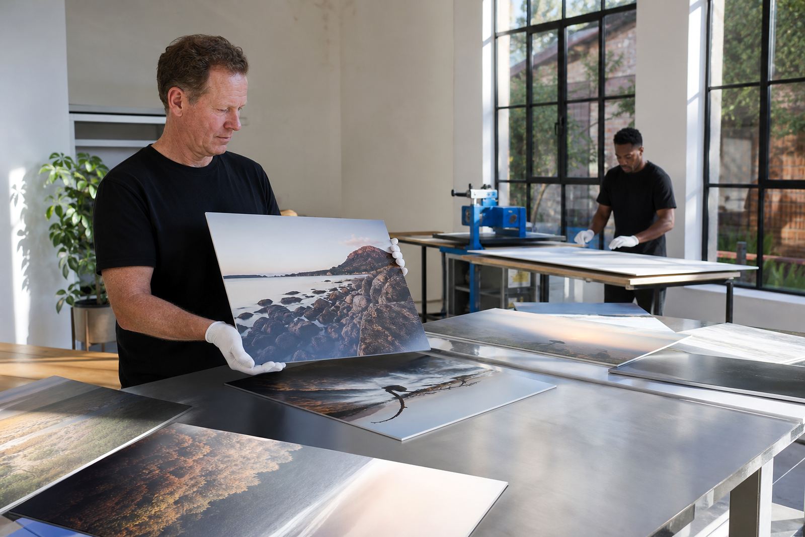
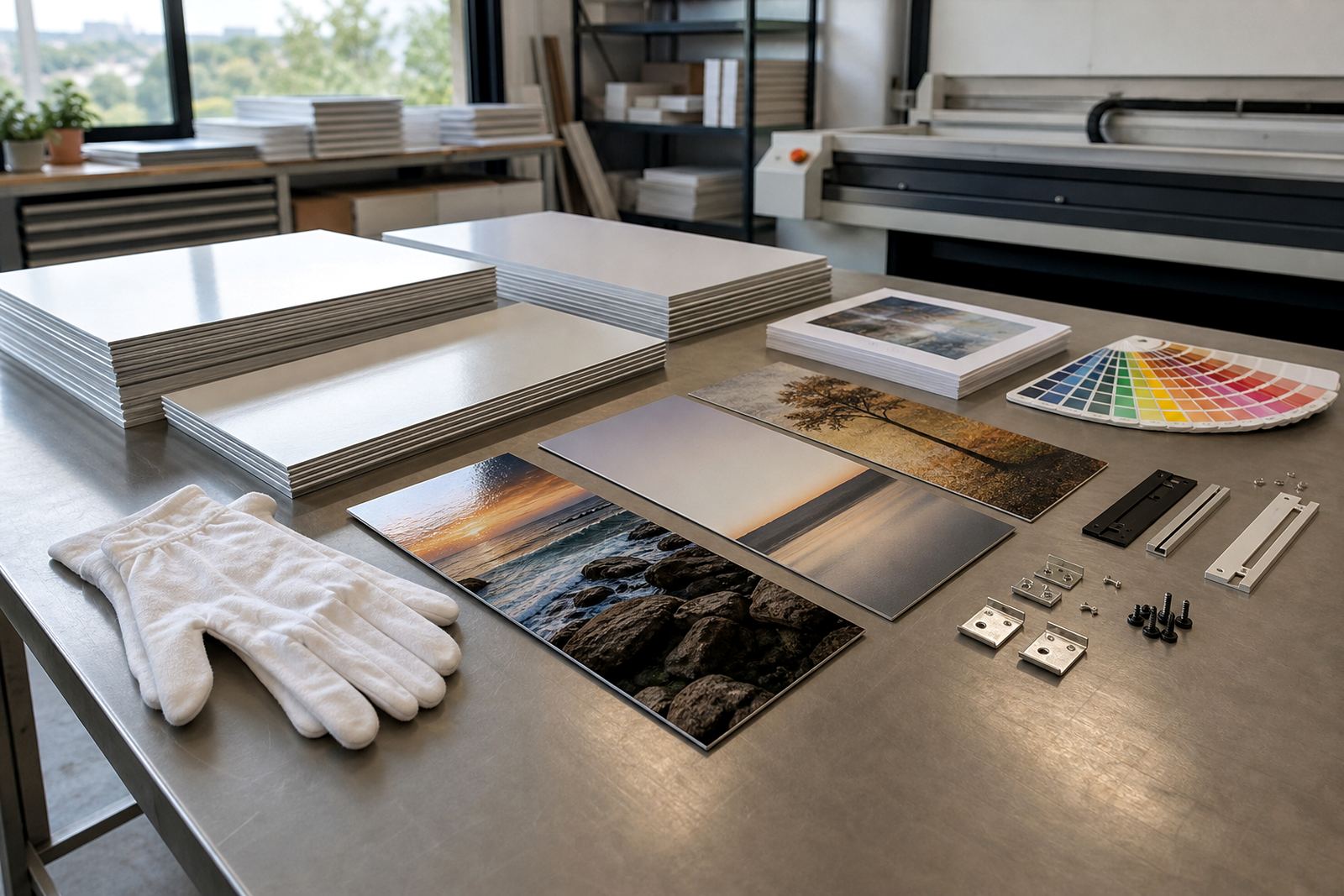
Before packing and delivery, the panel should be checked for crop balance, colour preparation, finish choice and mounting options. If the image series is going to hang together, each file needs to line up in size and tone. Packing should also suit the route, especially for delivery across Johannesburg or further afield where handling can vary.
A practical checklist helps avoid delays:
- Confirm the final square size and crop position
- Check resolution for the chosen panel size
- Select gloss, matte, white or brushed finish
- Decide on mounting hardware and hanging method
- Review the proof for colour balance before printing
Square prints reward careful planning. When the crop is right and the finish suits the room, the result feels measured from the start.