
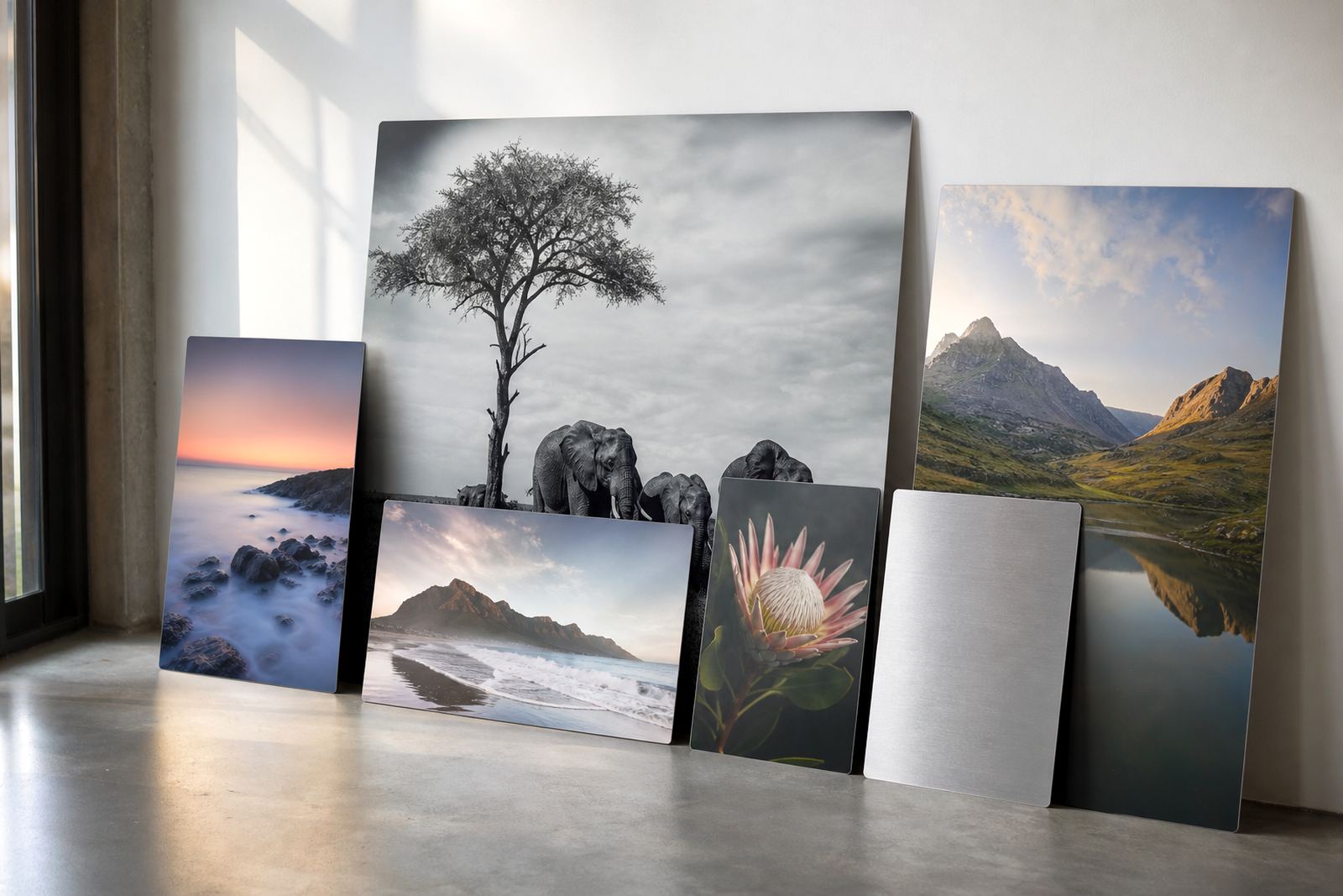
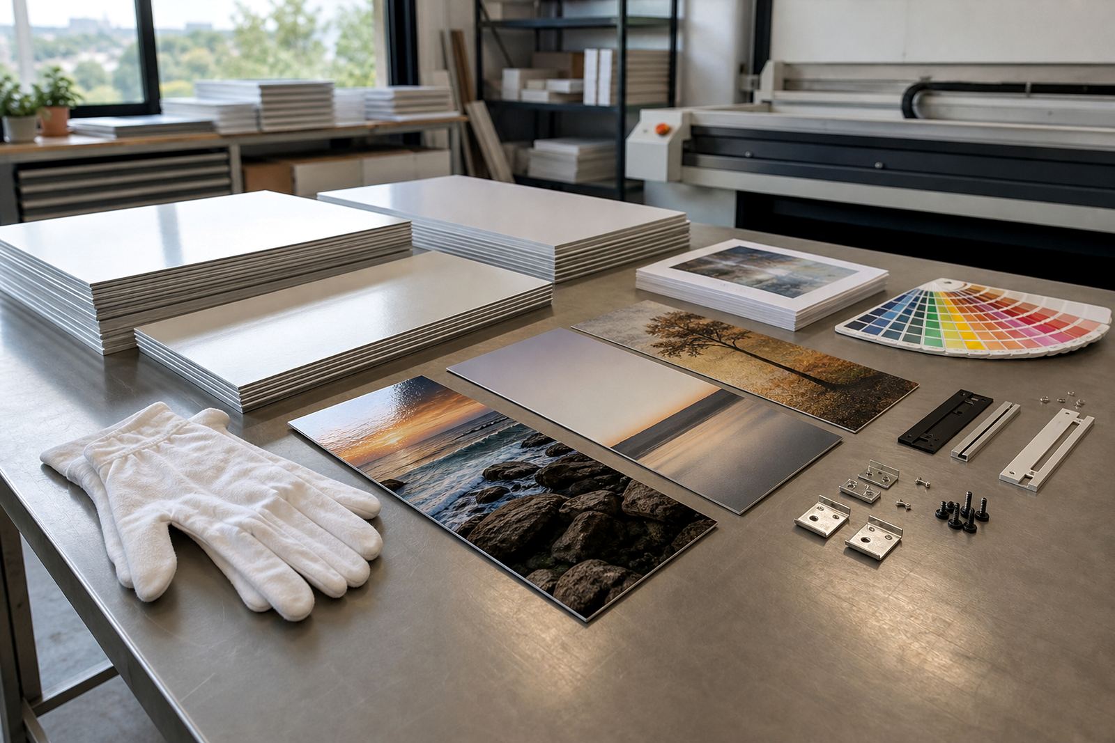
Why matte behaves better when the sun is in the room
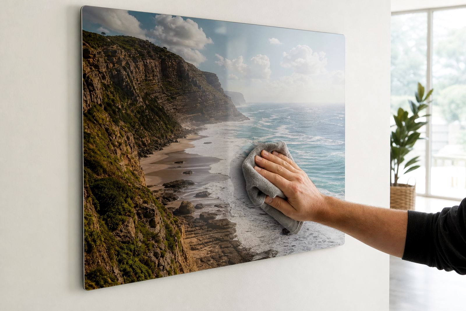
In a bright lounge, reception area or hallway with south-facing windows, gloss can throw back light from every angle. A matte finish cuts that reflection down, so the image stays readable whether people are standing close or walking past. That matters in Johannesburg homes with large windows, and it matters just as much in office foyers where overhead lights stay on all day.
On sublimation aluminium, the image is infused into a coated panel under heat and pressure. The coating takes the ink cleanly, and the aluminium gives the panel a firm, flat base. Matte does not mean dull. It usually means softer glare, steadier viewing and a calmer feel in rooms that already have a lot happening visually.
For portrait work, landscapes and brand visuals, matte can be the better fit when the wall gets direct sun for part of the day. It also suits spaces with tiled floors, glass partitions or polished tables nearby, because those surfaces can bounce light straight back at the artwork.
The finish choice is not only about shine
People often think the finish is just a style choice, but the room should guide the decision. A white matte panel carries colour cleanly and can give a crisp, even look for photography, corporate displays and interior decor. A brushed finish brings a visible metallic grain through parts of the image, which can add texture, though it is less suitable where every tone needs to be exact. Gloss gives more punch, but in bright rooms it can become distracting.
When we review a file, the finish is part of the conversation from the start. A dark image with a lot of shadow detail may need more careful colour preparation on matte than a lighter image would. If the panel is going into a boardroom in Sandton or a gallery wall in Cape Town, that little bit of planning saves a lot of disappointment later.
- White matte suits full colour images and clean branding.
- Brushed works well when a more industrial or textured look is wanted.
- Gloss is best where the room is controlled and reflections are limited.
- Matte is often the safest option for bright interiors and direct viewing.
File prep that keeps the print sharp enough for close viewing
Matte surfaces are forgiving with glare, but they still need a good file. The panel should be prepared at the right size and resolution so faces, fine text and detailed edges stay crisp. For smaller panels, low quality images are often the biggest issue. On larger panels, the problem shows up faster because any softness is easier to see from 1 or 2 metres away.
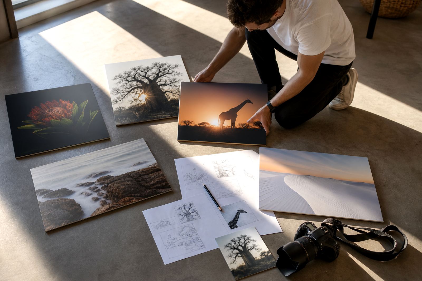
It helps to supply the largest clean file you have, with the image cropped for the final panel shape. If the panel is going to be square, panoramic or split into multiple panels, the crop should be decided before printing. Our team checks resolution, prepares colour, and flags problems where needed so the print does not arrive too soft, too dark or with awkward cropping.
- Use the highest resolution file available.
- Check that faces and text are not too close to the edge.
- Allow for crop differences on custom sizes.
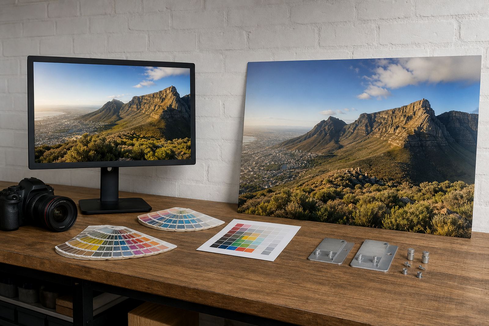
- Ask for a test panel if colour matching is critical.
Where matte panels earn their keep in South African spaces
Matte aluminium panels are useful in homes, but they are especially practical in working spaces. A reception wall in Pretoria, a studio in Randburg or a consulting room in Durban can all get strong daylight and mixed lighting. In those settings, a reflective finish can make a panel hard to read for much of the day. Matte keeps the image visible, even where the room is not under perfect control.
In coastal areas like Gqeberha, the air can be more humid and interiors may run cooler, so hanging hardware and mounting need to be handled properly. Aluminium panels are a solid choice because they do not behave like paper or canvas when the weather changes, but the fixing method still matters. The panel should sit level, with enough support for the size and weight of the piece.
A practical example: a Randburg marketing office wanted a series of branded image panels for a glass-fronted boardroom. Gloss looked impressive in the sample, but the room had direct afternoon light and ceiling spots that would have caused constant glare. The final set used a matte white finish, with crop planning adjusted for each panel. It looked neat and was easier to view during meetings, which is what the client needed.
Mounting choices that suit a clean wall, not a heavy frame
Many matte panels look best when they appear to float slightly off the wall. That can be done with generic hanging hardware, stand-off fixings or concealed systems depending on the size and where the panel will live. For bigger pieces, the wall condition matters. Plasterboard, brick and tiled surfaces all need different fixing methods, and you do not want a panel shifting because the anchors were guessed at.
For offices and public areas, mounting should also consider safety and day to day handling. A reception wall in Johannesburg might need a cleaner visual result, while a family lounge may need something less likely to catch fingers. The right choice depends on the wall, the panel size and how often people move around the space.
- Small panels can use lighter hanging systems.
- Larger panels need stronger fixing points and accurate levelling.
- Concealed mounts keep the focus on the image itself.
- Spacing from the wall can help with airflow and a neat shadow line.
What gets checked before a matte panel leaves Randburg
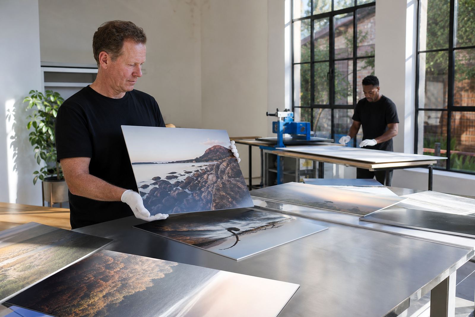
Before dispatch, the panel should be checked for colour consistency, clean edges and correct sizing. If a client is matching a new panel to an older one, that match has to be handled carefully because different files, lighting and finishes can shift the result. Reprint matching is especially important when a business wants a series of panels across more than one site.
Customers must own the images they send, or have the right to use them. That applies whether the panel is for a family photo, a brand campaign or an artist edition. It is a basic point, but it matters. Once the file is approved, the panel can be packed for local delivery in Randburg, Johannesburg, Pretoria, Midrand or Sandton, and also sent further afield to Cape Town, Durban and Gqeberha.
Matte finishes are not about hiding colour. They are about letting the image do its work without fighting the room. In a bright space, that often makes the panel easier to live with and easier to enjoy, even when the daylight is doing its own thing.