
Why monochrome behaves differently on metal
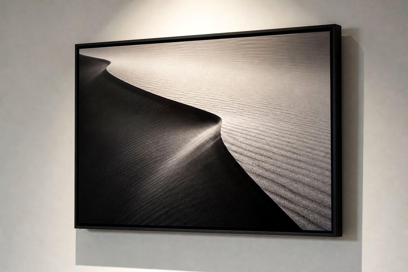
Black and white prints on coated aluminium depend on tone separation more than colour. When a file is converted to monochrome, subtle differences in shadow, skin tone, fabric texture and background detail must still hold together once the image is heat transferred onto the panel.
On a gloss surface, deep blacks can look striking and the contrast can feel stronger. Matte softens reflections and often suits portraits, architecture and fine art images where you want to read the detail without glare from window light or overhead fittings. In Randburg offices and Johannesburg homes with bright daylight, that choice matters more than people expect.
- Strong tonal range gives the print depth.
- Mid grey detail keeps faces and textures from looking blocked up.
- High contrast files can benefit from test panels before a full run.
Gloss or matte, which finish helps the image breathe
Finish choice changes the way a black and white image sits in a room. Gloss on aluminium gives a sharper punch and works well for dramatic city scenes, sports imagery and formal portraits where clean highlights help the picture hold attention. Matte is usually the safer option for galleries, boardrooms and reception areas where lighting changes during the day.
For coastal clients in Durban or Gqeberha, matte can also be practical when strong natural light and reflective windows make glare a problem. In Pretoria or Sandton, gloss can work beautifully in controlled indoor spaces, but only if the wall light does not hit the panel head on.
- Gloss: stronger contrast, more reflection, more impact.
- Matte: softer sheen, easier viewing, better under mixed lighting.
- White coated aluminium: clean and bright for neutral monochrome work.
- Brushed aluminium: lets metallic grain show through, best used with care on black and white imagery.
What file prep must get right before printing
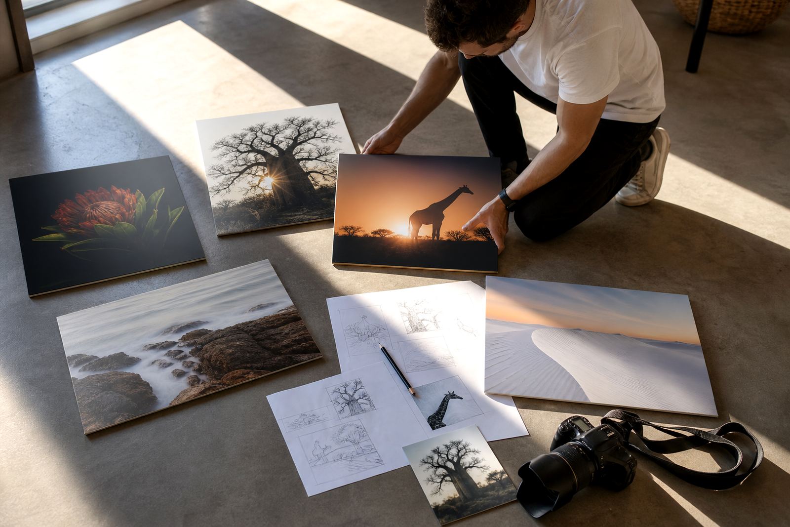
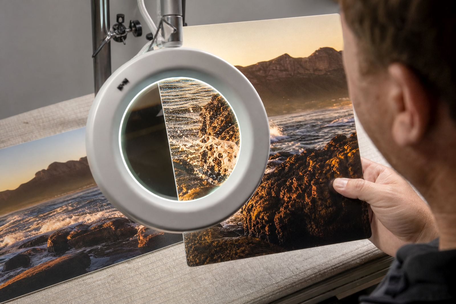
A good panel starts with the image file. Monochrome files need proper resolution, clean sharpening and thoughtful cropping so that the transferred print does not lose edge detail. As a guide, higher resolution files are best for larger panels and close viewing distances, while smaller panels can handle less detail if the source is still clean.
It also helps to check black point and white point before production. If the shadows are too heavy, the panel can look muddy. If the highlights are pushed too far, faces and light stone can lose shape. That is why file checks, crop planning and colour preparation are part of the process, even for images that have no colour at all.
- Send the largest clean file you have.
- Check that the crop still works in the intended panel size.
- Avoid over sharpened files, they can printes with hard edges.
- Ask for a test panel when a series needs consistency.
The look changes with the room, not just the panel
Black and white aluminium prints are often chosen because they sit neatly in modern homes, law offices, medical rooms and hospitality spaces. But the room changes how the piece reads. A gloss panel in a hallway with bright downlights can create reflections that distract from the image. The same panel in a shaded meeting room may look crisp and direct.
For businesses across Johannesburg, Cape Town, Durban, Pretoria and Gqeberha, the practical question is not only what looks good on screen, but where the print will hang. A reception area with large windows needs a different finish from a private office or gallery wall. If the image is going above eye level, a slightly stronger contrast can help the picture read from a distance.
Hanging hardware and panel size are part of the artwork
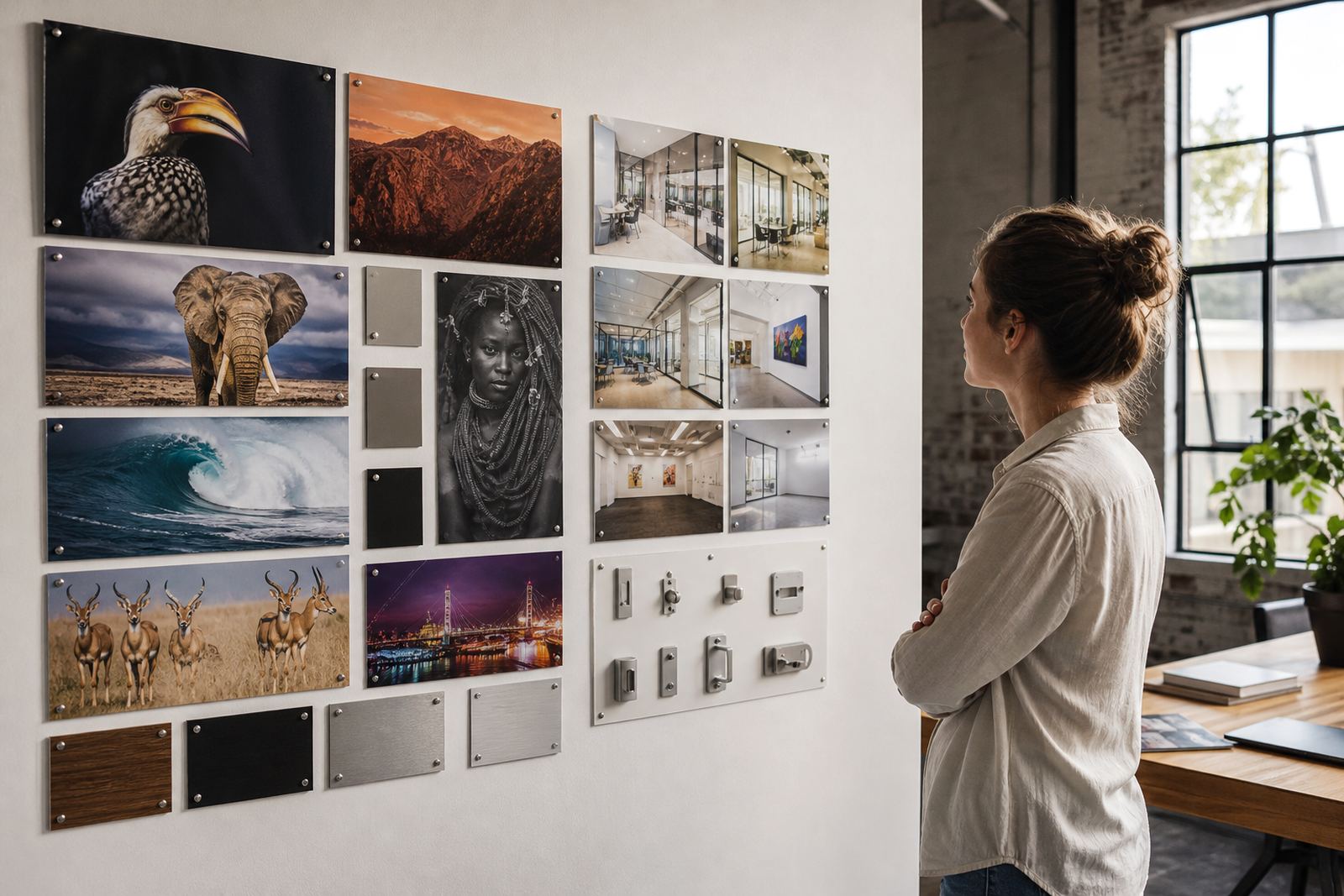
Aluminium photo panels need the right hanging method so they sit flat and secure on the wall. Generic hanging hardware can include standoff fittings, concealed mounts or slim wall fixings, depending on the size and weight of the panel. Larger pieces should be handled carefully during delivery and installation, especially where the wall surface is uneven or where municipal buildings have stricter mounting rules.
Size also changes the visual effect of monochrome work. A small print can feel intimate and quiet. A large panel can turn a portrait or landscape into the main feature in a room. For multi panel layouts, spacing must be planned so the image flow stays balanced across each section.
- Choose hardware that suits the wall type.
- Allow enough wall space for sightlines and cleaning.
- Keep multi panel gaps consistent.
- For heavier panels, confirm the mounting position before final drilling.
A Randburg example that shows the difference
A photographer in Randburg sent in a black and white street portrait for a client boardroom in Johannesburg. The first version had strong blacks, but the highlights on the subject’s shirt were too bright for a gloss finish. After a file review, the tonal balance was adjusted, the crop was tightened, and a matte test panel was produced to compare surface response under the room lighting.
The matte panel won out because the boardroom had large windows and reflective glass furniture. The final piece held detail in the face and jacket, and the client could read the print clearly from across the room. That sort of adjustment is small, but it makes the difference between a picture that hangs and one that truly works in the space.
SubAlu handles file checks, finish selection, custom sizing, mounting options, packing and delivery, with production and dispatch managed from Randburg for clients across South Africa. Customers must own the images they send or have the rights to use them, whether the job is for a home wall, gallery wall or business interior.