
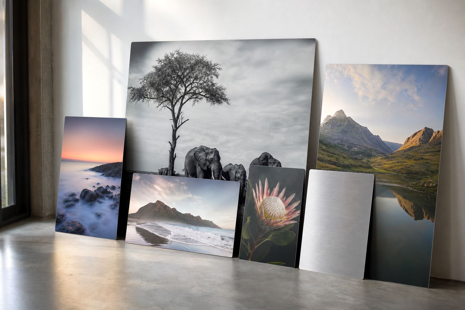
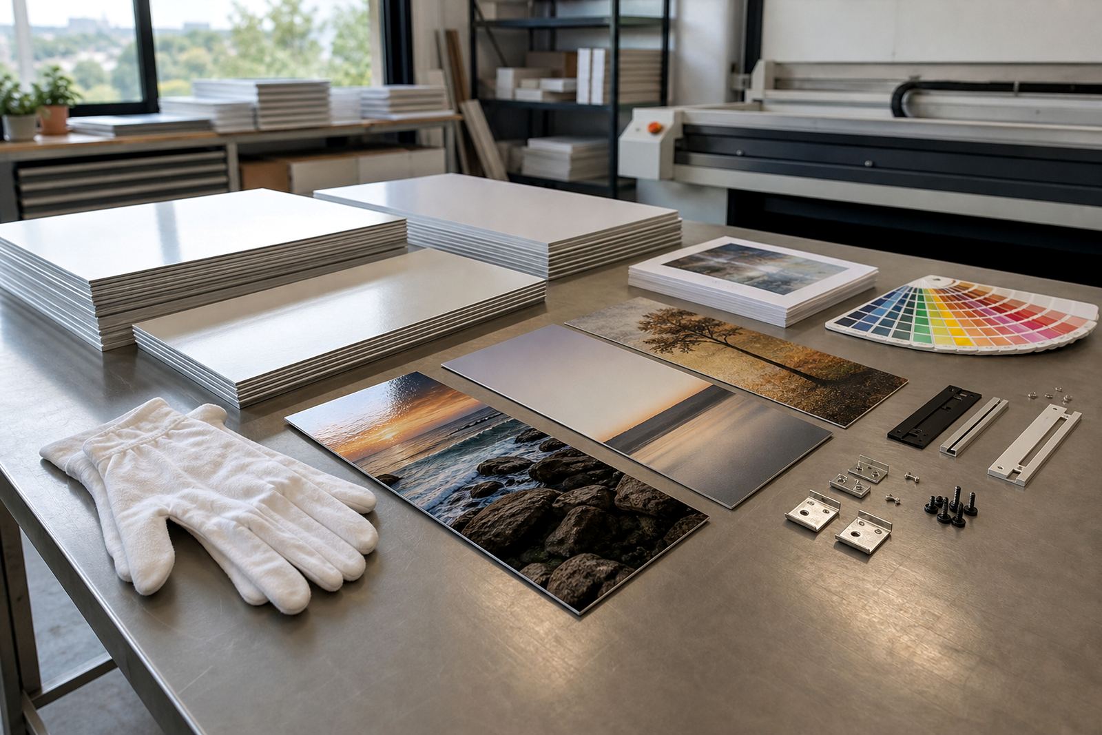
Why aluminium shows the fight between light and dark
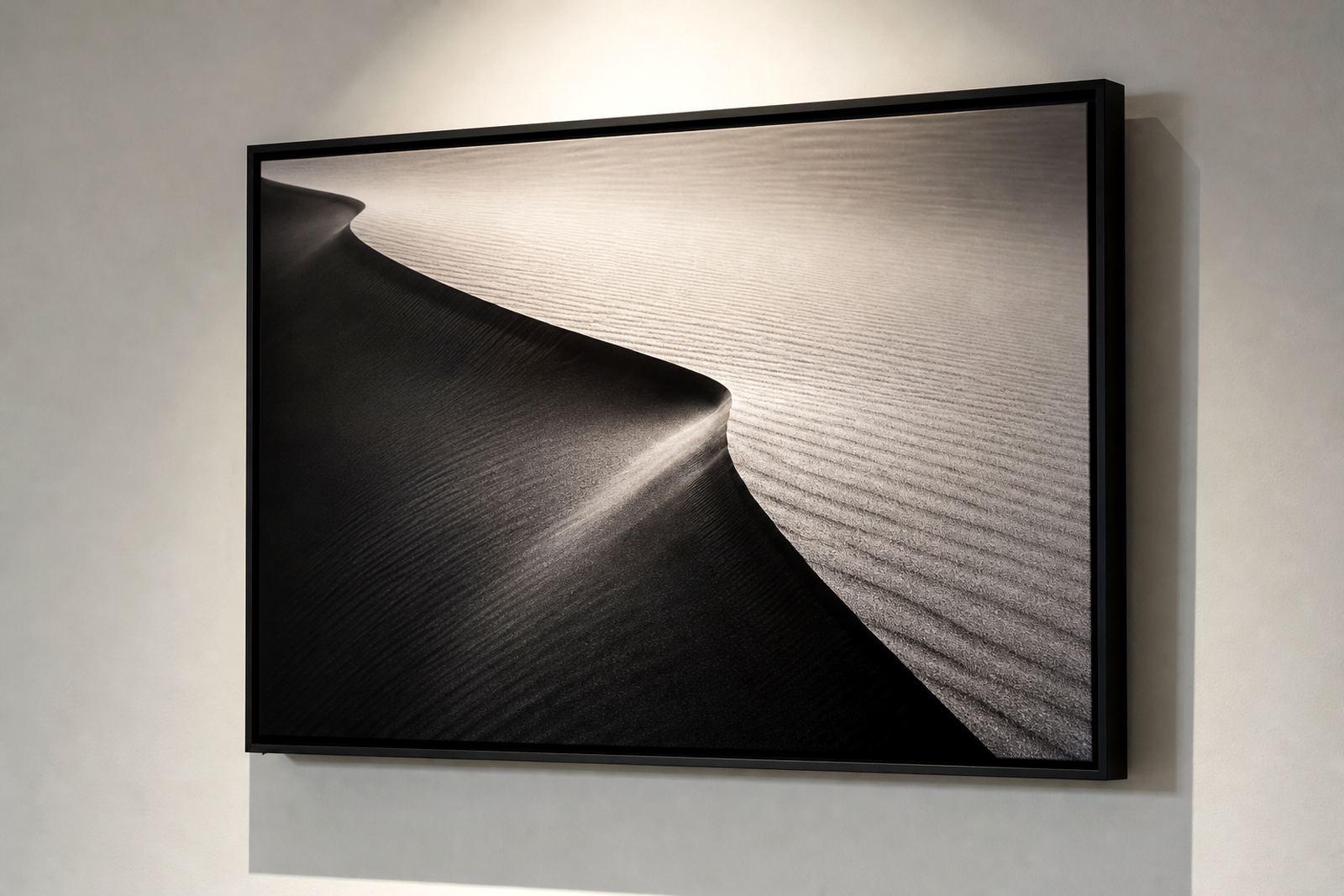
Dye sublimation onto coated aluminium gives a crisp surface, so the file has less room to hide weak exposure choices. If the highlights are blown out, the white coat can make them look flat. If the shadows are blocked up, the depth that makes a portrait or landscape feel real is lost.
That is why shadow highlight balance matters more on metal than on some softer media. The panel does not forgive poor tonal separation, but it rewards careful files with clean contrast and very good colour stability.
The tones that usually cause trouble
In South African work we often see the same problem areas: wedding dresses at a bright venue in Sandton, black suits at a midday event in Pretoria, or a Highveld sky over a dark game reserve foreground. Each one asks for detail at both ends of the scale.
- Bright clouds need texture, not a white patch with no structure.
- Dark clothing should keep folds and edges visible.
- Faces need midtone detail so skin does not go waxy.
- Reflections on water, glass or polished floors should be controlled before print.
File checks that save a panel from looking harsh
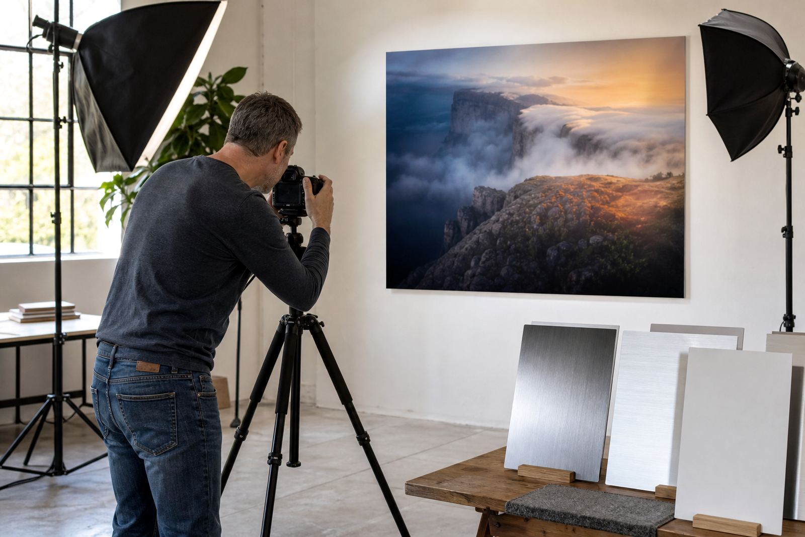
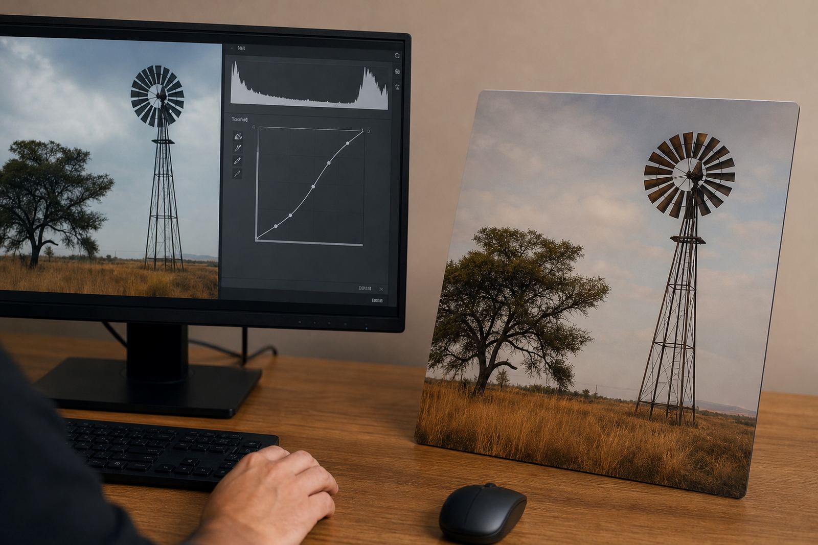
Before printing, the file should be checked for resolution, crop and tonal spread. A panel that looks fine on screen can still print too contrasty if the image was edited for a bright monitor and then sent without a proper proof check. For larger panels, this matters even more because any weak shadow or clipped highlight becomes easier to spot from a few steps away.
Our colour and prepress process looks at the dark end, the bright end and the transition between them. That is where most prints either hold together or fall apart.
- Check that the image is sharp enough for the panel size.
- Watch the histogram so bright areas are not clipped.
- Keep black detail where the subject needs depth.
- Adjust crop lines so important tones are not cut off at the edge.
Finish choice changes how light behaves on the panel
Gloss, matte, white and brushed finishes each treat shadow and highlight differently. Gloss gives stronger punch and can make contrast feel higher, which suits bold colour and dramatic images. Matte softens glare and can make a portrait easier to view in offices or galleries with mixed lighting. White panels carry the most neutral colour reading, while brushed aluminium lets the metal texture remain part of the artwork.
For a photograph with very fine detail in the shadows, a matte or white finish may be kinder. For a sunset or strong architectural image, gloss can give the surface more brightness. The right choice depends on the room, the subject and how much natural light hits the wall.
A Randburg example from a real wall
A client in Randburg once sent a colour image of a model standing under trees with a bright sky behind her. The first file had lovely colour, but the face sat too dark and the clouds had little texture. After colour preparation and a test panel, the balance was adjusted so the face stayed natural while the sky kept its detail. On the finished aluminium panel, the scene held together from the reception area to the meeting room.
That kind of correction is common for customers in Johannesburg, Cape Town, Durban, Pretoria and Gqeberha. Coastal humidity in Durban can also make people think about wall location and handling, while office glare in Pretoria or Johannesburg can affect whether gloss is the right pick.
Hanging, packing and care after the print leaves the shop
Once the panel is printed and mounted, the hanging hardware should suit the size and weight of the piece. Larger panels need proper support so they sit flat and do not warp over time. Packing should protect corners and edges, especially for delivery to Midrand, Sandton or further out on courier routes.
- Use the supplied hardware exactly as fitted for the panel size.
- Keep the panel out of direct, harsh sun where possible.
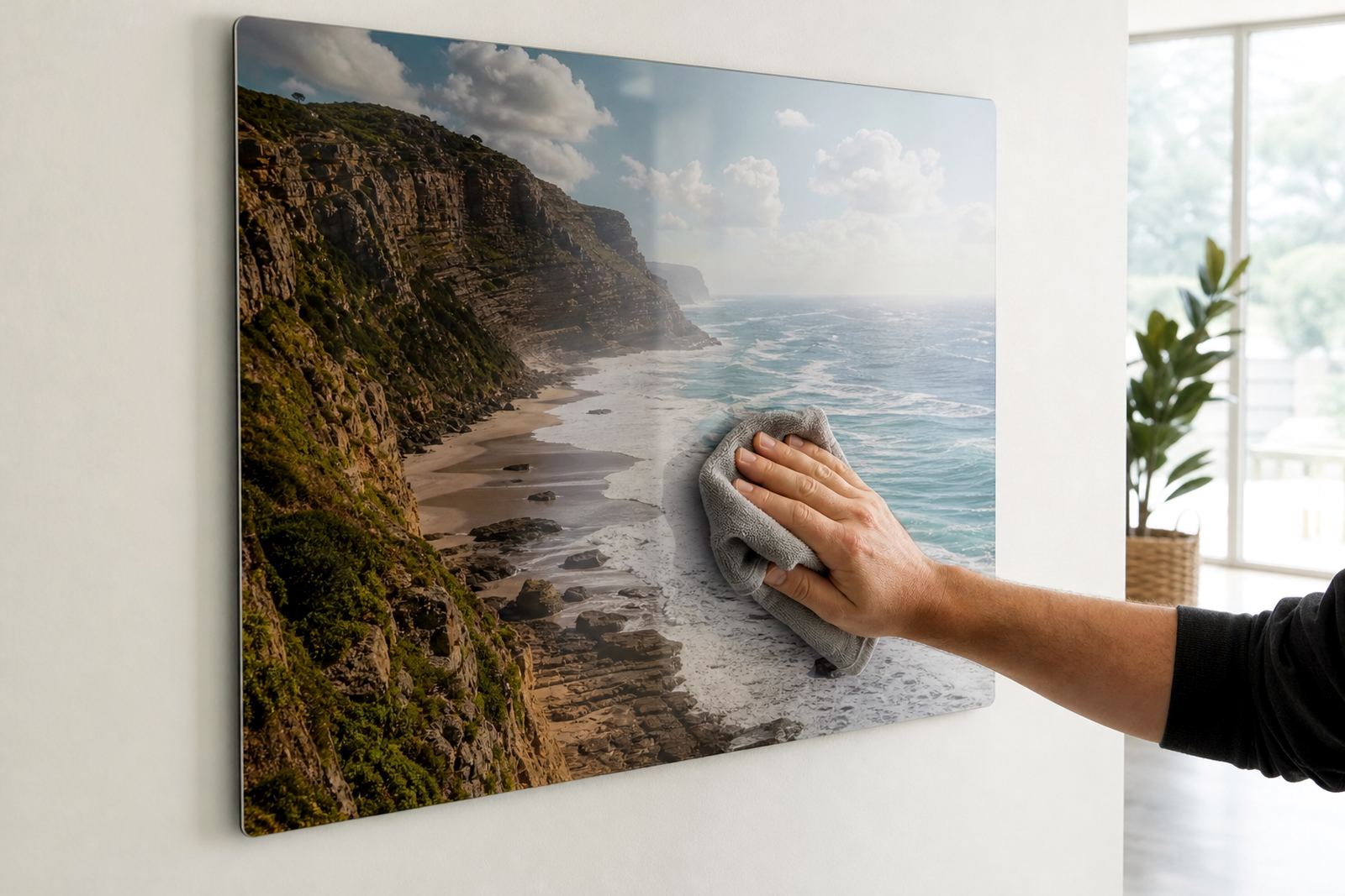
- Wipe with a soft dry cloth, not a wet one.
- If a client wants reprint matching later, keep the approved file set in good order.
Customers must own the images they send or have the right to use them. That protects the printer, the client and the final artwork.