
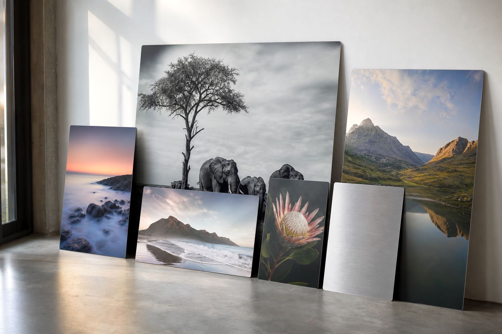
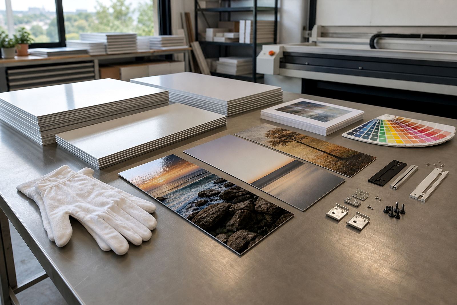
When one image has enough nerve for the wall
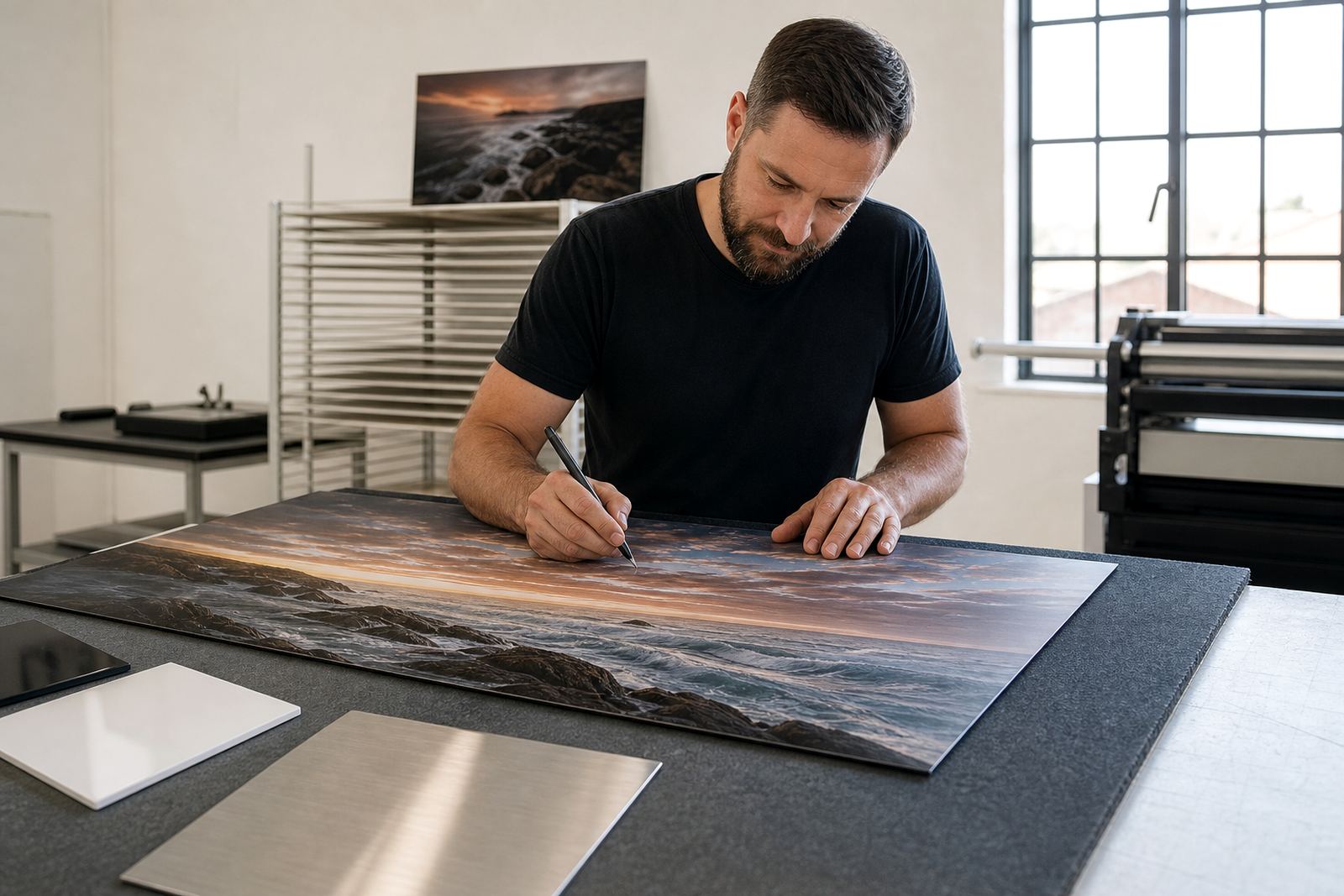
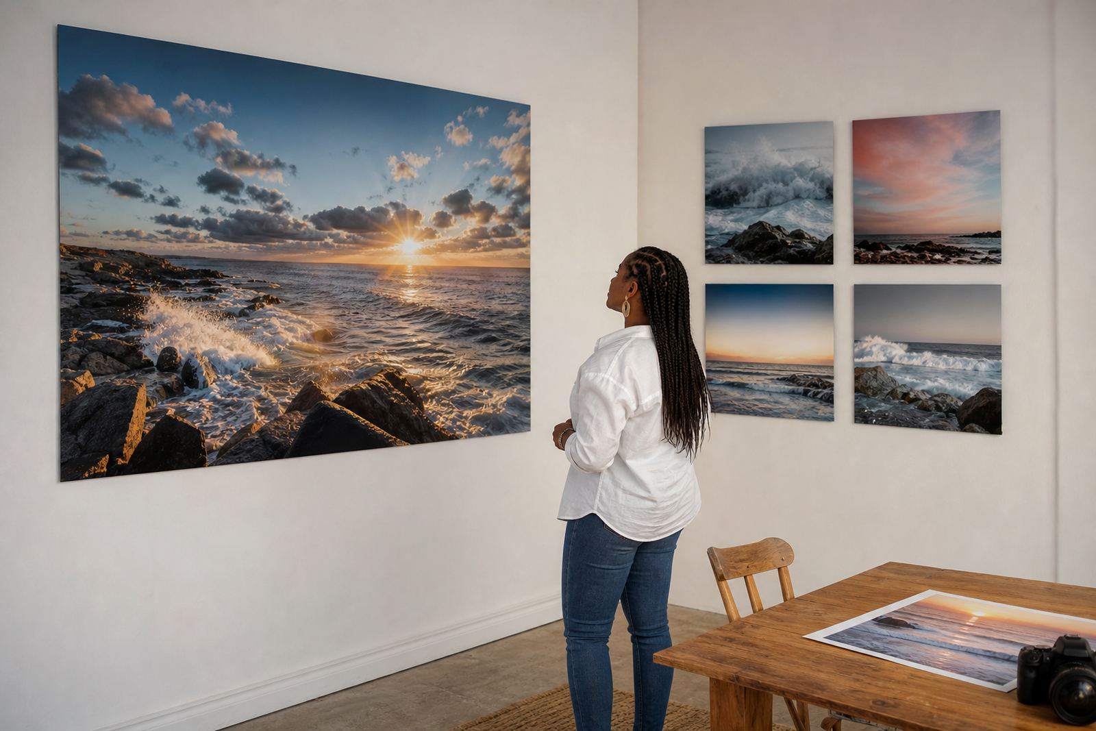
A single statement panel works best when the photograph or artwork already has a clear centre of interest. Think of a strong portrait, a landscape with one horizon line, or a product shot that needs room to breathe. On coated aluminium, dye sublimation places the image into the surface so the picture reads crisply, with clean colour and tight detail when the file is sharp enough.
For a lounge, reception or boardroom, one panel often feels calmer than several smaller pieces. It gives the eye one place to land, which helps in narrow passages, compact apartments and offices where there is already a lot happening. In Randburg, we often see this work well above a sofa or in a reception area where the wall is long but not very high.
- Best when the image has one strong focal point
- Useful where the wall is short or the room is already busy
- Works well for clean modern spaces and formal interiors
When a series gives the wall more breath
A grouped series suits a story that unfolds in parts. It might be three coastal frames, a travel sequence, botanical studies or a set of portraits where each panel stands on its own yet belongs together. The gaps between panels matter, because they create tempo and help the viewer move from one image to the next.
For businesses, a series can also carry more information without forcing one image to do all the work. A café may use a sequence of local street scenes, while an interior designer may prefer three colour matched works instead of one large panel. If the source files are from different shoots, colour preparation and crop planning become important so the set feels planned, not patched together.
- Good for stories, collections and themed work
- Helps break up very wide walls
- Useful when each image needs its own moment
How to judge the wall before you choose
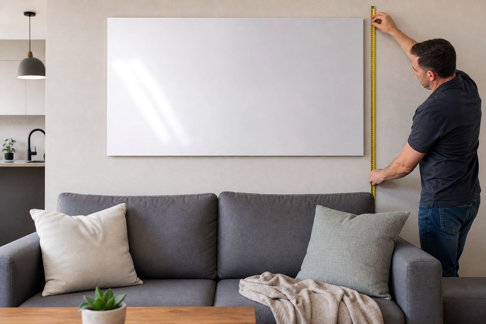
The wall decides more than most people expect. Measure the usable width and height, then leave breathing room around the piece or set. A common mistake is choosing a panel size that is technically correct but looks crowded once it is mounted. In South African homes, especially open-plan spaces, furniture placement and daylight shift the final look more than the image alone.
We suggest looking at three things before order: viewing distance, available light, and how much wall texture is present. Very smooth walls can carry a large glossy panel without issue. Heavily textured plaster or a wall with uneven light from windows may suit matte better, because it cuts reflections. Coastal clients in Durban and Gqeberha often prefer finishes that do not show every highlight from strong sun or bright indoor lighting.
- Short viewing distance favours fewer panels and stronger composition
- Bright rooms may need matte or brushed finish
- Large blank walls can take a series without feeling empty
Finishes that change the mood before the image does
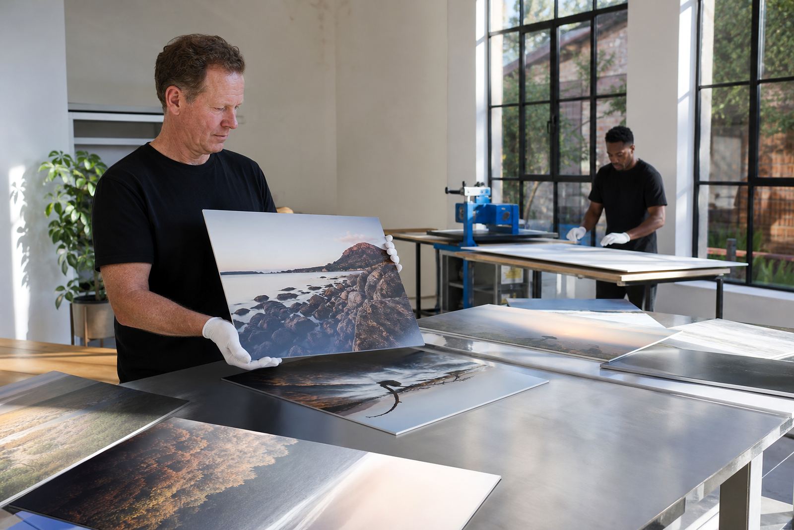
Finish choice affects how the picture lands in the room. Gloss gives strong colour pop and a slick surface, which can suit vivid work and controlled lighting. Matte softens reflections and can feel more restrained in a gallery or office. White coated panels usually give the cleanest colour base, while brushed aluminium leaves some of the metallic texture showing through lighter parts of the image for a more industrial look.
The same file can behave differently on each finish, so colour review matters. Deep blacks, bright reds and skin tones all respond in their own way. We check resolution and file sharpness too, because a close-up panel will reveal softness fast. If a client wants a series, matching finish across all panels keeps the set coherent even when the images themselves vary.
- Gloss for high colour and strong contrast
- Matte for lower reflection and a quieter look
- Brushed for a metallic character in the lighter areas
Mounting and spacing that keep the set honest
Hanging hardware should suit both the weight of the panel and the wall it will meet. For single panels, concealed mounting keeps the image floating slightly off the wall and gives a neat finish. For multi panel layouts, alignment is everything. Even a 3 mm shift between panels can be visible once the set is on a long wall, so planning the spacing before production saves trouble later.
In offices and commercial interiors, we also think about maintenance and access. If a panel may need to move for cleaning or wall repairs, the fixing should allow that without damaging the print.
- Single panels suit concealed hanging systems
- Series need measured gaps and level installation
- Wall type and room humidity should guide the fixing choice
A Randburg office, two approaches, one clear decision
A practical example: a Randburg legal office wanted a feature for a waiting area with a long wall, but not much depth in the room. One option was a single oversized city image. The other was a three panel series showing local street detail in black and white. The room had bright side light in the morning and a reception counter close by, so the series was the better fit. It gave the wall movement without overpowering the seating area.
That kind of decision is common across Johannesburg, Pretoria, Cape Town, Durban and Gqeberha. A photographer with a hero image may want one bold panel for a show wall. A business with several brand visuals may need a set that can travel across corridors, meeting rooms or retail zones. Either way, the file check, crop planning and finish selection should happen before printing, not after the wall is already waiting.
- Use one panel for strong singular imagery
- Use a series when the wall is long or the story has multiple parts
- Match finish and spacing to the room light and size