
Start with the wall you can really use
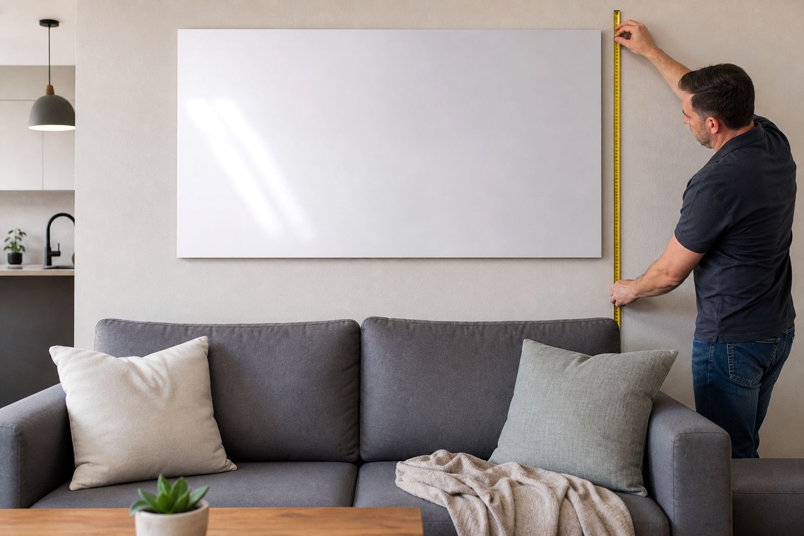
Before you think about image styles or finishes, measure the open wall width from side to side. In most homes and offices, the usable area is smaller than it first seems once you allow for skirtings, windows, switches, aircon units and door frames. A panel that fits the wall on paper can feel cramped if it sits too close to those edges.
A good working rule is to leave breathing room on both sides. If the wall section is 2400 mm wide, a single panel or grouped layout often works best at about 1600 mm to 1900 mm overall, depending on the room. That keeps the piece present without forcing it into the corners. In a narrow passage or reception area, a slimmer vertical panel may suit better than a wide panoramic piece.
If you are planning a cluster of panels, measure the full span from the outer edge of the first panel to the outer edge of the last panel. People often only measure each panel separately and forget the gaps between them, which changes the final size quite a bit.
Let the furniture below set the lower boundary
The furniture under the artwork matters as much as the wall itself. A panel above a couch, headboard, sideboard or boardroom credenza should sit high enough to feel connected, but low enough to avoid floating awkwardly. Usually, 150 mm to 250 mm above the furniture is a practical starting point.
For larger items like a lounge suite or hotel headboard, the artwork width should usually land at about two thirds to three quarters of the furniture width. That proportion keeps the room balanced and stops the wall piece from looking squeezed. If your couch is 2400 mm wide, a wall panel arrangement around 1600 mm to 1800 mm often reads well in a normal room.
- Measure the furniture width first, then compare it to the wall section above it.
- Check how much clear wall remains above the item once you allow for lamps, frames or shelving.
- If the room is busy, choose one larger panel instead of several small ones so the eye has one place to rest.
Turn the photo into a size that still holds detail
Wall size is only one part of the decision. The image itself must carry enough detail for the final panel size. A landscape shot with plenty of open sky can stretch nicely across a long wall, while a portrait image may suit a narrower panel or a vertical pair. When a photo is enlarged too far, faces, textures and fine lines can start to look soft.
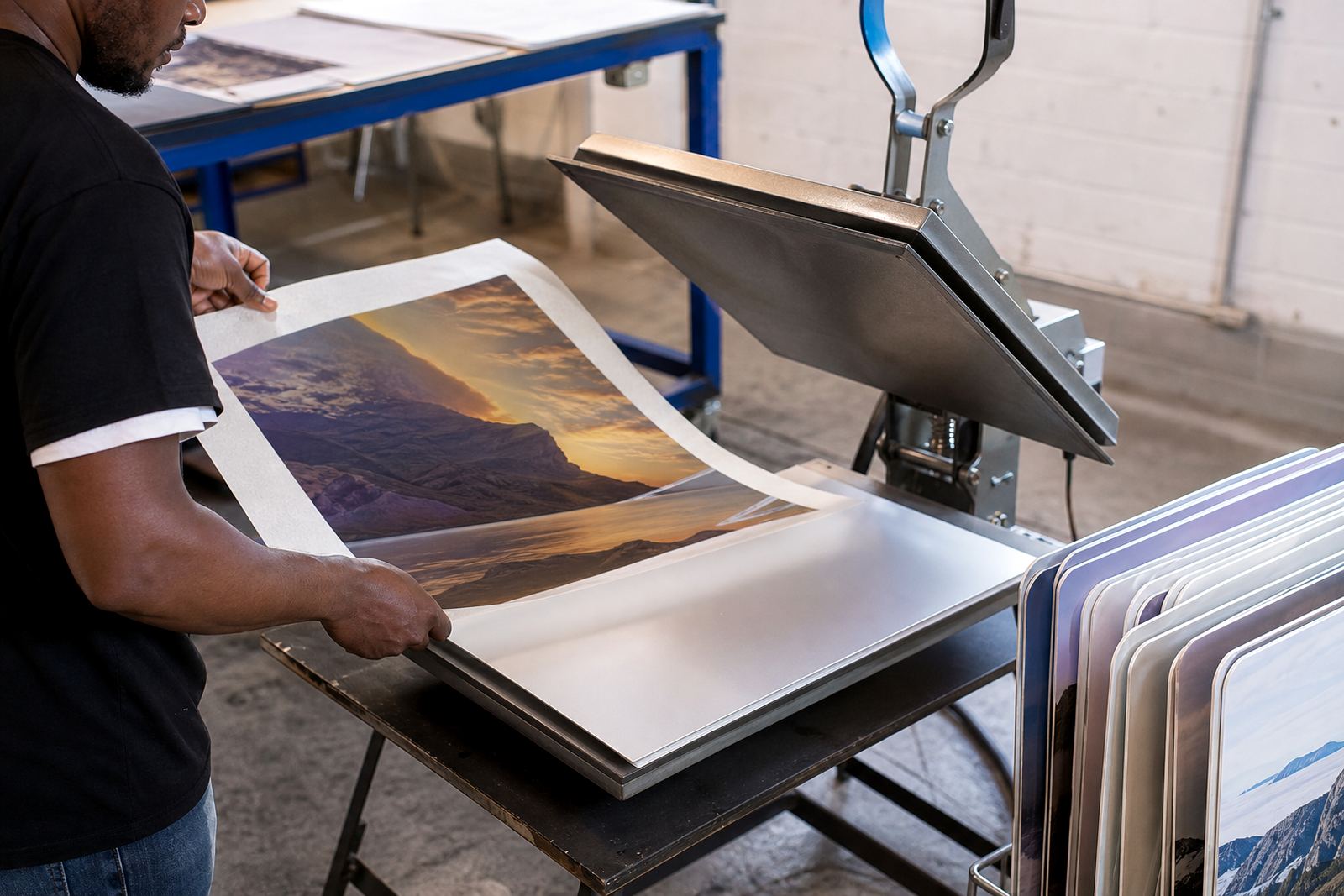
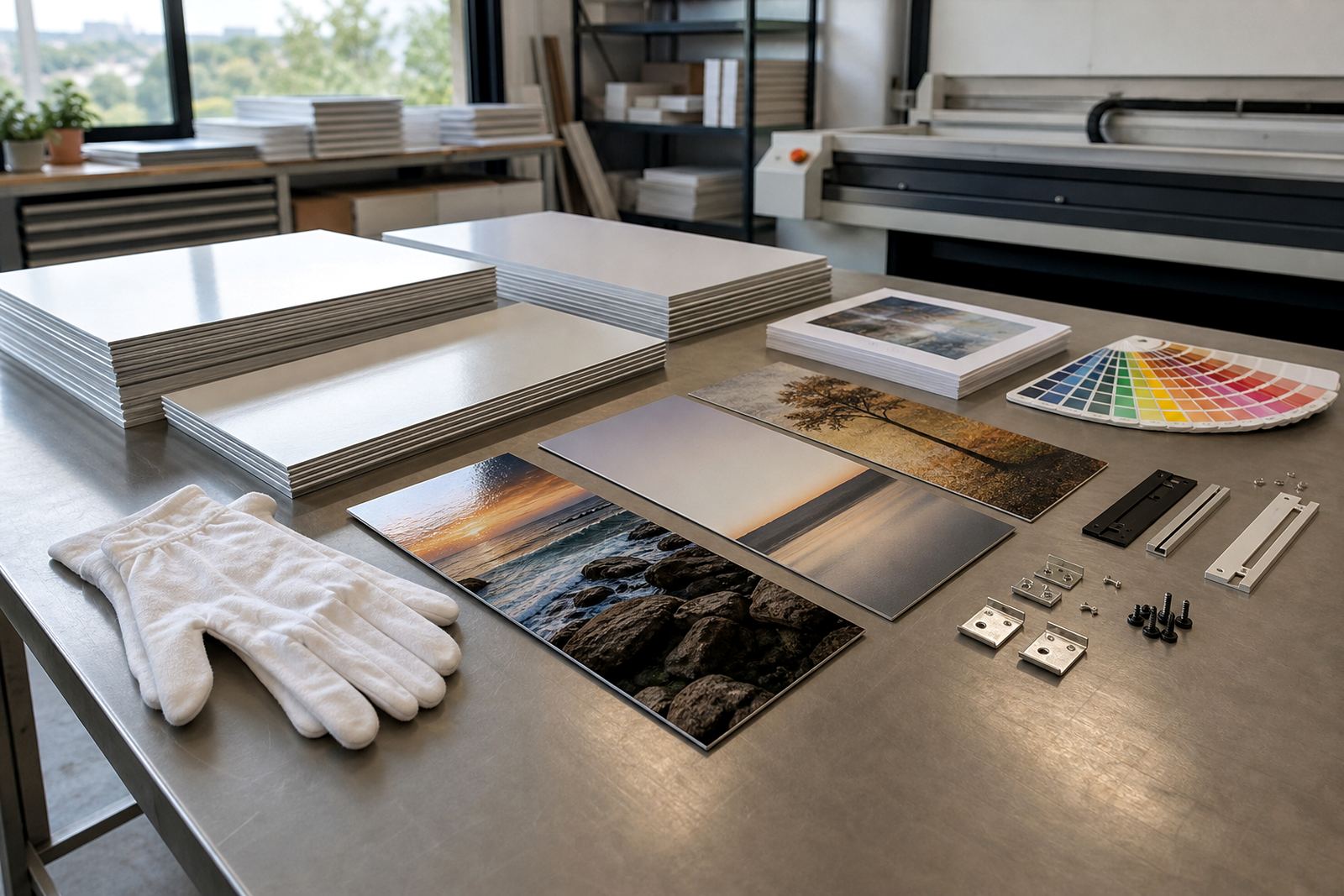
For dye sublimation onto coated aluminium panels, the image needs clean source files and a sensible resolution for the finished dimensions. As a rule, a sharper original gives more room to scale up without loss of clarity. If the image will be seen from a few metres away, such as in a lounge or passage, that helps. If it will be viewed close up in a home office or gallery, finer detail matters more.
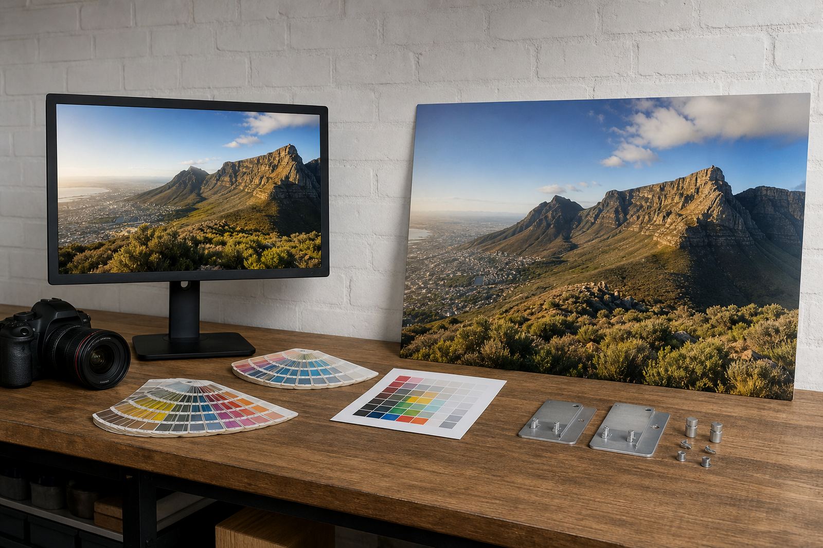
File checks, resolution review and crop planning are worth doing before any panel is made. That way the final size is matched to what the image can handle, not just what the wall can take.
Choose the finish for the room, not only for the picture
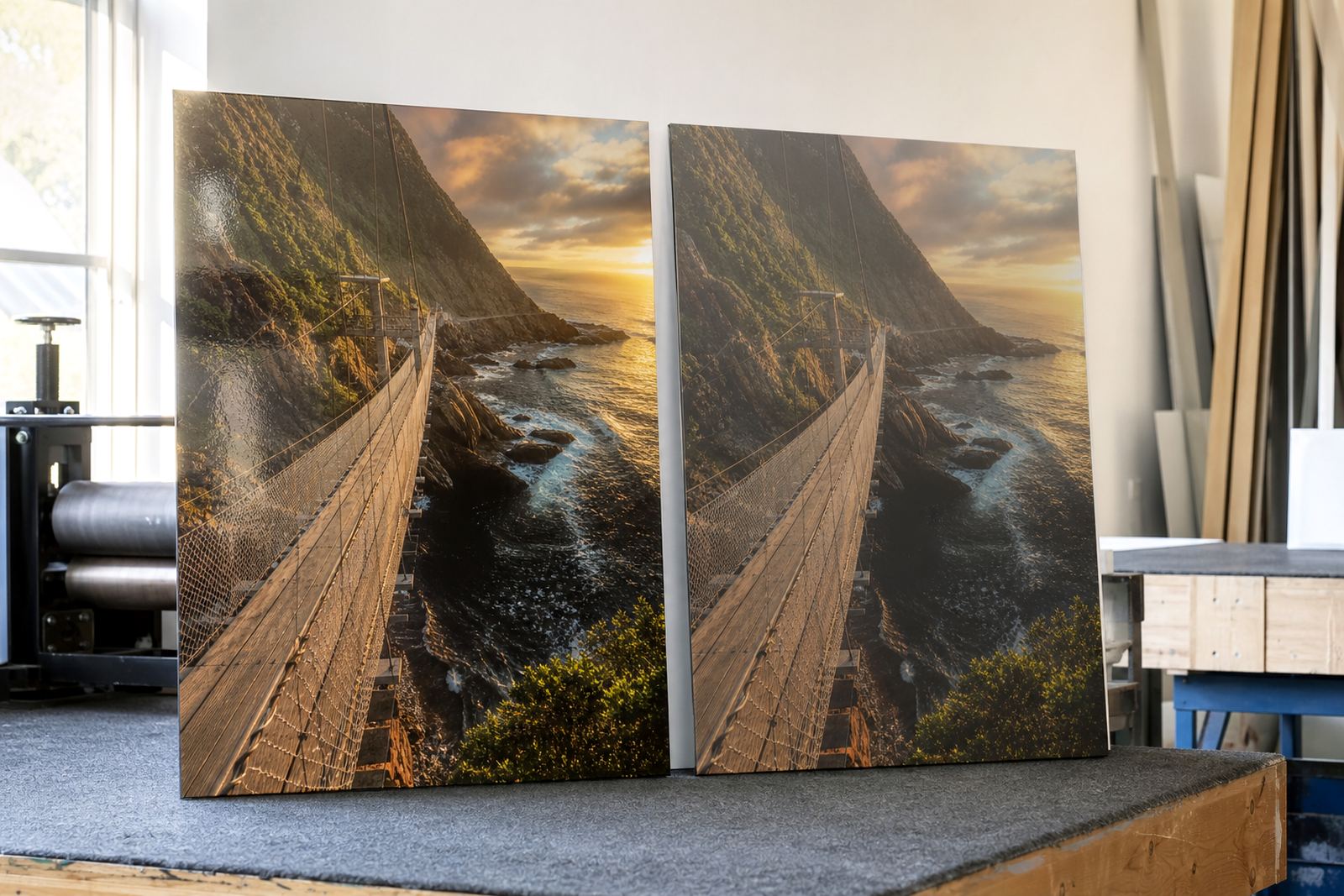
Finish changes how the wall size feels. A gloss finish gives stronger colour pop and reflects more light, which can make a smaller panel feel lively in a bright room. Matte is calmer and helps reduce glare from windows or office lighting. White coated aluminium gives clean colour reproduction, while brushed aluminium can leave parts of the metal grain visible in lighter areas for a more industrial look.
In Johannesburg offices with glass partitions or strong daylight, matte can be easier to live with. In a north-facing room in Cape Town or Durban, where sunlight and humidity can vary through the day, finish choice can also affect how much reflection you notice. The panel size may stay the same, but the visual weight changes with the surface.
- Gloss works well for bold colour and saturated images.
- Matte suits softer rooms and spaces with strong natural light.
- White is often the cleanest option for accurate colour work.
- Brushed adds texture and can support a more restrained image.
A Randburg lounge example that is easy to picture
Take a Randburg lounge with a 2600 mm wall above a three-seater couch that measures 2100 mm wide. The wall has two plug points near the edges, so the usable span is really closer to 2300 mm. In that space, a single panel around 1600 mm wide, or a two-panel set with a combined width around 1700 mm, would feel comfortable.
If the ceiling is standard height, a horizontal layout usually suits the room better than stacked portrait panels. Add 180 mm of clearance above the couch and keep the artwork centred on the seating area, not the wall as a whole. That small shift makes the room feel planned instead of filled.
For a business reception in Sandton or Midrand, the same method works with a waiting bench or counter. Measure the furniture, check the traffic flow, and leave enough clear wall for signage or notices. A panel that blocks a thermostat, alarm keypad or compliance notice will create problems later.
When one panel is enough and when a set works better
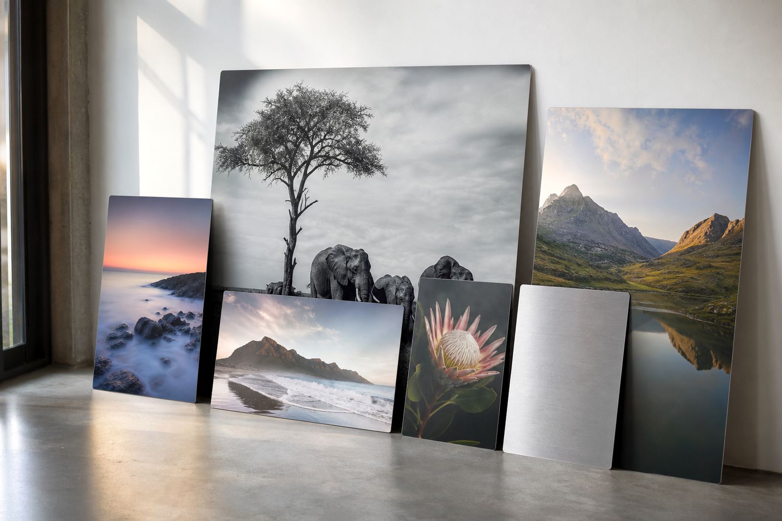
Single panels suit focused images, smaller walls and rooms where the furniture is already doing most of the visual work. A set of panels is useful when the wall is wide, the image is panoramic, or you want more presence without one very large sheet. Split layouts also work well for large offices, restaurants and display spaces where the wall is interrupted by doors or fittings.
The key is to keep spacing consistent. Uneven gaps make a layout look accidental. A neat line between panels helps the eye read the full image properly. If the wall width is limited, one larger panel often looks cleaner than three small ones that never quite line up with the furniture below.
- Use one panel for simpler walls and direct focal points.
- Use multiple panels for wide walls and panoramic images.
- Keep the outer edges aligned with the furniture below where possible.
- Check that the total layout still leaves enough wall around it.
The last check before production
Before a panel is prepared, confirm the final width, height, finish and mounting method. Also make sure you have the right to use the image you send. That matters whether it is a family photo, a commissioned image, a brand asset or an artwork file. If the image needs a crop adjustment, a test panel or a reprint match later on, it is better to sort that out at the start.
Packing and delivery also play a part in size choice. Very large panels can move through Johannesburg, Pretoria, Cape Town, Durban and Gqeberha safely when they are packed properly, but the bigger the panel the more careful the handling needs to be.
If you are unsure, use the wall and furniture measurements together rather than guessing from memory. That one step usually gives a better result than choosing by eye alone.