
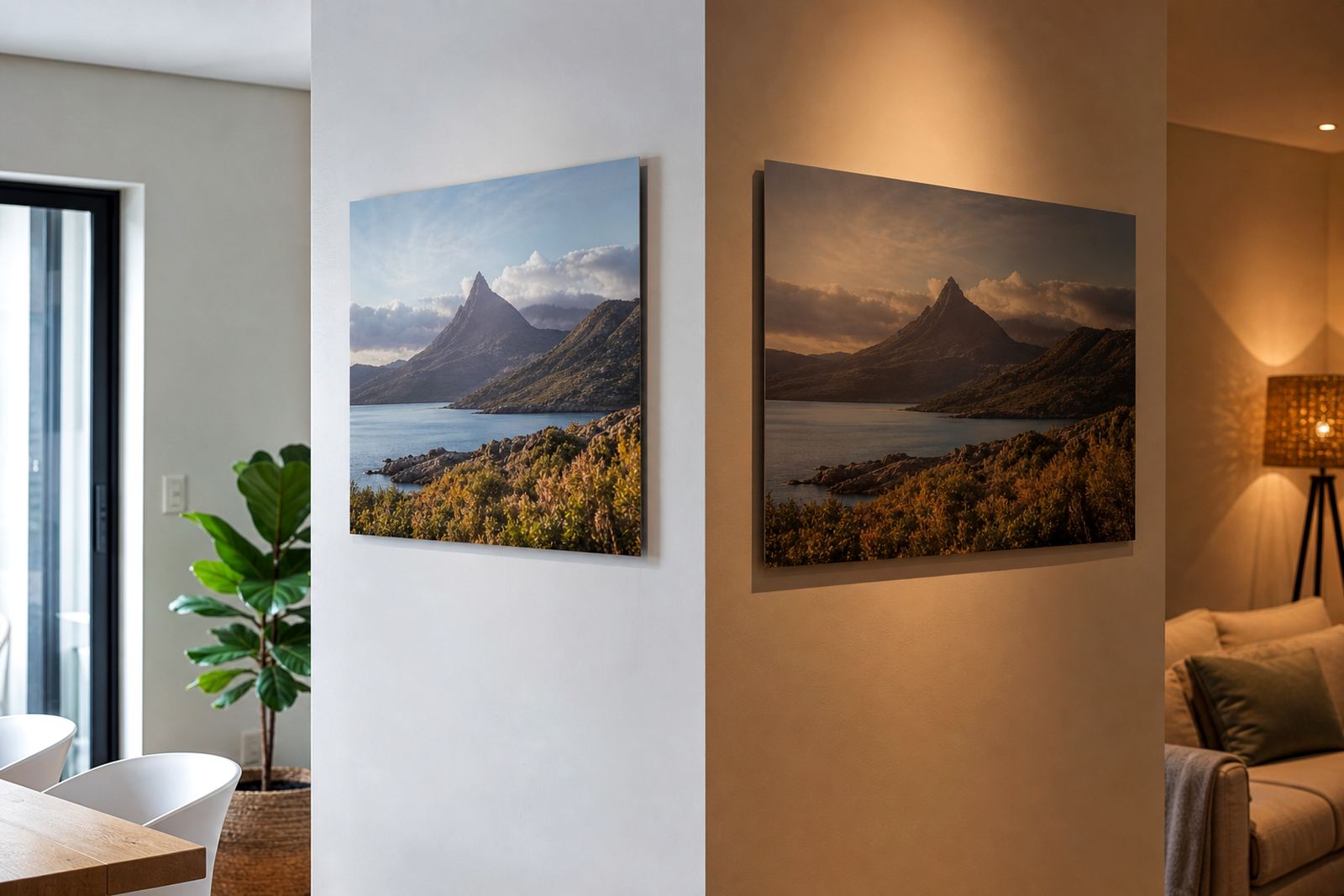
Why the same panel can look different before lunch and after dark
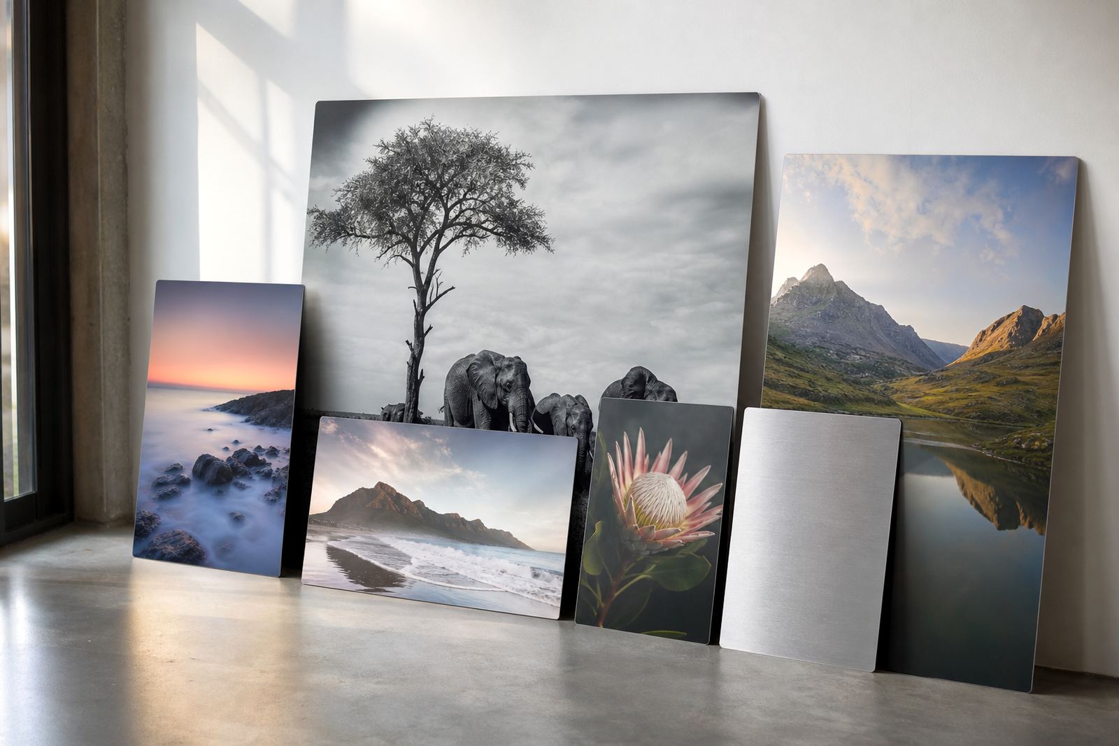
We usually start with the room rather than the file. If a panel will hang above a reception counter with ceiling spots, that is very different from a hallway in Cape Town with filtered daylight all afternoon. Light from one side can also reveal texture in the print, especially on brushed aluminium where the metal grain becomes part of the look.
For photographers and artists, this matters when the final viewing angle changes through the day. A face photograph can feel intimate in morning shade and more formal under sharp evening lighting. Product imagery in an office can need stronger contrast so it still reads well from across the room.
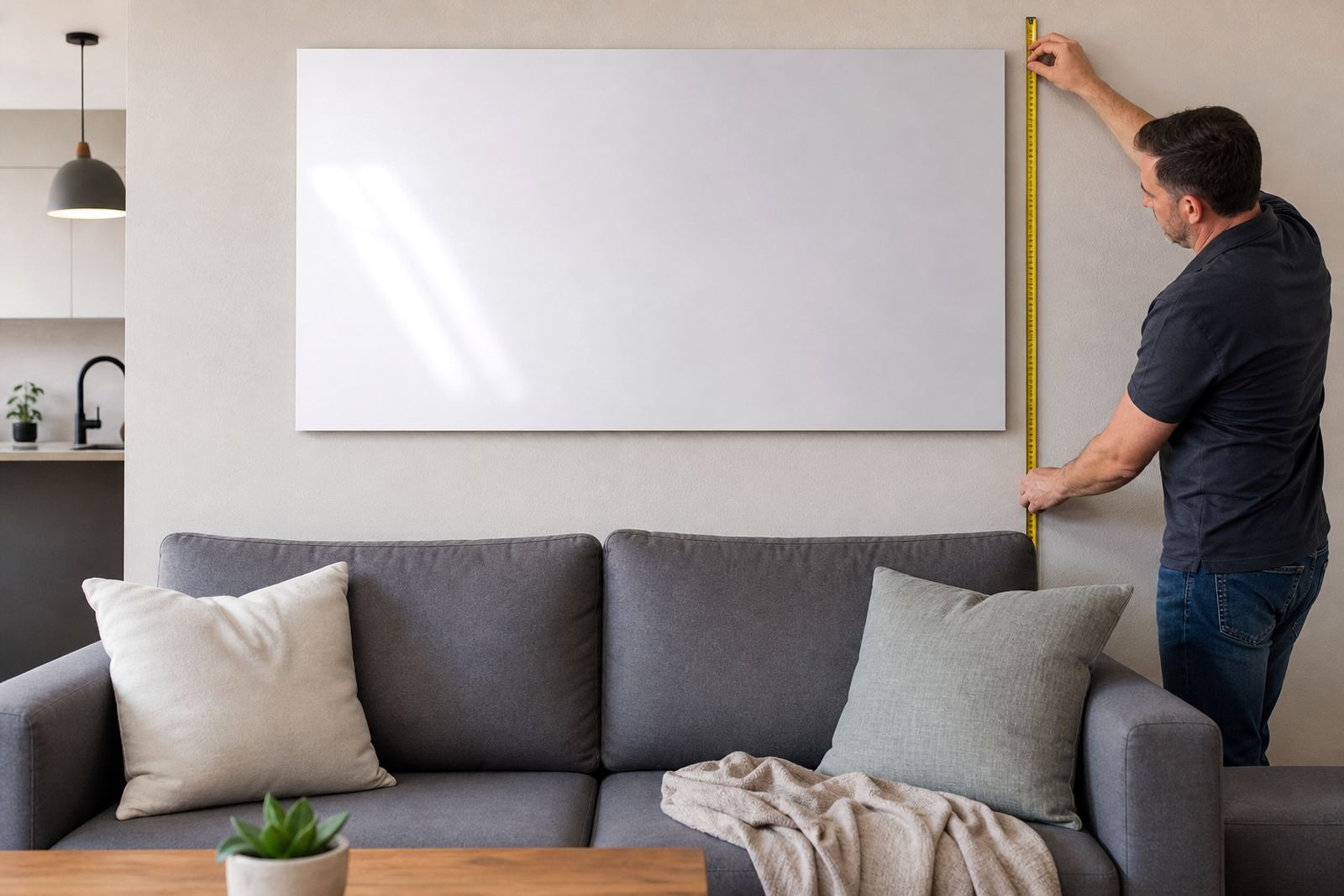
- Measure the wall size and note where the nearest window sits
- Check whether the room uses warm, neutral or cool lighting
- Look for reflective surfaces nearby, such as glass tables or tiles
- Take a phone photo at the time of day the panel will be seen most
Choosing gloss, matte, white or brushed for the space
Resolution matters more when the room is bright. In strong light, the eye notices soft edges, flat skin tones and weak contrast much faster. Files should be checked for enough detail at the final size, with careful cropping so faces are not pushed too close to the edge. If the image is intended for a large wall in Sandton or a boardroom in Midrand, file quality needs extra attention.
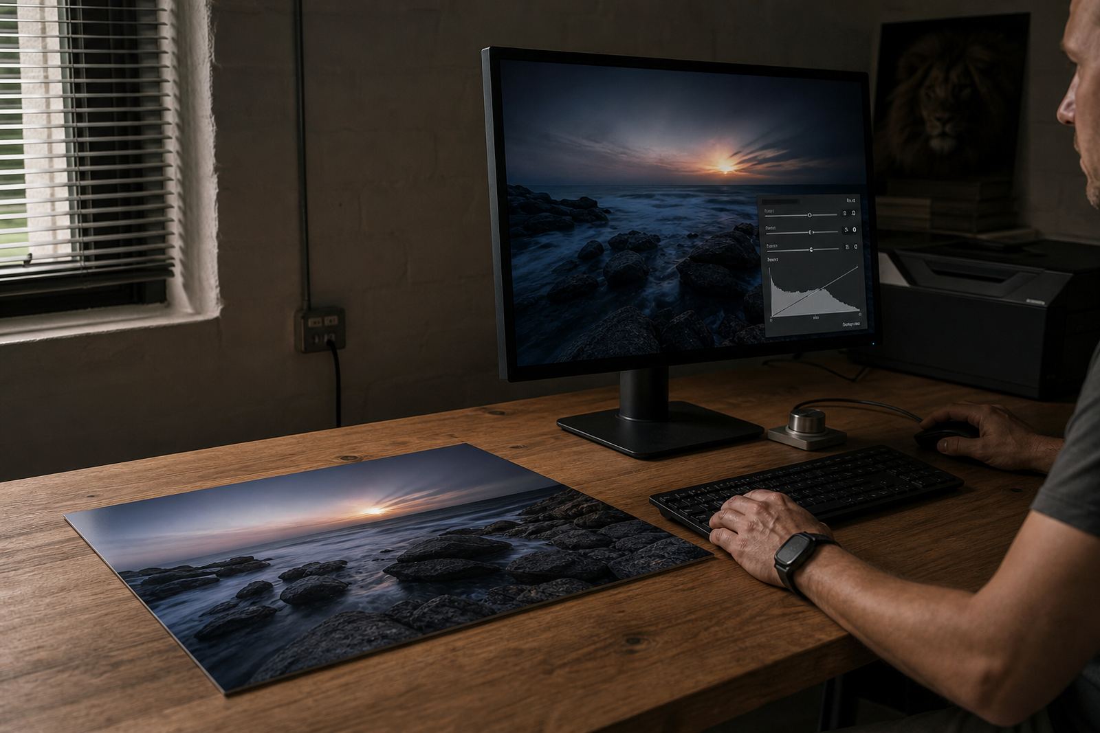
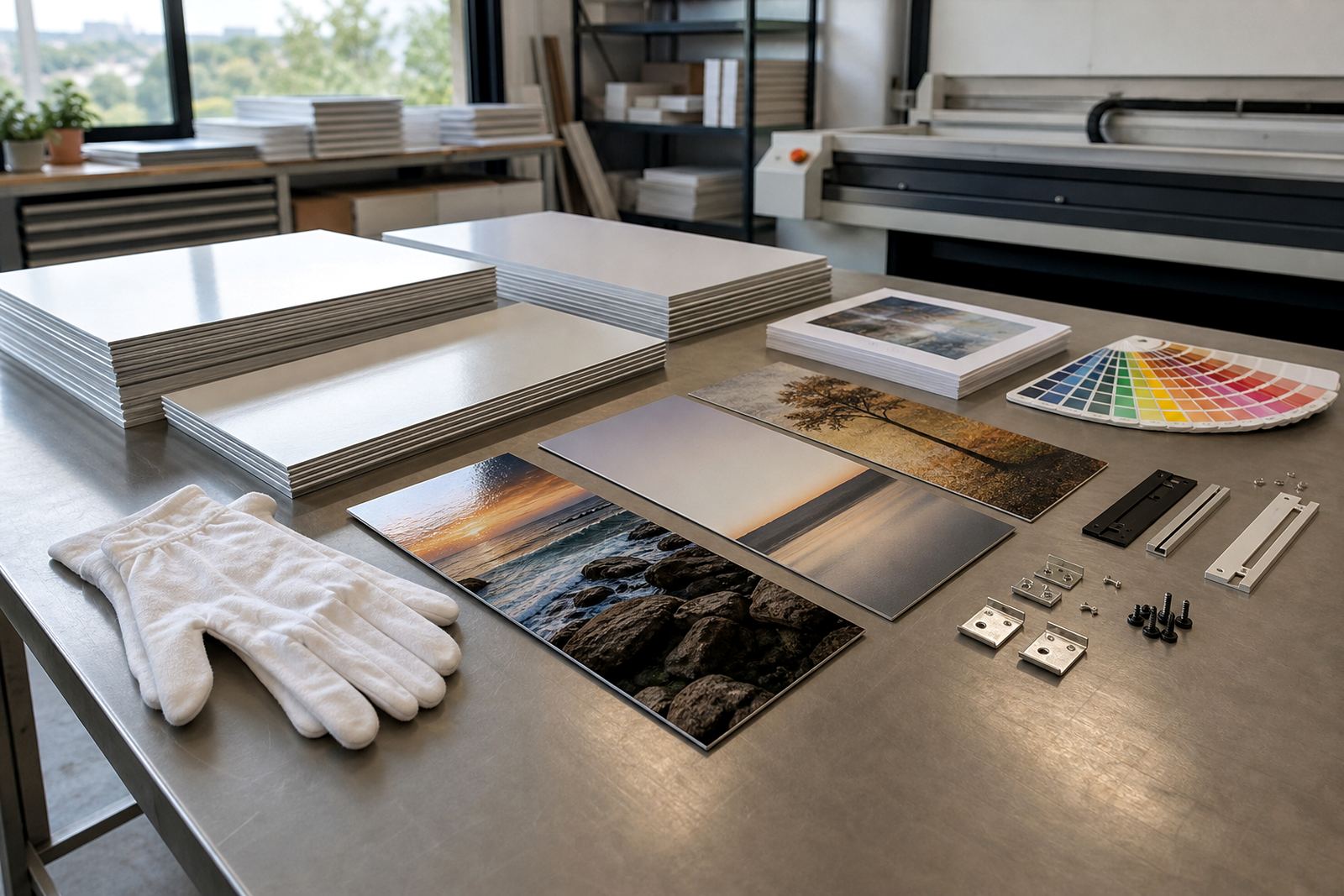
Colour preparation also plays a part. The image may look richer on a screen than it will on aluminium, so test panels are useful when the final environment has mixed lighting. A slight shift in colur temperature can change the mood completely. Cool white light may make a landscape feel sharper, while warm light can bring out ochres and reds.
- Use full size source files where possible
- Avoid heavy compression before print preparation
- Check crop safe areas for key details and text
- Ask for a test panel when the room lighting is uncertain
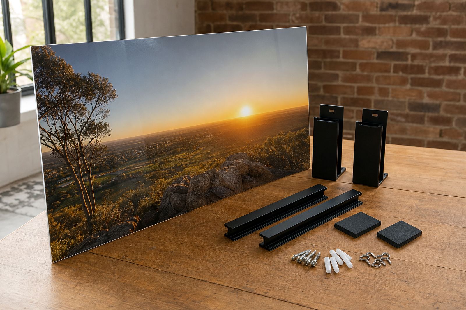
Mounting choices that keep the light doing the right thing
A practical example: a Randburg client wanting a family portrait for a dining room with afternoon sun from the west. A gloss finish would have looked lively in the morning, but by late afternoon the room would have thrown glare straight across the faces. A matte finish with careful crop planning gave a calmer result, and the image still held detail under the ceiling lights at night.
That kind of decision is common across Johannesburg, Cape Town, Durban, Pretoria and Gqeberha. The same artwork can behave very differently from one address to another. A coastal apartment, a tiled office foyer, and a gallery corridor all ask for a slightly different finish and mounting approach.
- Send a clear photo of the wall and the room light sources
- Tell us what time of day the panel will be viewed most
- Note whether the space uses warm lamps, LEDs or mixed lighting
- Share the final size needed so the image can be checked properly