
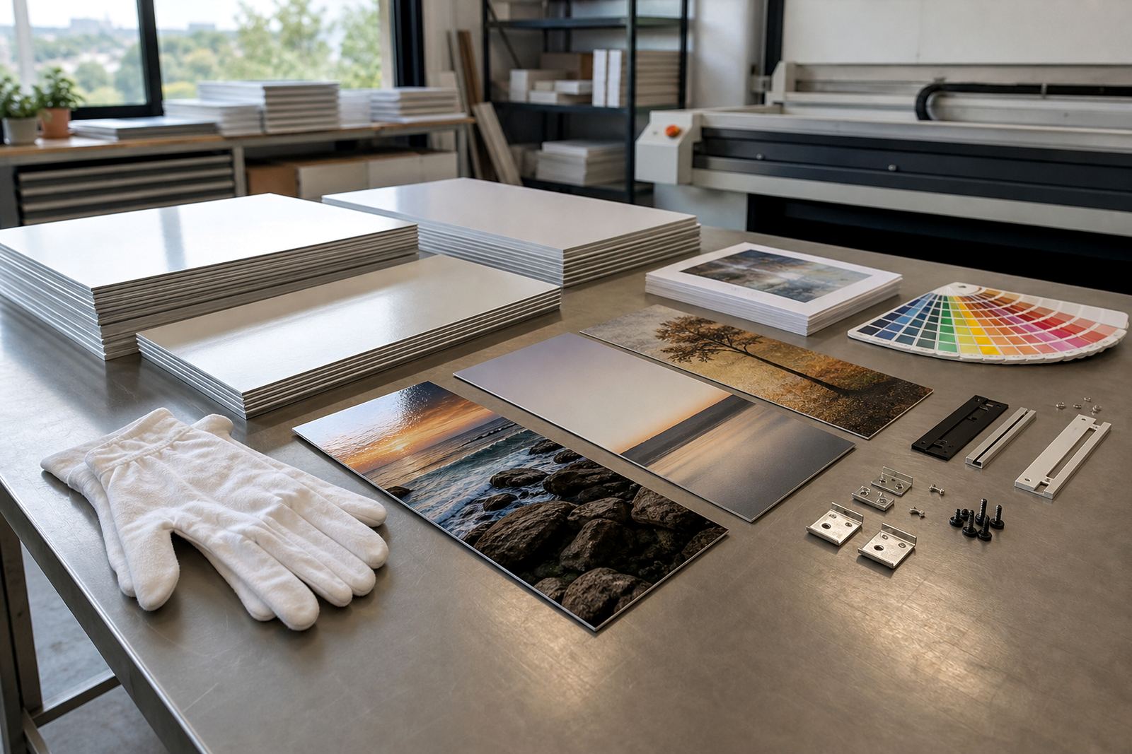
Why the gap matters more than people think
With multi panel aluminium prints, the spaces between panels are part of the design. A narrow gap can make one strong image feel like a single continuous piece, while a wider gap gives each panel room to breathe. The right balance depends on the photo, the wall size, and how far people will stand back to view it.
For a home in Randburg, a hallway set may need tighter spacing so it reads well in passing. In a boardroom in Sandton, a larger gap can suit a wide wall and create a more measured look. Good spacing stops the set from looking squeezed against the wall or drifting too far apart.
Diptychs and triptychs need different spacing logic
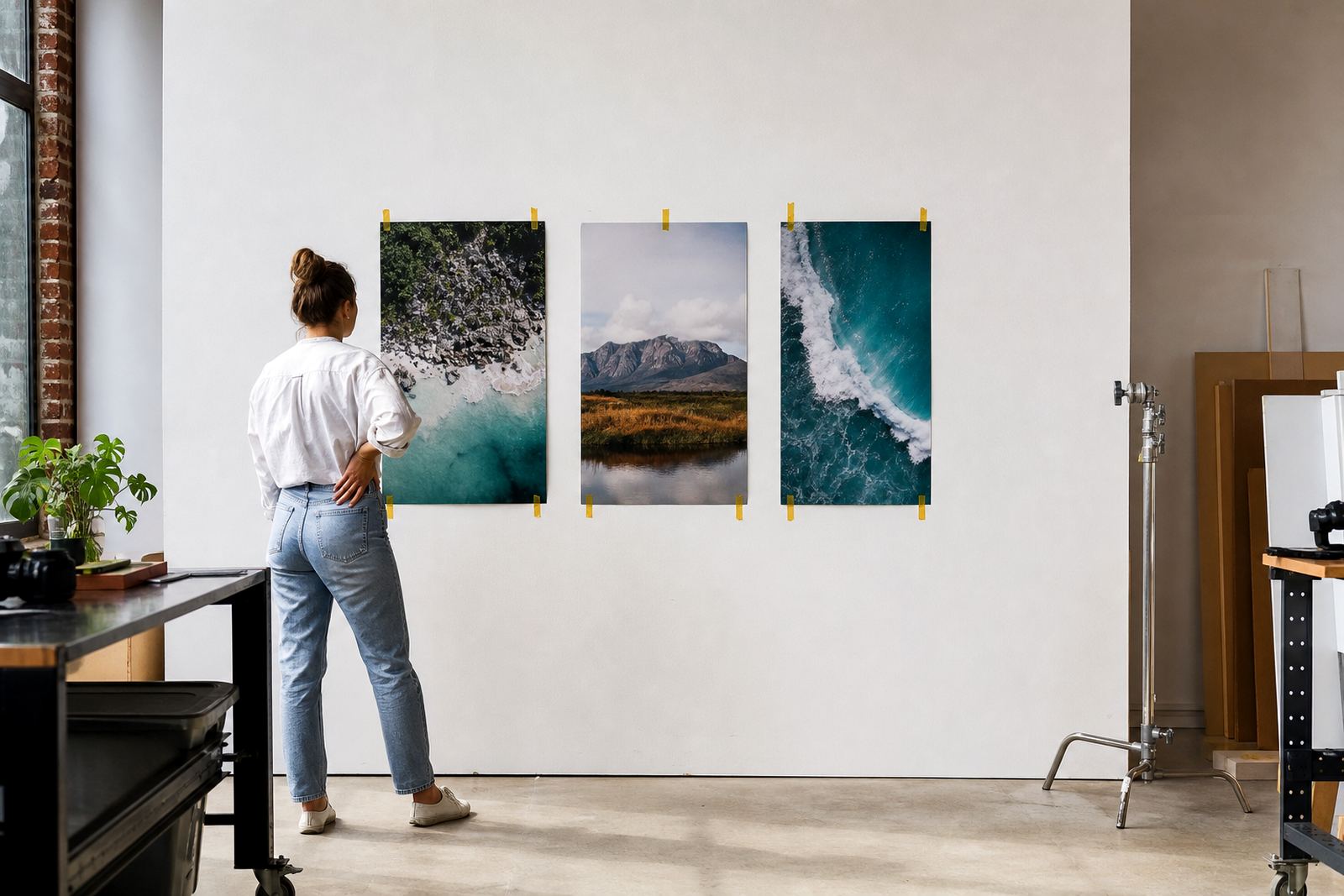
A diptych usually works best when the two panels feel linked, with the eye moving easily from one side to the other. A triptych gives more room for rhythm, so the centre panel can carry the strongest point of the image while the outer panels support it. If the image has a horizon, skyline, or portrait subject, the gap should protect that visual flow.
- For diptychs, keep the spacing even and restrained so the split feels intentional.
- For triptychs, check that the centre panel is not too dominant unless that is the brief.
- If the artwork has text, fine detail or faces, the gaps should not interrupt important elements.
- For abstract or architectural images, a slightly wider gap can work very well.
How finish choice changes what the eye picks up
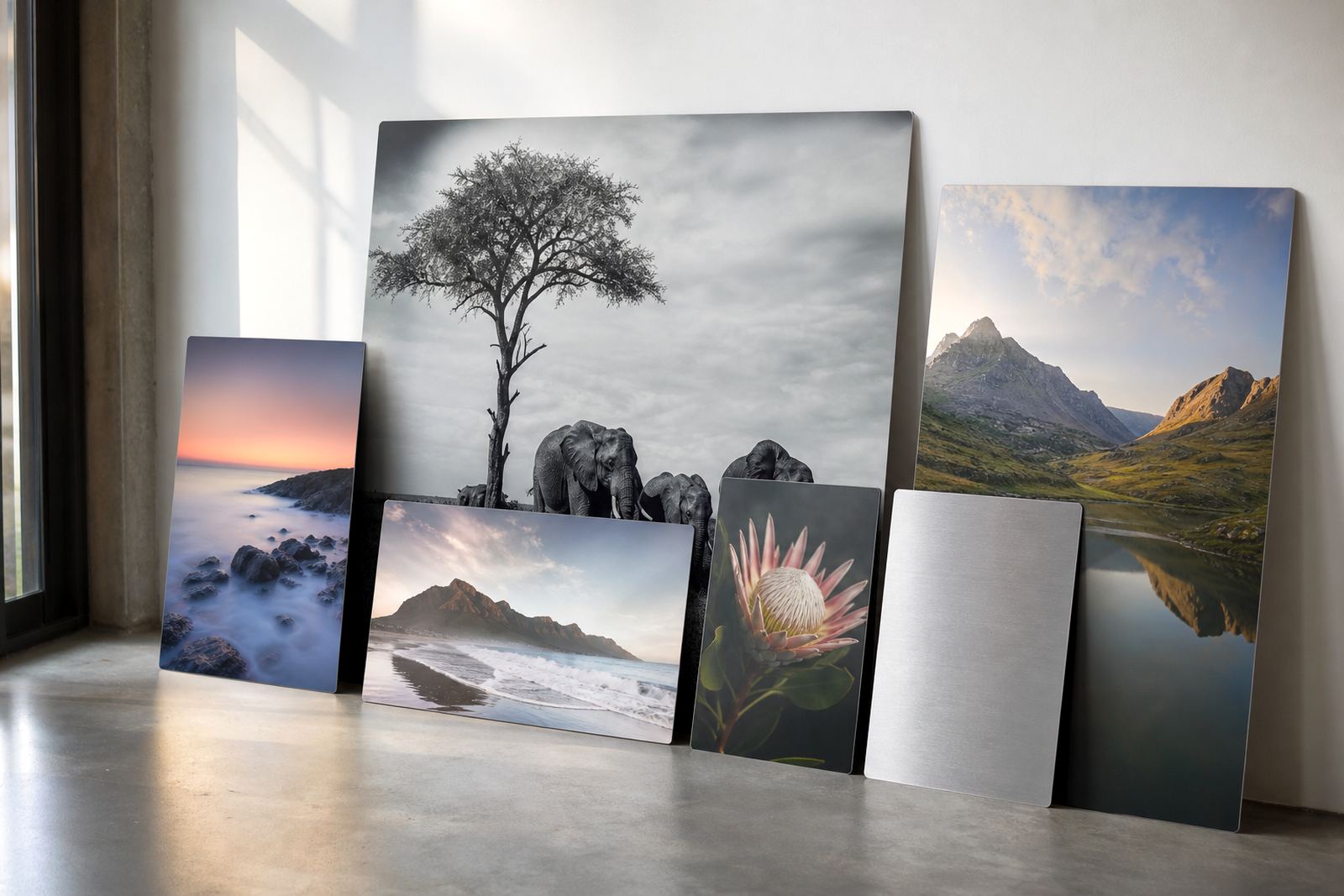
The finish on the aluminium panel affects how spacing is read. Gloss finishes reflect more light, so a too-tight gap can cause highlights to jump across the set and distract from the image. Matte finishes soften that effect and suit rooms with strong side light or glass walls. White coated panels hold colour strongly, while brushed aluminium lets parts of the metal texture show through in lighter areas.
In coastal areas like Durban, where humidity and bright light are common, finish choice can make a practical difference in how the panels are viewed day to day. On a brushed set, spacing should be planned with the image contrast in mind so the natural metal texture does not swallow smaller details. That is where test panels can help, because what looks fine on a screen may read differently once printed and mounted.
Sizing rules that keep the wall balanced
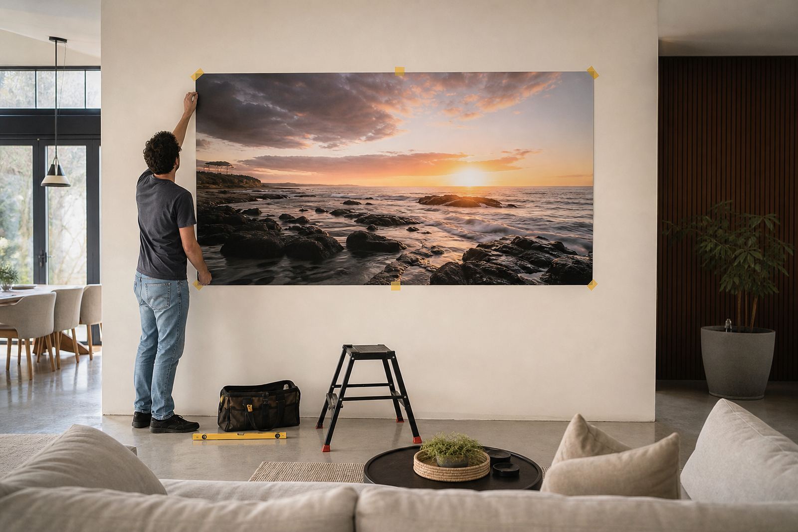
Spacing should always be decided with the full wall area in mind, not just the panels themselves. A common mistake is to size the artwork first and leave the gaps as an afterthought. The result can feel too narrow for a large wall or too spread out for a compact one.
- Measure the full wall width and height before choosing panel sizes.
- Leave enough outer margin so the set does not push into corners, skirtings or light switches.
- Keep panel edges level with one another, especially on long horizontal sets.
- Use the same gap across the whole set unless the composition clearly asks for a change.
For example, a three panel landscape for a Pretoria reception area may need a more open layout than the same artwork in a passage in Midrand. The wall size, viewing distance and furniture below the artwork all affect the final spacing.
Local example: a Johannesburg skyline over a reception counter
A business in Johannesburg may want a triptych above a reception counter, with the skyline moving across all three panels. If the panels are too close, the image can feel cramped and the eye has no pause between sections. If the panels are too far apart, the skyline loses its continuity and the set starts to look like three separate pictures.
A better result is usually a measured gap that matches the width of the counter below. The centre panel carries the main point of interest, while the side panels hold the building lines or colour blocks. This kind of layout works especially well in offices where clients stand for a moment, then move on. It feels orderly and gives the wall a clear point of focus.
Mounting, alignment and the practical side of delivery
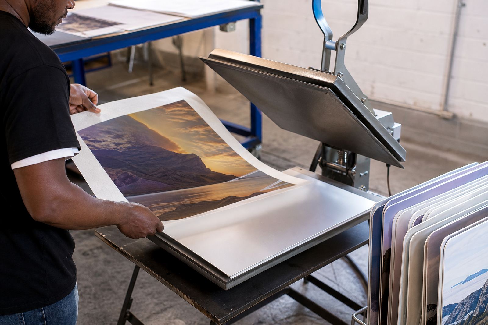
Multi panel sets only look right when the mounting is consistent. Each panel needs to sit at the same depth from the wall, with hardware placed in a way that keeps the faces level. If one panel tilts even slightly, the gap can appear uneven and the whole set looks off. Packing matters too, because aluminium panels can shift if they are not secured properly for delivery to Cape Town, Durban, Gqeberha or elsewhere in South Africa.
- Confirm the hanging points before final production.
- Check that the wall can support the combined weight of the set.
- Allow for slight wall irregularities, especially on older plastered surfaces.
- Keep installation marks hidden behind the panels where possible.
We also remind customers that they must own the images they send or have the rights to use them. That applies whether the panels are for a family home, a gallery wall, or a business display. If a file needs colour preparation, crop planning or reprint matching, it is best handled before the final mount is made.
Spacing that suits the room, not just the artwork
The best spacing is the one that suits the room. A living room may call for a softer, more open arrangement, while a corporate wall often benefits from tighter control and cleaner lines. In both cases, the wall should feel considered, not overcrowded. The set should also allow for natural light, furniture, and walking space around the display.
At SubAlu in Randburg, multi panel spacing is planned with the image, the finish and the wall size together. That makes it easier to choose between gloss, matte, white or brushed aluminium and to decide whether the set needs custom sizing, test panels or a specific mounting option. When those details are matched properly, the finished panels sit neatly and the image carries the room without shouting for attention.