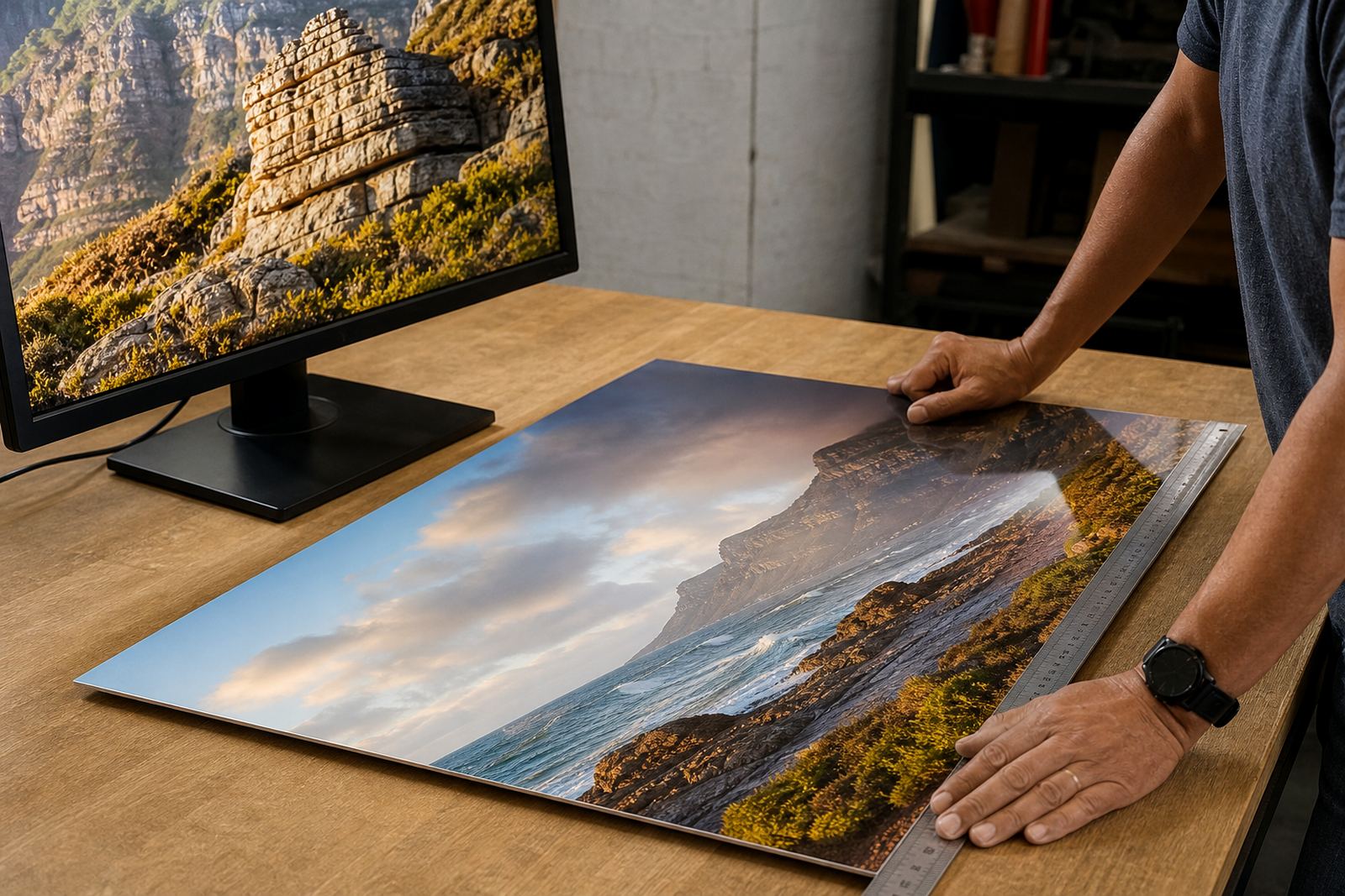

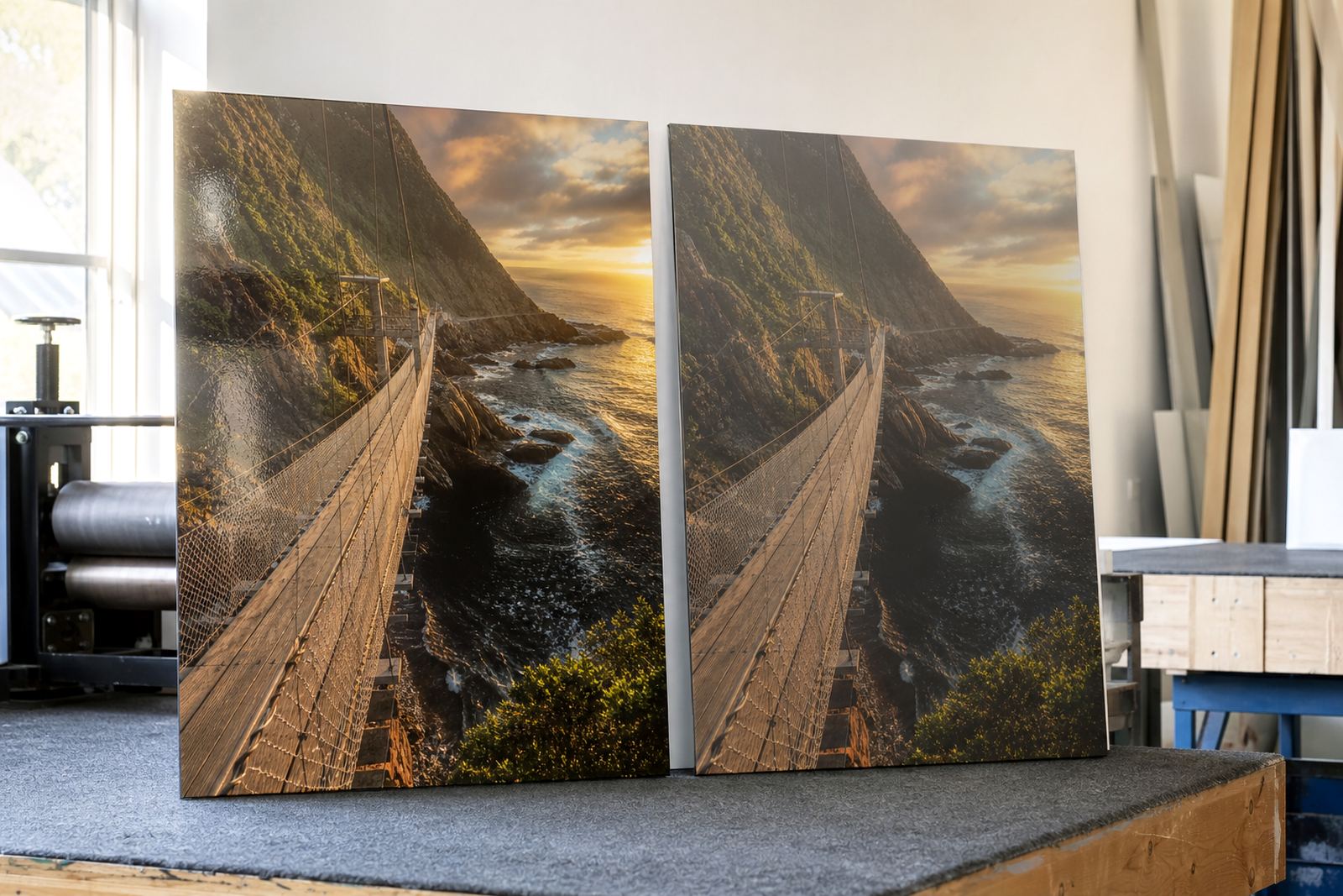
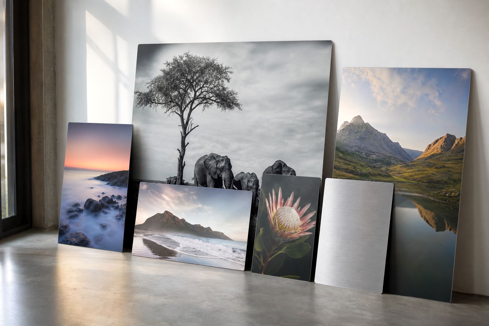
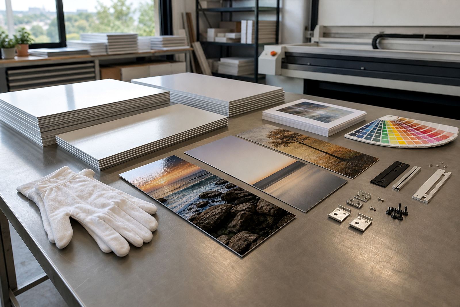
When light hits the panel first
Gloss gives a stronger shine and deeper looking colour, which can suit bold landscapes, city scenes and highly saturated artwork. On a coated aluminium panel the dye sublimation process bonds the image into the surface, so the finish choice is not just about appearance, it also changes how the panel sits in a room with bright windows or overhead lighting.
Matte has a softer look and cuts down reflections. That makes it easier to view from more angles, especially in reception areas, passage walls and lounges where people move around a lot. In Randburg offices with glass fronts or in Cape Town homes that get strong daylight, matte often feels easier on the eye.
- Choose gloss when you want more punch in colour and contrast
- Choose matte when glare is a problem or viewing happens from different angles
- Check the wall light at the actual hanging height, not just near the window
Which finish suits which image style
The image itself should guide the finish. Gloss can give portraits, wildlife frames and marine scenes a sharper edge, with blacks that appear deeper and highlights that stand out. It is useful when the image has clean detail and the subject is meant to command attention.
Matte works well for softer tones, black and white work, fine art photography and images with subtle texture. It can reduce the distraction of reflections on faces, water, glass buildings and pale skies. If the panel is for a corporate boardroom in Sandton or Pretoria, matte often keeps the look calmer.
- Portraits: gloss for impact, matte for a more restrained finish
- Black and white: matte often gives a steadier tonal read
- Bright colour work: gloss can make reds, blues and greens feel livelier
- Soft art prints: matte keeps detail without a shiny surface
Coastal homes, inland offices and the reflection problem
South Africa’s light changes a lot from place to place. Durban humidity and strong coastal light can make glossy panels feel more reflective during the day, especially in rooms with large windows. In Johannesburg and Pretoria, afternoon sun can fall hard across a wall, so the viewing angle matters just as much as the finish.
For homes with open-plan living, it helps to stand where people will usually view the piece and see how the surface behaves. A gloss panel may still be right if the wall is shaded or if the image needs extra depth. Matte is usually the safer pick where glare would spoil the view.
- Coastal rooms: matte is often easier where daylight is strong
- Office corridors: gloss can work if the wall is not directly facing windows
- Reception areas: test for reflections from lights, glass and polished floors
Colour changes are not only about the image file
With sublimation aluminium, the file quality matters, but the finish also affects how colour is read. Gloss can make colour appear richer because light bounces off the surface, while matte can soften that effect and present a more even appearance. That is useful when the image needs to feel consistent from left to right across a wall.
High resolution files give better edge detail, clearer skin tones and cleaner shadows on both finishes. A well prepared file also helps when crop planning or custom sizing is needed, because the panel edges and any mounting gap must be allowed for before production. If the source image is cropped too tight, a strong gloss finish can draw attention to it.
- Use the highest practical resolution for the size of the panel
- Allow safe borders for mounting and trimming
- Check colour balance before printing, especially on skin tones and dark scenes
Finishes beyond gloss and matte
Gloss and matte are the main choices, but aluminium panels can also be produced with white or brushed surfaces. White gives a clean base for full colour images and works well when the artwork needs a bright, neutral background. Brushed aluminium leaves part of the metallic texture visible, which can suit industrial images, monochrome work or designs that benefit from a silver sheen.
For photographers and artists, the finish should support the image instead of fighting it. A brushed panel can add texture to architecture or machinery shots, while a white panel is often the best all round choice for family images, product displays and branded visuals. The right answer depends on the room, the subject and how close people will stand to it.
- White finish: clean, neutral and versatile
- Brushed finish: metallic texture for selected subjects
- Gloss or matte: best when the main decision is glare versus impact
Hanging it straight the first time
Hanging hardware matters because the finish can change how the panel is noticed. A gloss panel with a slight tilt may catch light in an awkward way, while a matte panel gives a little more forgiveness. For larger panels, the mounting system should keep the print flat against the wall and allow secure fixing to a suitable surface.
In offices, galleries and private homes across Johannesburg, Cape Town, Durban, Pretoria and Gqeberha, the best hanging option depends on panel size, wall type and how often the image may need to be moved. Clean installation helps the finish look intentional rather than uneven.
- Use hardware suited to the panel size and wall surface
- Keep large panels level so reflections stay even
- Allow enough clearance if the wall has skirting or uneven plaster
A practical way to choose for one wall
If you are unsure, start with the room rather than the finish. Ask where the light comes from, how far people stand back, and whether the panel is meant to stand out or sit quietly in the background. For a home in Randburg with afternoon sun on one side of the room, matte may be the better everyday choice. For a reception wall with controlled lighting, gloss can give the image more presence.
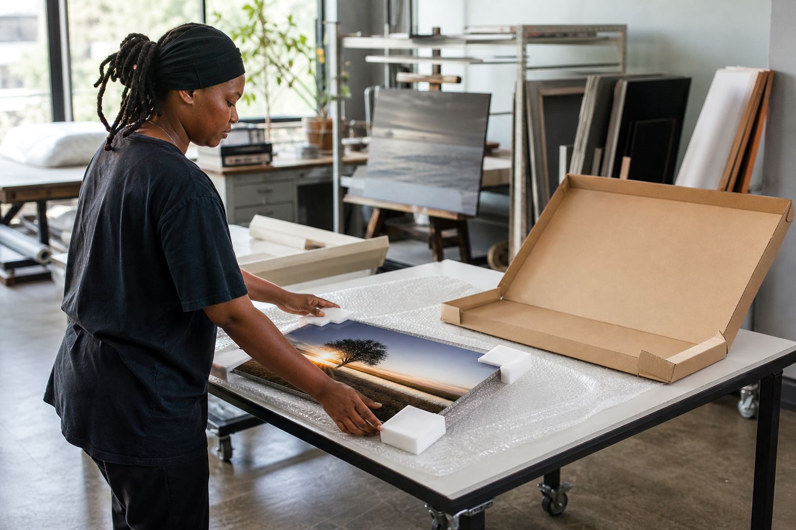
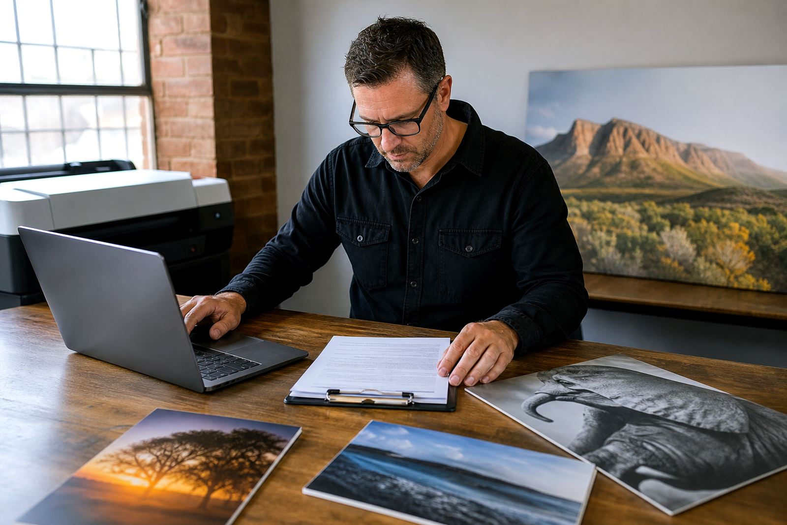
SubAlu handles file checks, resolution review, colour preparation, crop planning, finish selection, test panels, custom sizing, mounting options, multi panel layouts, packing and delivery, plus care advice and reprint matching. That support is useful when you want the finish to suit the image properly first time, not after the panel is already on the wall.