
Why an office wall needs more than a pretty picture
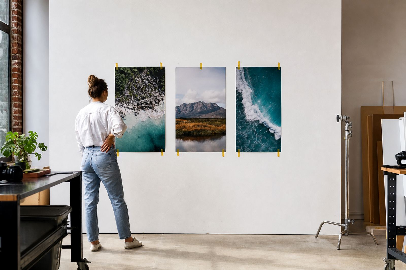
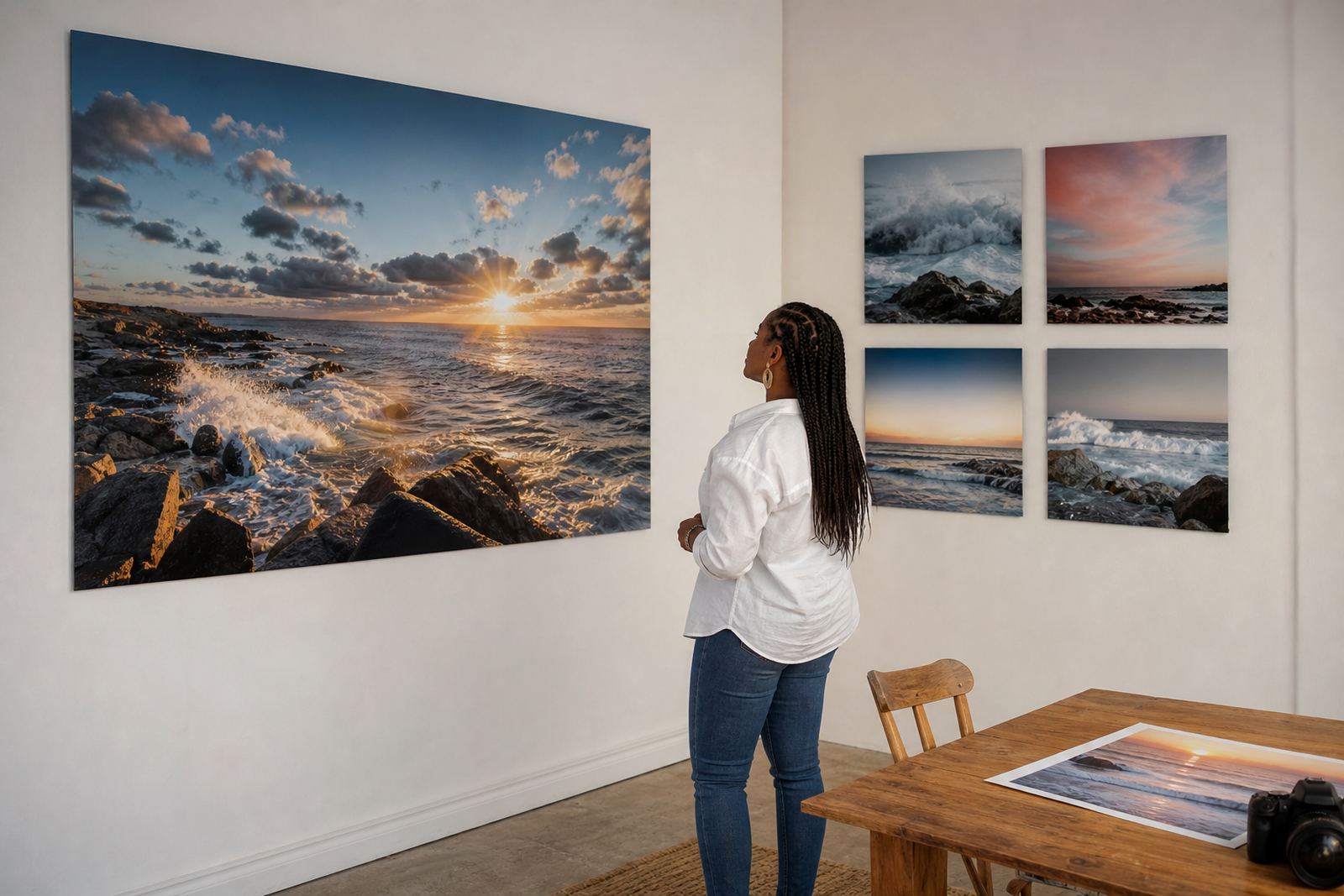
A reception wall, boardroom corridor or client lounge does more than fill a blank space. It speaks for the business before a word is said, so the image on the wall should match the tone of the company, the building and the people using the space. In Johannesburg offices, for example, a legal practice may want controlled, formal imagery, while a property firm in Sandton may prefer bright city views or polished site photography. Both can work, but only when the image use is properly sorted.
That starts with rights. If the image is not owned by the business, or licensed for that exact use, it can create trouble later. A staff photo from a launch, a contractor image from a supplier, or a picture found online all need permission before they go onto a panel. It is not only about copyright, it is about avoiding awkward calls after the job is already hanging.
The rights check that saves a headache later
Before a panel is printed, the client should be able to confirm that they own the image or have written permission to use it. That matters whether the panel is going into a lobby in Pretoria, a clinic in Durban, or a corporate office in Cape Town. The same rule applies to staff portraits, product shots, building exteriors and event images.
Clear rights also help when images need to be reused across several branches. A multi-site business may want one campaign image in Midrand, another in Gqeberha, and a consistent brand set in Randburg. If the rights are not sorted, one branch may have permission while another does not. That creates delays and, frankly, unnecessary admin.
- Keep the original source file where possible.
- Keep written permission for any third-party image.
- Check whether the image can be used in one branch or across all branches.
- Confirm whether the use is for internal display, customer-facing areas, or both.
Finish choice changes how a business image reads
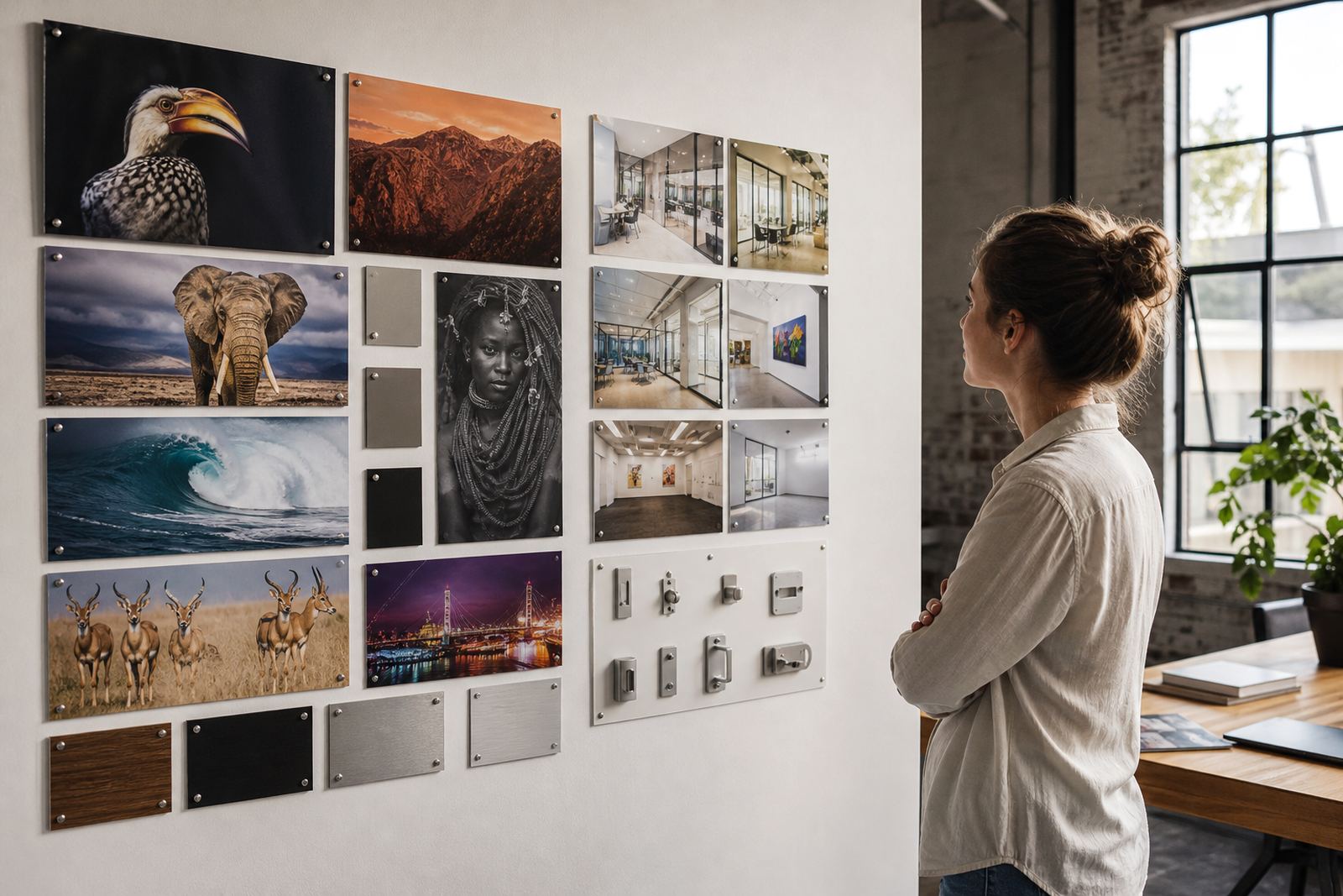
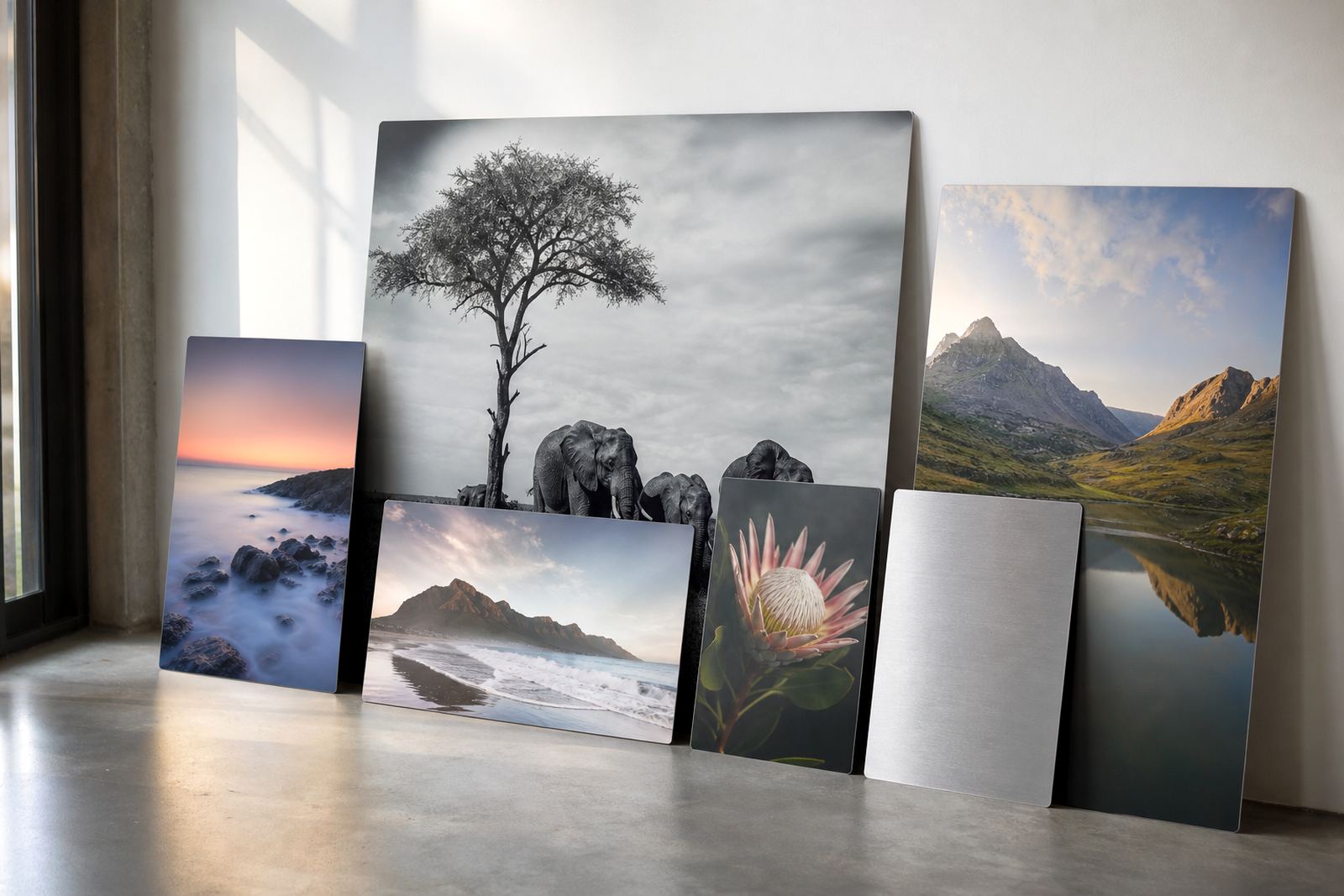
Coated aluminium panels respond differently depending on the finish. Gloss gives strong colour and a bright surface, which suits bold product imagery and high-contrast photography. Matte softens reflection and is useful in rooms with strong strip lighting, glass walls or afternoon sun. White panels give a clean base for detailed images, while brushed aluminium lets the metal grain show through in certain areas, which can work well for industrial, architectural or monochrome work.
The finish should match the space, not just the image. A conference room with daylight from the side may not suit a glossy panel because glare can be distracting. A retail fitting room or gallery wall may benefit from matte because viewers stand close. In coastal areas like Durban, a well-sealed, coated panel also holds up better where humidity is a factor, but the wall position and airflow still matter.
- Gloss for vivid colour and high impact.
- Matte for controlled viewing and lower glare.
- White for crisp detail and cleaner print appearance.
- Brushed for a metal-forward look with visible texture.
File preparation for sharp panels, not soft surprises
A panel can only print as well as the file supplied. Low-resolution pictures that look fine on a phone often fall apart at larger sizes. For business use, it helps to work from the highest quality file available, with good sharpness, proper cropping and a clean colour profile. A print that will hang in a boardroom should not arrive with pixel softness around faces or logos.
We also check crop planning so important details do not land too close to the edge. That matters with floating mounts, wrapped edges or multi panel layouts. It is also wise to review colour balance before print, because a warm office light can make an image look different once it is on the wall. Minor adjustments on screen can prevent a costly reprint later.
- Use the highest resolution file you have access to.
- Leave enough image area for trimming or edge wrap where needed.
- Check logos, faces and text for edge placement.
- Approve a test panel if the image is critical to the brand tone.
Brand tone across branches, from Randburg to Gqeberha
Businesses with more than one location often need image consistency more than variety. A law firm, medical group or property company may want the same visual language in Johannesburg, Pretoria and Cape Town, even if the wall sizes differ. That is where custom sizing and reprint matching matter. The image can be resized for each wall while keeping the same colour feel, crop logic and finish selection.
For one Randburg client, a simple interior upgrade worked because the image set was planned as a group rather than one print at a time. Reception had a strong city image, meeting rooms used calmer architectural panels and the passage carried a repeated colour family. The result was not flashy, just orderly and professional. That kind of consistency is hard to fake if each branch orders on its own without a shared image plan.
Hanging hardware and care that make the wall stay tidy
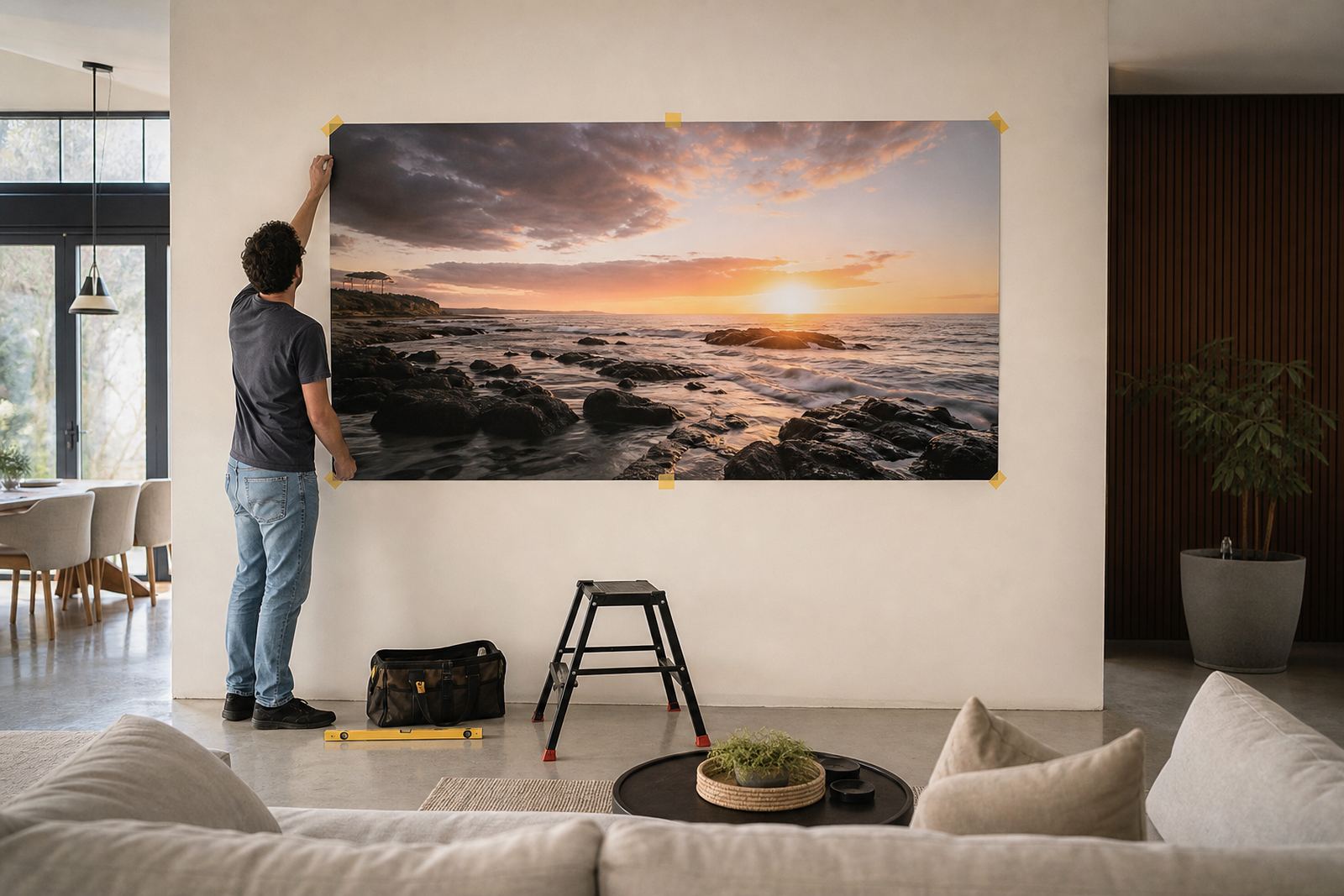
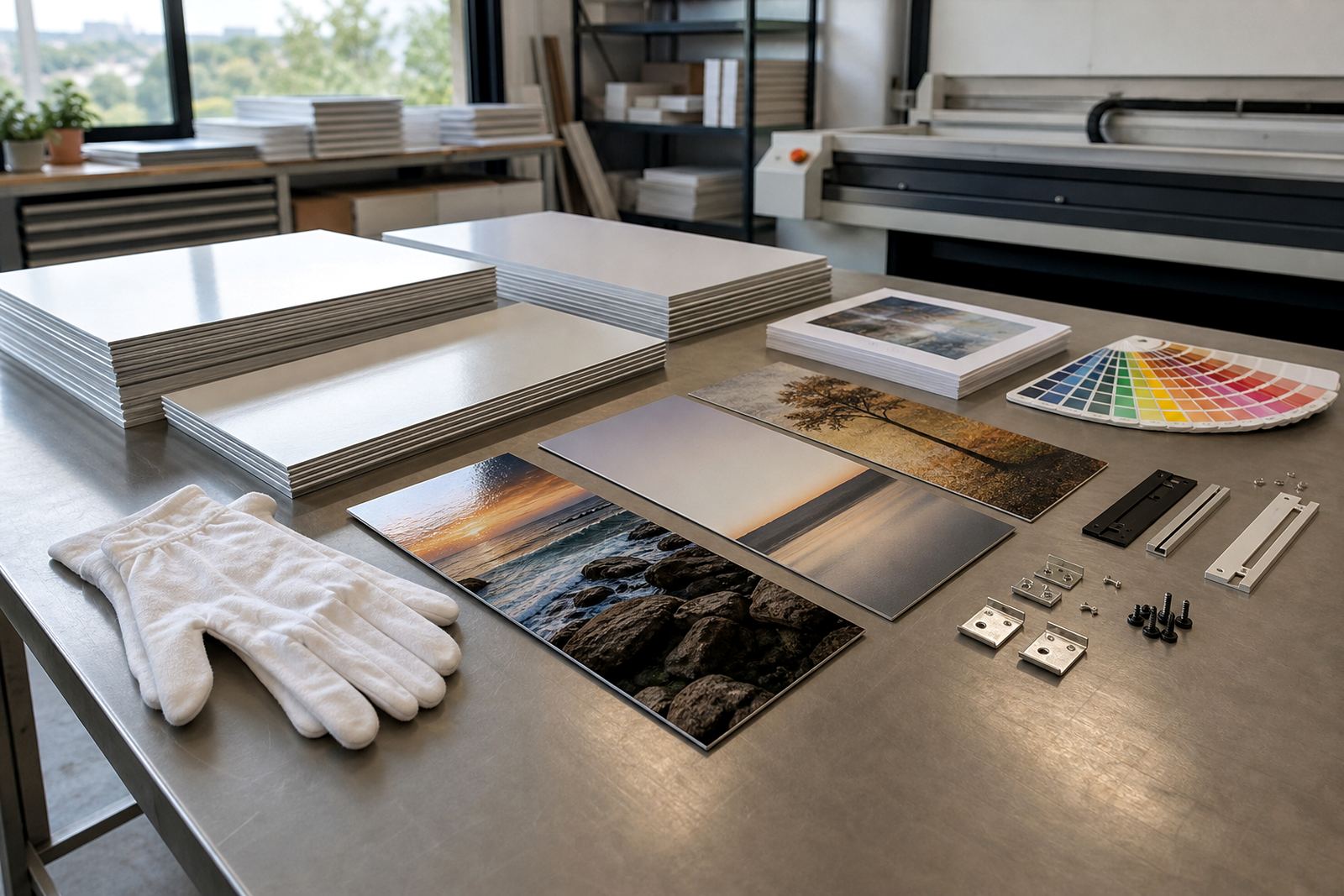
The panel itself is only half the job. Hanging hardware should suit the size, weight and wall type, whether that is drywall in an office park or a solid masonry wall in a retail unit. Generic mounting options can include hidden stand-offs, aluminium rails or secure brackets, depending on the finish and layout. A wide panel in a corridor needs different support from a small feature piece near a front counter.
Clean edges and correct packing also matter during delivery. A panel that arrives with corner damage or a bent hanger is frustrating, especially when a launch date is fixed. Once mounted, care advice should be practical: wipe with a soft dry cloth, avoid harsh cleaners and keep sharp objects away from the surface.
- Match the hanging method to the wall structure.
- Use spacing that keeps the panel level and secure.
- Keep cleaners gentle and non-abrasive.
- Review the display under the room’s normal lighting before final fixing.
When the image use question comes up in the boardroom
Most image problems are not print problems, they are planning problems. A business that sorts rights, tone, size and finish early spends less time arguing later about why one image looks too shiny or why a second branch cannot use the same file. That is especially true where the same picture may appear in a waiting area, a proposal room and a client-facing entrance all at once. Consistency gives the space a more settled feel.
For clients working with SubAlu in Randburg and across Johannesburg, Cape Town, Durban, Pretoria and Gqeberha, the safest route is to treat every image as part of the brand system. If the file is approved, the rights are clear and the finish suits the room, the panel does its job without fuss. That is the whole point, really: good display, no drama and no last-minute scramble.