
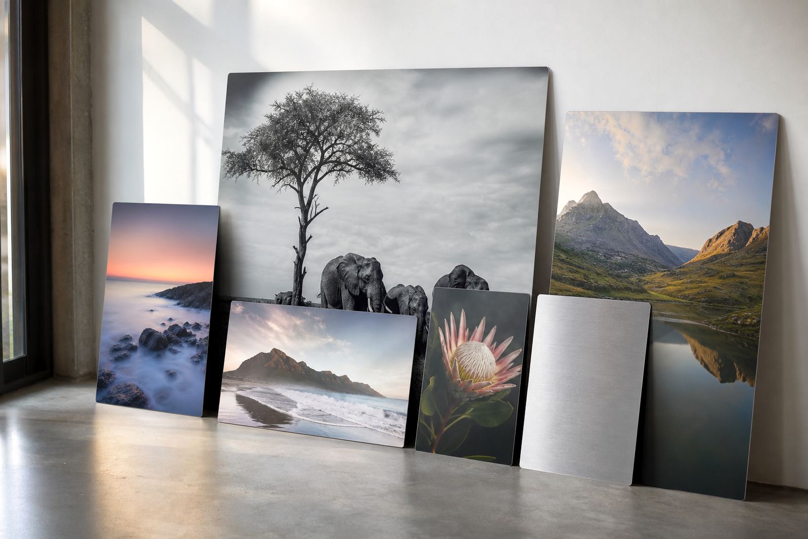
Where the brushed grain does the talking
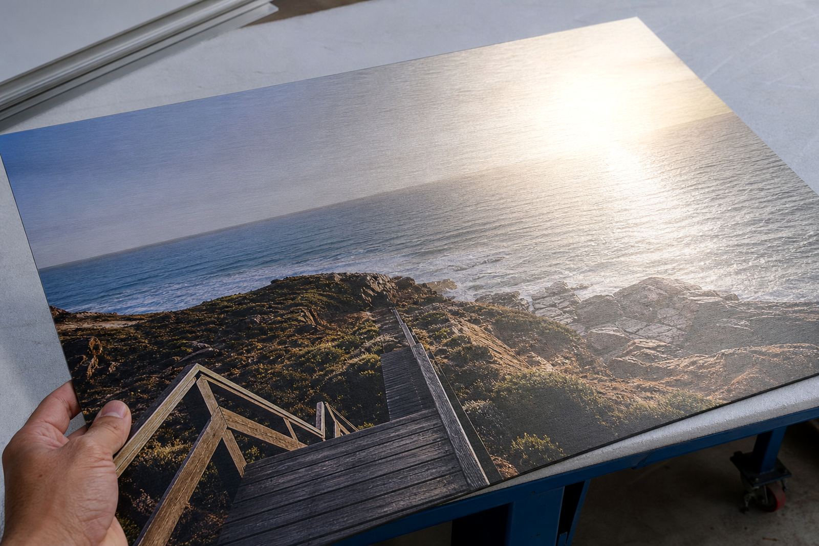
Brushed bases are useful when you want the panel itself to stay visible in parts of the image. On a coated aluminium panel, the dye sublimation process places colour into the coating, not onto a layer of paper or film, so any pale or unprinted areas allow the metal grain to show through. That effect is most noticeable in highlights, white clothing, mist, skies, chrome objects and minimal layouts.
The result is not the same as a standard white panel. White backgrounds stay white, while brushed backgrounds carry a subtle metallic tone. In practical terms, that makes the image feel more industrial or contemporary, especially for black and white portraits, automotive work, architectural shots and product images with strong contrast. It can also work well for logos and typography where parts of the design are left open.
- Best for light backgrounds, highlights and negative space
- Useful when you want the panel to be part of the artwork
- Less suited to images that must look like a pure paper print
What changes once the file meets the panel
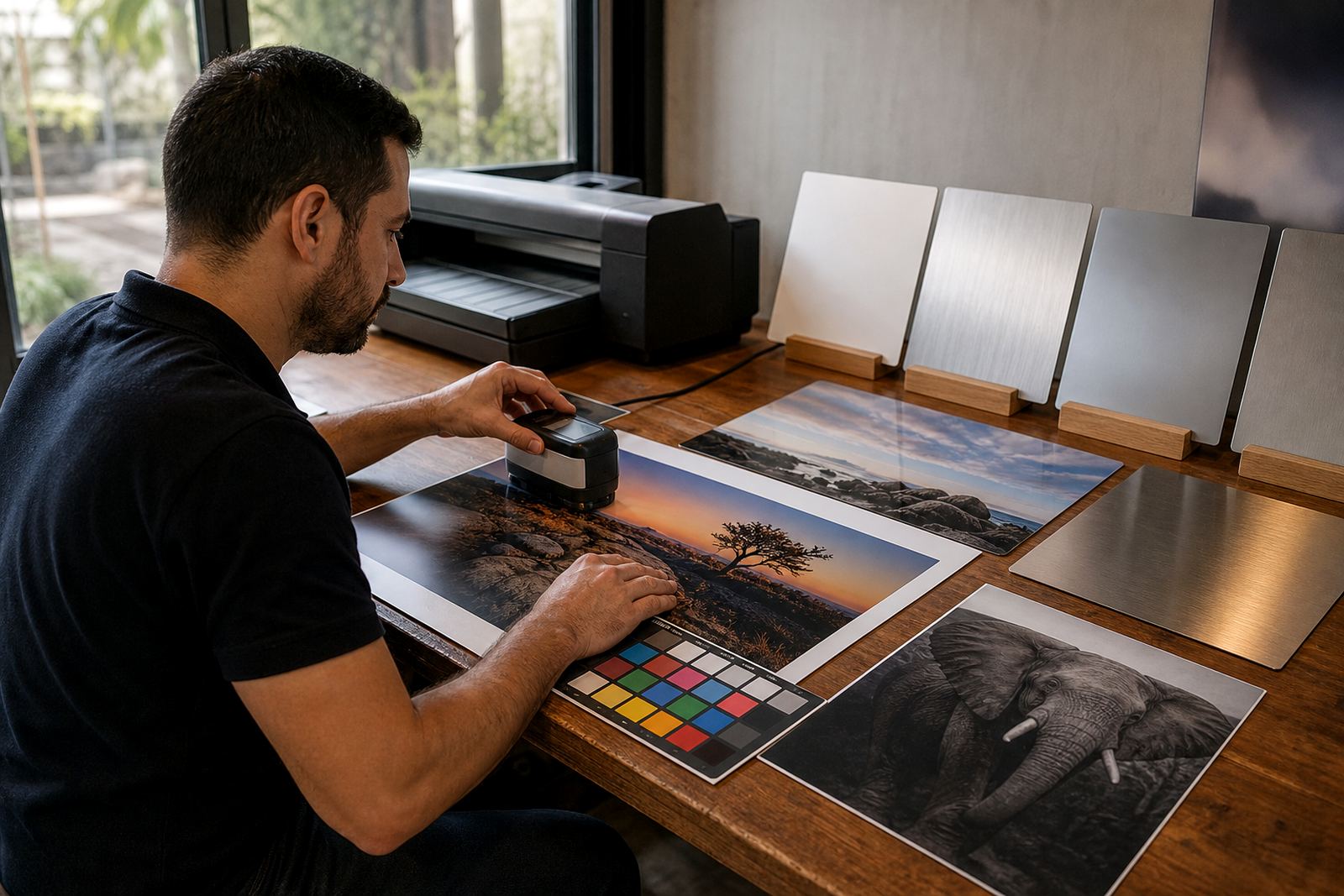
With brushed aluminium, colour handling matters more than many clients expect. The file needs enough resolution for the final size, and the image should be checked for sharpness before printing. If the photo is enlarged too far, the brushed surface can make soft edges and fine textures look uneven. A clean file with the right crop gives a much better result than a heavily edited one that has already been squeezed, stretched or over-sharpened.
Colour preparation is also important because metal shifts tone slightly compared with other print surfaces. Deep blacks can look stronger, while pale greys, skin tones and warm neutrals need careful balancing. If the artwork includes very white areas, those spaces may not print as solid white on brushed base. That is often the point, but it should be planned for before production begins. For photographers in Johannesburg or Cape Town sending work for a wall piece, a short file check can prevent reprints and delays.
- Check image resolution at the finished panel size
- Confirm crop lines before printing starts
- Review skin tones, blacks and pale highlights on a test panel where needed
Choosing gloss, matte, white or brushed without guessing
Finish selection should follow the image, not the other way round. Gloss gives strong colour and a brighter visual pop, which suits saturated travel scenes or bold commercial work. Matte reduces glare and helps with viewing in offices, galleries and homes that get hard afternoon light. White panels give the most familiar print look, while brushed panels create the metallic effect in pale areas and any part of the image that is left unprinted.
If the artwork has a lot of sky, fog, silver objects or black and white contrast, brushed can add a useful texture. If the image is meant to feel soft and natural, white or matte may be the safer choice. In a Durban office with strong sunlight and humidity, matte may be better for day-to-day viewing. In a Randburg boardroom with controlled lighting, brushed can make a product panel or brand image feel more deliberate and technical.
- Gloss for impact and brightness
- Matte for reduced glare
- White for a clean print look
- Brushed for metallic character in pale or unprinted areas
Local walls, local light and why the finish matters
South African spaces change from one town to the next, and the finish should take that into account. A panel hung near a window in Pretoria can pick up a lot of direct light in the morning. In coastal areas such as Gqeberha, humidity and salt in the air also make durable, easy-clean surfaces useful. In offices around Sandton and Midrand, artificial lighting can flatten a print unless the surface has enough character to hold attention.
Brushed aluminium works well where the room itself is part of the display. The grain catches light differently through the day, so the image can shift slightly as people move past it. That can be a strength for reception areas, studios and meeting rooms. It is less forgiving on files with weak contrast or poor tonal separation, so the image should be prepared with care. A practical example would be a black and white cityscape for a Cape Town law office, where the brushed surface gives the skyscraper edges and bright sky a sharper, more modern feel.
Mounting that holds the panel flat and presentable
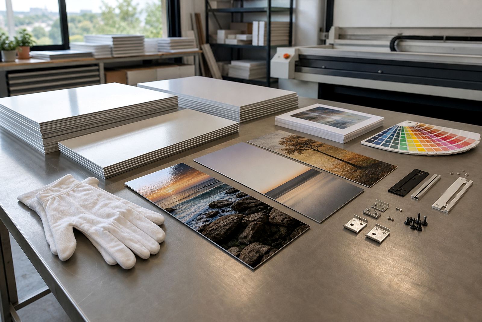
Once a brushed panel has been printed, the mounting method matters nearly as much as the image. Clean hanging hardware keeps the panel level, improves safety, and gives the work a neat edge off the wall. In offices, schools, galleries and retail spaces, the fixings should suit the wall type and the panel size. Larger panels need more careful support so they do not bow or pull unevenly over time.
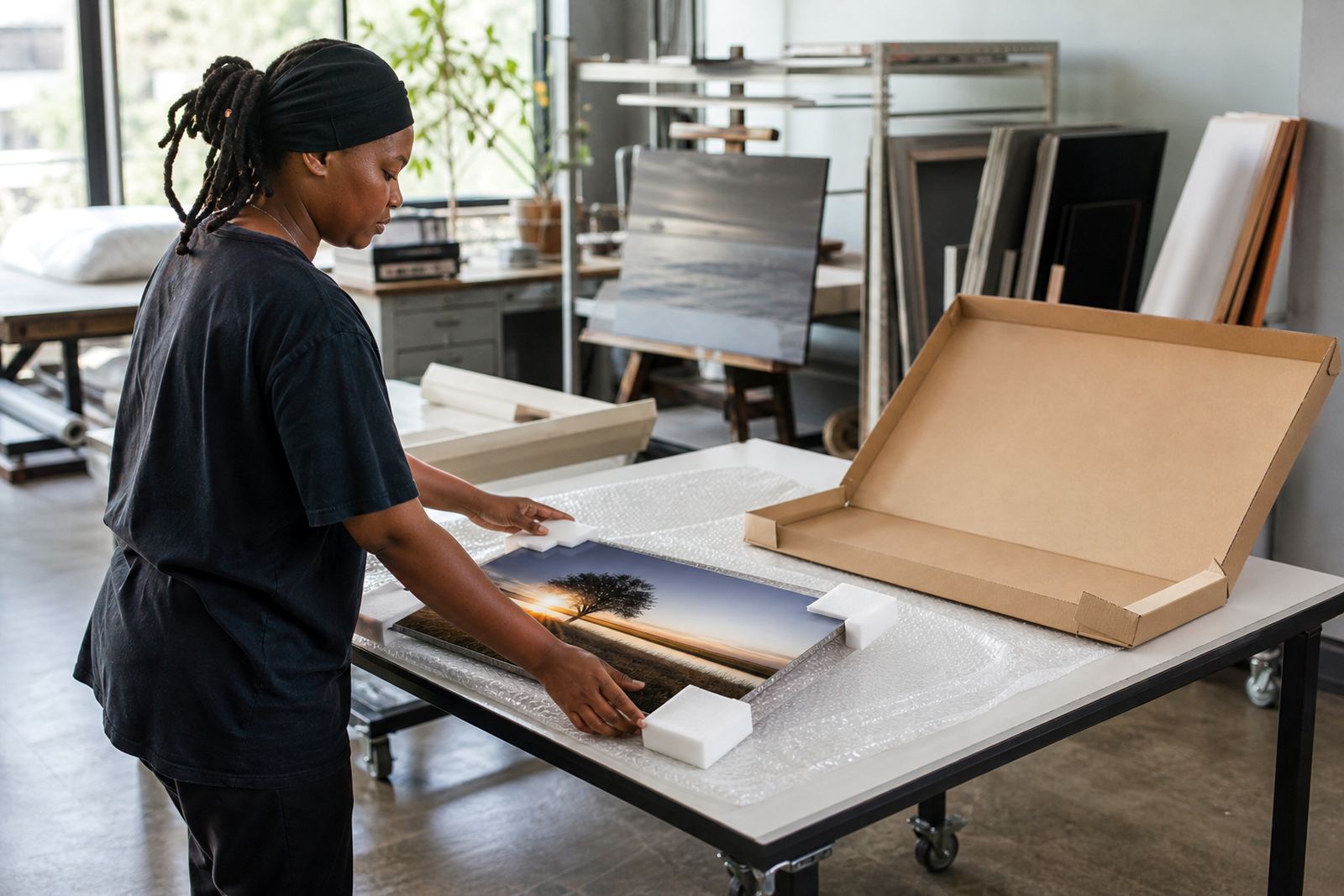
For clients across Johannesburg, Durban, Pretoria and Cape Town, packing and delivery should also protect the corners and surface from knocks. Aluminium holds up well, but a dent or scratch can show more clearly on brushed finishes because the grain reflects light. When the work is for a shop front, boardroom or hospitality space, it helps to decide on hanging hardware at the same time as the finish, size and layout. That way the panel arrives ready for the wall, not with a last-minute search for suitable fittings.
- Use hanging hardware matched to panel size and wall type
- Protect corners during packing and delivery
- Keep the back fixing aligned for a level finish
The file handover that saves a second print
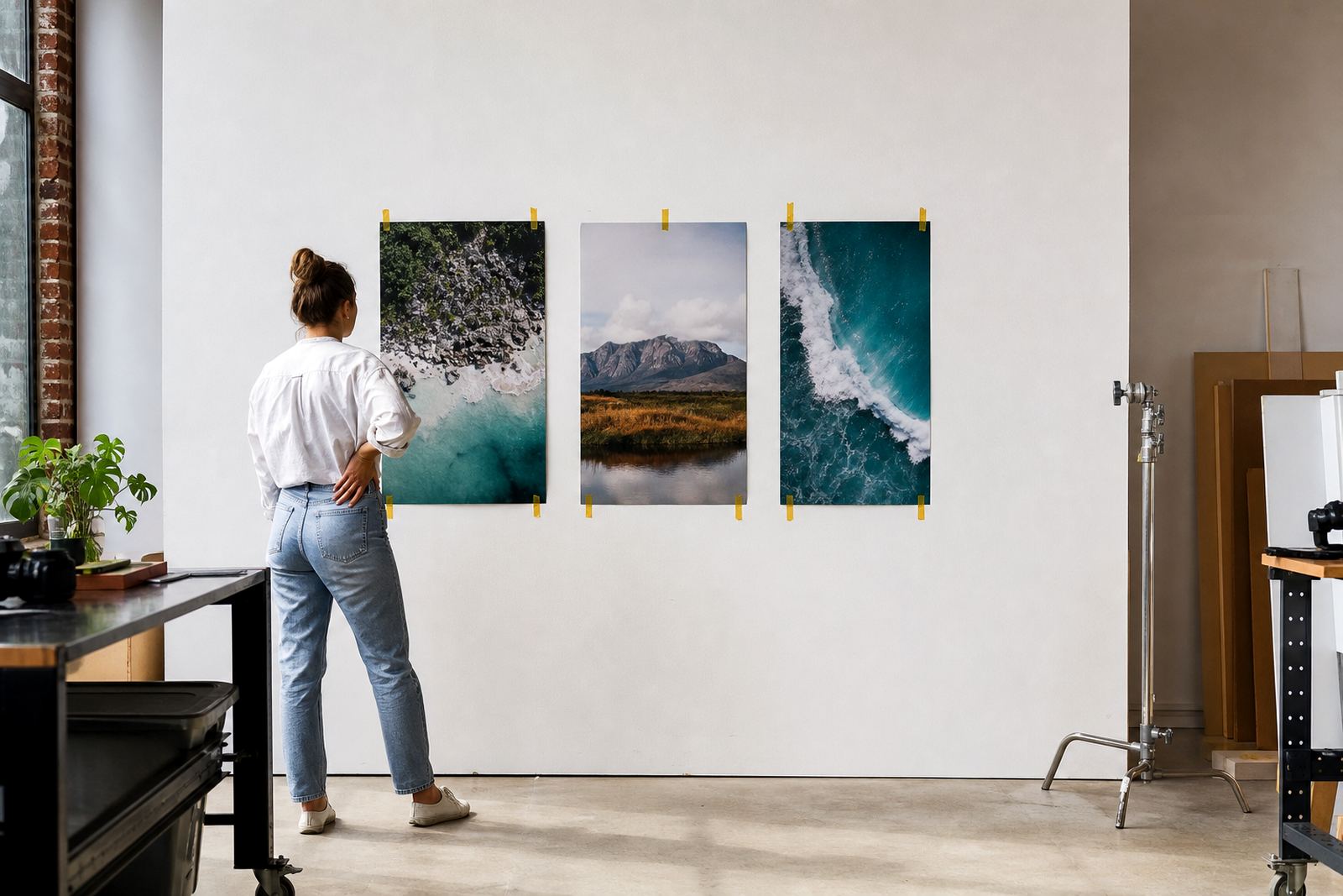
Customers should own the images they send or have permission to use them. That is especially important for commercial pieces, team portraits, brand imagery and exhibition work. Once the rights are clear, the next step is to review the file for resolution, crop, finish choice and any areas where brushed metal may change the look. A short test panel can help if the final work is large or the image uses pale tones that need careful handling.
For reprints, the aim is to match the earlier result as closely as possible. That means keeping the same file version, finish, size and mounting arrangement. If a panel is being sent to an office in Randburg or a client space in Sandton, the safest path is to confirm the details before production begins. It saves time, cuts waste and makes delivery smoother.
Brushed metal is not a trick finish. Used well, it gives pale areas a metallic tone that can sharpen the whole composition. Used badly, it can make an image feel unfinished. The difference usually comes down to file quality, planning and choosing the right surface for the story the photograph needs to tell.