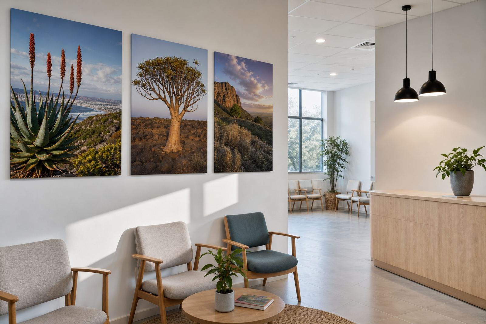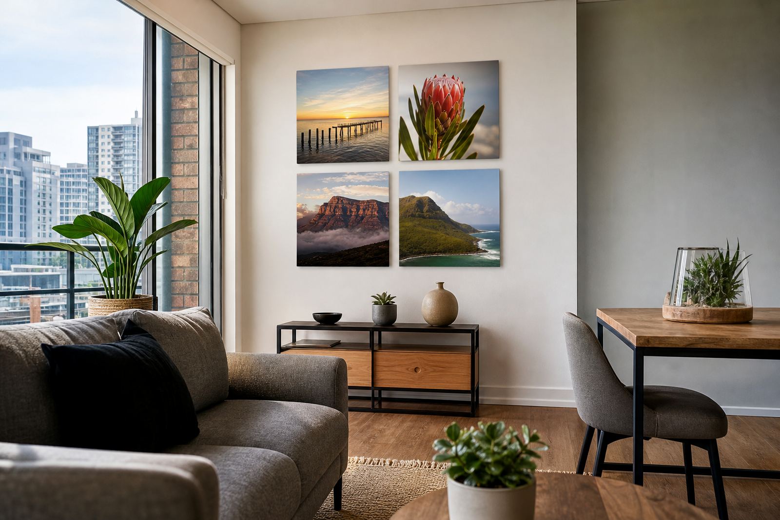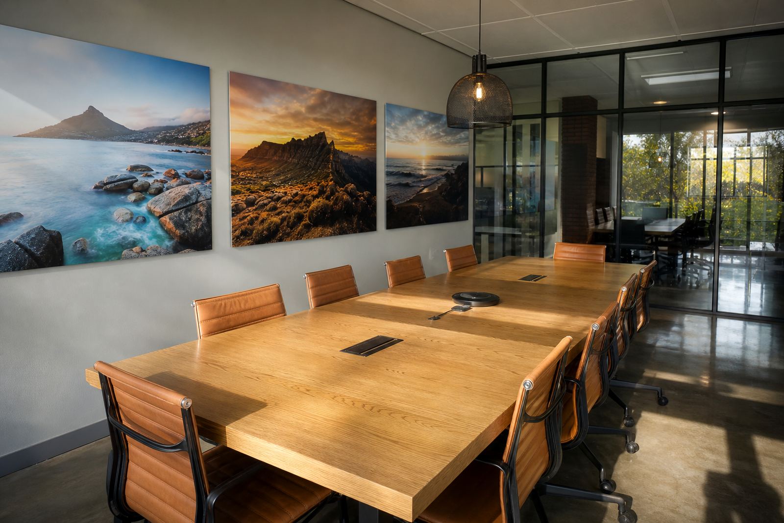

A coastal wall that had to hold its colour
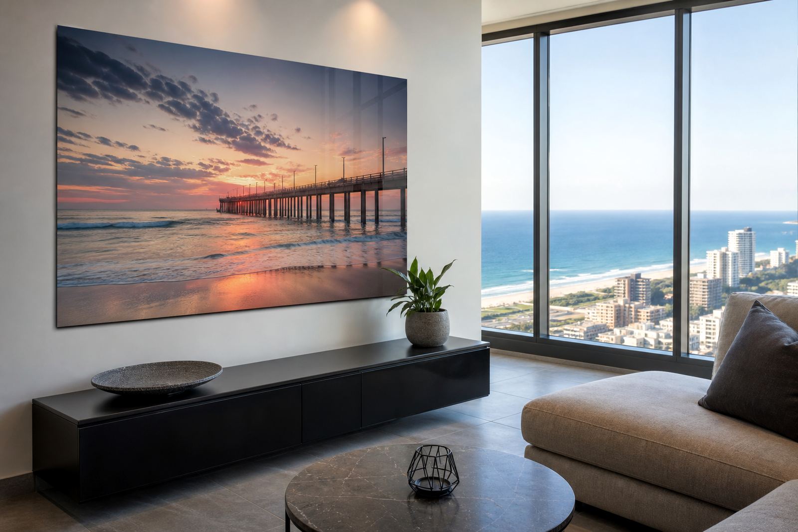
The client was a private apartment owner in Durban looking for a striking wall set for the main living space facing the sea. The images were panoramic coastal scenes taken on a high-resolution camera, with long horizons, pale surf, and evening light that could easily lose detail if the file work was not handled properly. The goal was to keep the prints crisp from normal viewing distance and give the room a polished finish without making it feel busy.
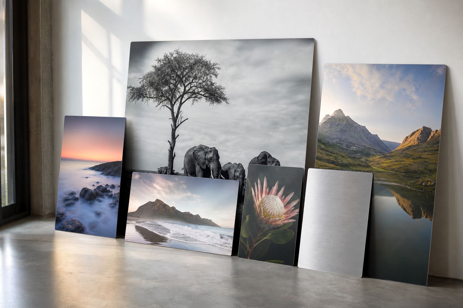
The apartment had a lot of natural light during the day, plus reflective surfaces in the room, so the choice of substrate and finish mattered. Gloss aluminium was selected because it gives colour depth and a glass-like sheen, which suited the water, sky and shoreline tones. The client wanted the panels to sit neatly in a modern interior, and also needed something that could handle humidity from the coast with less concern than paper or standard framed prints.
- Project type: private apartment wall set
- Location: Durban seafront apartment
- Visual style: panoramic coastal photography
- Finish chosen: gloss aluminium for deep colour and reflective impact
The file work before any panel was printed
Before printing, we reviewed the image files for resolution, crop balance and tonal range. Panoramic work can look impressive, but if the file is stretched too far across a large panel the sky banding or soft edges become obvious. The files were checked for usable pixel dimensions, horizon alignment, and safe trim areas so that no important detail would disappear at the edges once the panel sizes were finalised.
Because the apartment wall required more than one panel, we also planned the spacing and visual flow between each piece. That meant checking where the break points would fall across sea lines, buildings and movement in the surf. A little extra care here makes a big difference once the panels are on the wall, especially in a room where people will see the work from different angles through the day.
- Resolution review for large-format printing
- Crop planning for a multi panel layout
- Colour preparation for coastal blues and warm sunset tones
- Test layout checked for horizon continuity and panel spacing
Why gloss aluminium worked in that room
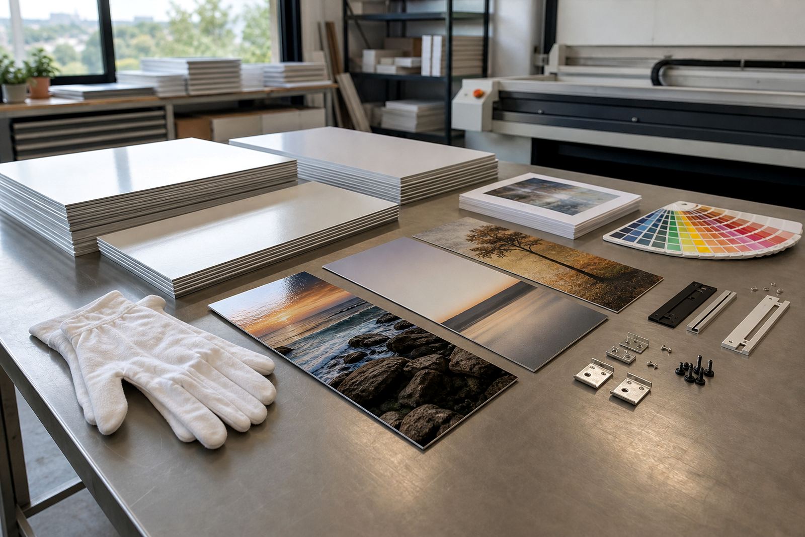
We supplied dye sublimation prints on coated aluminium panels, using a gloss finish to bring out contrast and rich colour. With this method, the artwork is transferred into the coating itself, rather than sitting on top like a surface print. That gives a clean, permanent appearance and it suits images with fine texture, water detail and bright light. The reflective nature of gloss did mean we had to think carefully about where the panels would catch the sun, but in this apartment the placement was right.
The finish also helped the coastal colours feel fuller without looking over-processed. The blues held their depth, the foam stayed bright, and the darker sections kept enough density to anchor the set visually. Brushed aluminium was discussed as an alternative, but the client preferred the stronger visual punch of gloss for this particular room. White aluminium would have given a flatter look, which was not what was needed here.
The coating and panel construction were chosen for indoor use with good stability in changing coastal conditions. Durban humidity can be hard on some wall products, so the panel system needed to stay neat and not bow or lift when the weather turns damp. A careful finish matters alot in a place like this, where the windows stay open most days and the sea air is always present.
Sizing, mounting and the wall fit
The panels were made to custom sizes so the set would sit in proportion with the apartment wall and furniture layout. Mounting hardware was supplied generically as a concealed hanging system, allowing the panels to sit flat and appear to float slightly off the wall. That was important because the client wanted a tidy, uncluttered finish with no visible brackets distracting from the pictures.
We also discussed how the set would be installed around existing wall features. The apartment had skirting, electrical points and a glazed opening nearby, so accurate measurements were essential. A small error in spacing would have made the whole arrangement feel off-centre, and in a coastal flat those visual lines matter because the eye is drawn to the view outside as well as the artwork inside.
- Custom sizing matched to the wall proportions
- Concealed hanging hardware supplied for a clean finish
- Panel spacing planned to suit the viewing angle
- Installation kept clear of wall fittings and window lines
From approval to delivery in a tight Durban schedule
The full job ran over two weeks from file receipt to dispatch. The first stage covered image checks and layout planning, followed by colour preparation and sample confirmation. Once the panel sizes were approved, production moved into print and finishing, then mounting hardware was fitted and the set was packed for delivery. Because the work was headed for Durban, packing needed to be firm enough for road transport and handling at the apartment block.
Delivery was arranged for the client’s chosen time window, with care taken to protect panel faces and corners. The panels arrived ready for hanging, and the final result matched the calm but colourful look the brief called for. The reflective gloss finish gave the seafront images a strong presence without making the wall feel heavy, and the apartment gained a clear focal point that works both in daylight and at night under interior lighting.
- Week 1: file review, crop planning and colour preparation
- Week 2: printing, finishing, mounting and packed delivery
- Outcome: crisp coastal imagery with strong depth and a neat wall fit
- Best viewing effect: daytime natural light and warm evening lighting
What worked well
If we were doing the same kind of project again, we would follow the same process: start with file checks, confirm the panel layout early, and choose the finish based on the room light rather than on appearance alone. That approach keeps the final result grounded in the space it will live in, which is important for apartments along the coast where sun, reflection and humidity all play a part.
For clients in Durban, Cape Town, Gqeberha and other coastal towns, we would still lean toward gloss when the brief calls for high colour depth and a polished look. If the room has heavy glare, matte or brushed can be better, but in this apartment gloss was the right fit. The final set held its own against the view outside, and that balance is what made the project work.
Customers should always own the images or hold the rights to use them. Once that is in place, we can help with the technical side: resolution review, colour preparation, finish selection, mounting options and safe delivery across South Africa.
Key facts
| Client type | Private apartment owner |
|---|---|
| Project location | Durban seafront apartment |
| Material | Coated aluminium photo panels |
| Print method | Dye sublimation |
| Finish | Gloss |
| Timeline | 2 weeks from file receipt to delivery |