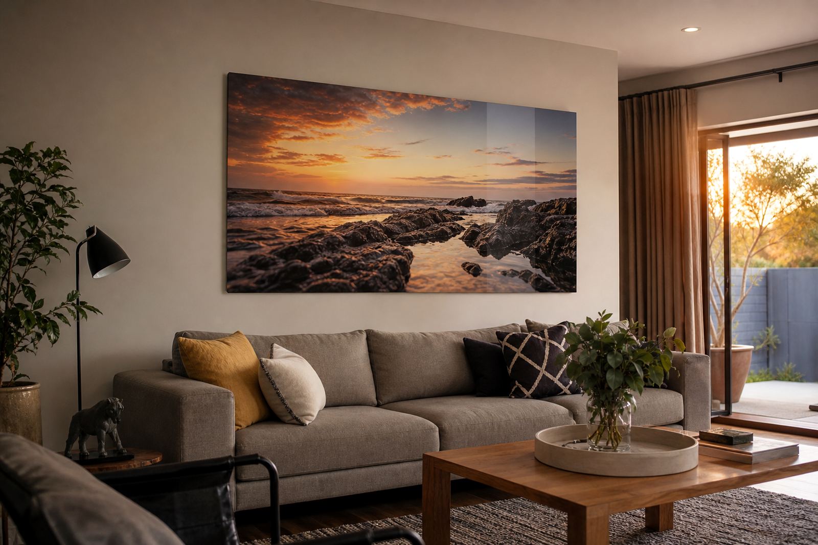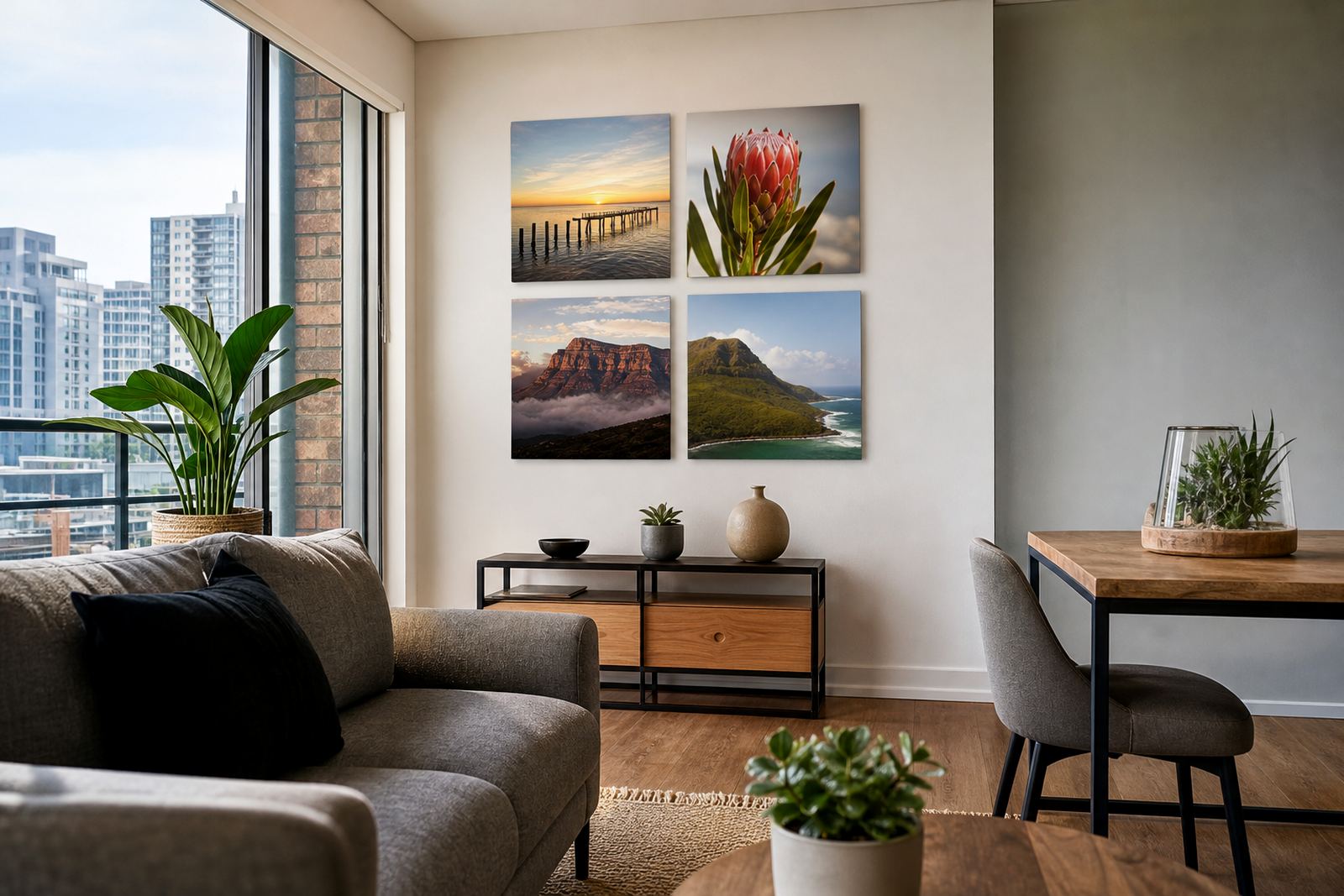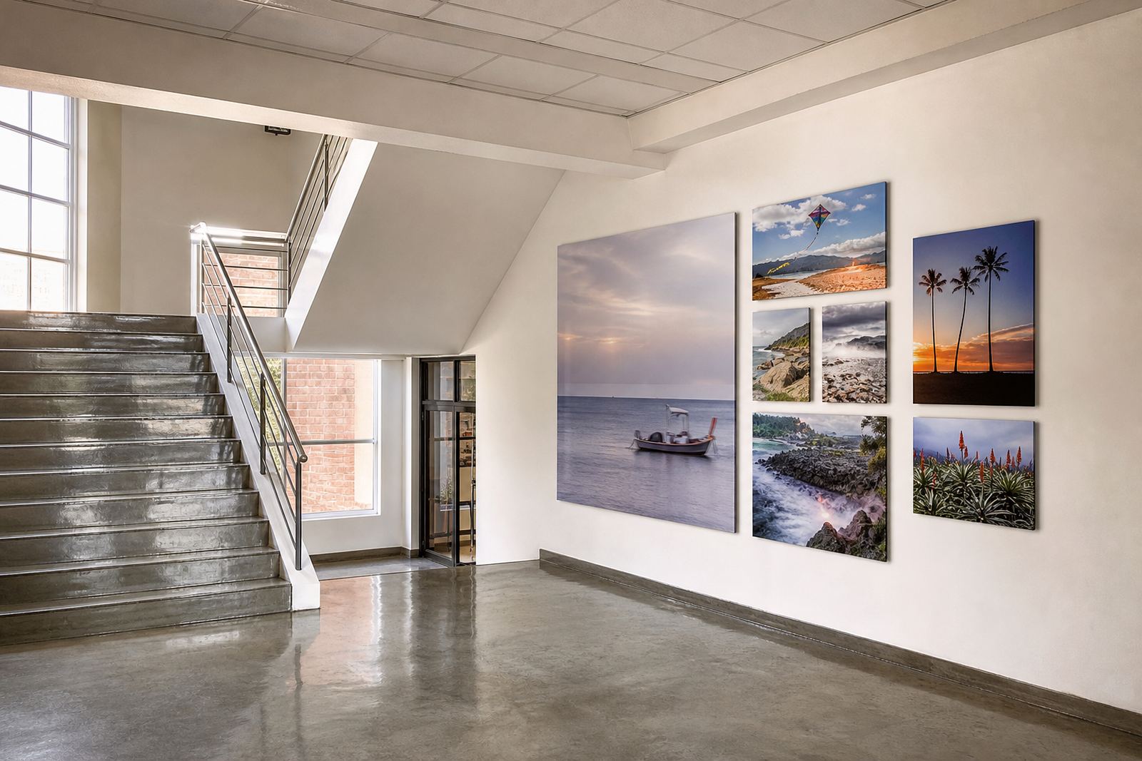

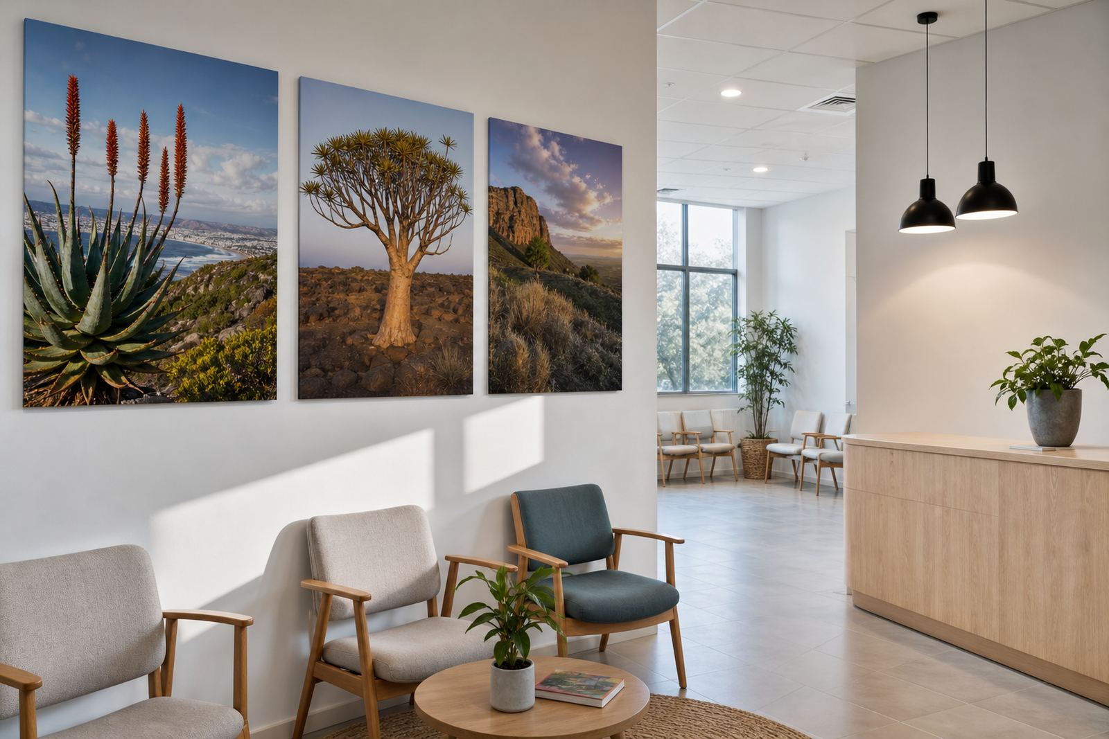
A waiting room needed less shine and more calm
The brief came from a healthcare client in Bedfordview, Johannesburg, where the spaces were already neat and practical but still felt a little hard under overhead lighting. The team wanted nature imagery that could soften the rooms without adding clutter, and the panels had to hold up in a busy setting with regular cleaning and people moving past the walls all day.
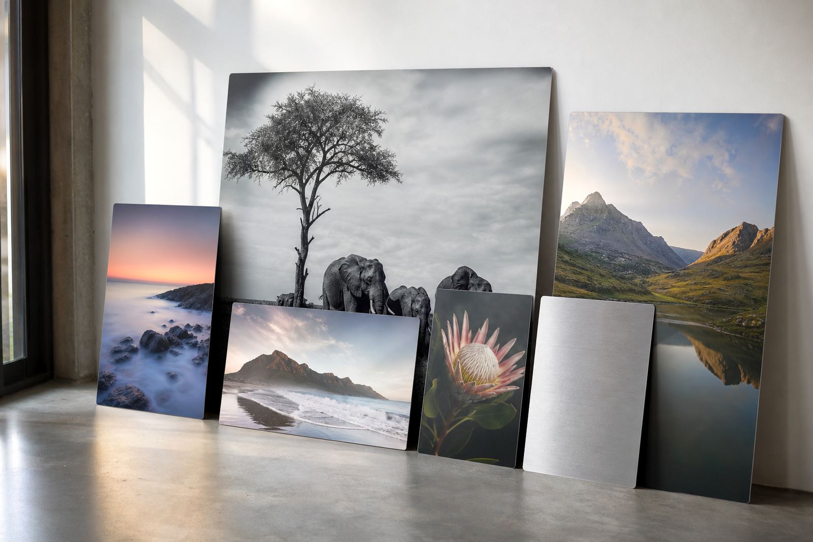
Glare was the first concern. The waiting areas had large windows, bright fittings and reflective surfaces, so glossy wall art would have thrown back too much light. We suggested matte coated aluminium panels because they give a quieter finish and still keep colour depth, which suited the client’s calming images of leaves, water and soft landscape tones.
What had to work in a medical environment
The clinic needed more than attractive pictures. Surfaces had to be wipeable, the edges had to stay neat, and the display could not protrude awkwardly into narrow corridors.
- Low glare for seated viewing under LED and daylight mix
- Durable aluminium substrate for long-term indoor use
- Clean sight lines for reception and passage walls
- Consistent finish across multiple panels
- Hardware suited to secure wall mounting in a public setting
We also checked the image files before production. Customers need to own the images or have the rights to use them, and the supplied artwork had to be suitable for enlargement without showing softness or blocked detail. That file review matters in a clinic, where people notice every colour shift and every weak crop.
How the panels were prepared and finished
For this project we used dye sublimation onto coated aluminium photo panels. The image is transferred into the coating under heat, which bonds the colour into the surface rather than leaving it sitting on top. That gives the panels their crisp detail and helps them cope with cleaning and general handling better than many paper-based prints.
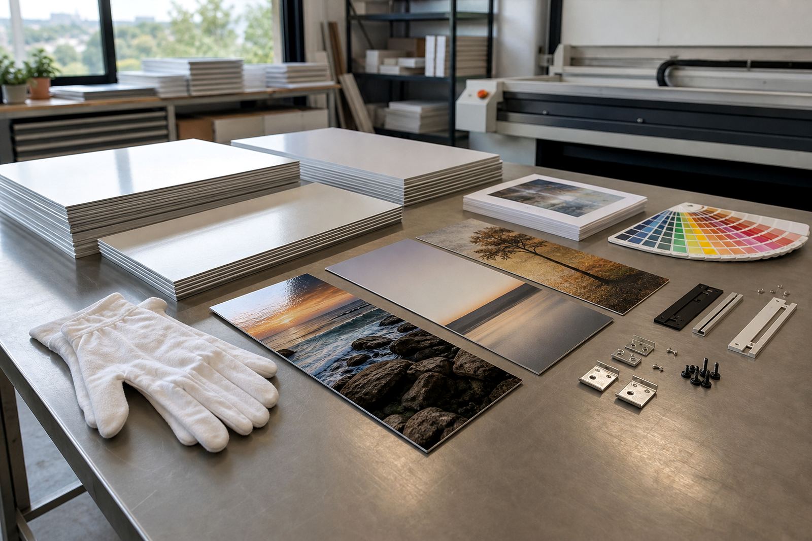
The client chose a matte finish for the main display areas, with white-coated panels for the clearest colour accuracy. In two smaller sections we also produced brushed aluminium samples to check how the texture would read under the room lighting. The matte option was selected for the final install because it reduced reflected glare from the corridor windows and kept the scenes more settled visually.
- Panel size was planned around wall widths and viewing distance
- Image crops were adjusted to suit each format before printing
- Edges were finished cleanly for a professional framed look without an actual frame
- Mounting hardware was supplied generically for secure fixing to the wall
Colour control from file to final panel
The clinic images had a lot of soft greens and pale neutrals, so colour control mattered from the start. Johan handled the prepress checks, looking at resolution, crop safety and tonal balance so the panels would not come out too dark in the shaded parts. Ayesha coordinated the file handover and sign-off, keeping the client informed on timing and any decisions needed on crop placement.
We prepared test panels first so the client could compare the matte surface against a brighter option before committing to the full set. That step helped avoid guesswork and gave the team confidence that the display would sit properly in the space. It also meant the final pieces matched one another, which is important when panels are hung in a row and the eye catches even a small colour change.
Delivery into Bedfordview without disrupting the day
The full job moved through production in just under two weeks, from file checks and test panel approval to finishing, packing and delivery. Nicole handled dispatch planning so the panels could arrive during a quiet window, which helped the clinic avoid disruption at reception and in patient areas.
Because healthcare interiors can be tight and busy, we packed each panel for careful handling and checked the hardware set against the final layout before it left Randburg. On site, the mounting plan allowed the panels to be fixed level and evenly spaced with no unnecessary fuss. The clinic team could see the result quickly, and the wall changed from plain circulation space to something much gentler for visitors.
- Production time: just under 2 weeks
- Delivery area: Bedfordview, Johannesburg
- Finish: matte for reduced glare
- Format: custom-sized panels in a coordinated series
- Use: waiting areas and internal passage walls
Why the result worked so well
The finished display did what the clinic needed. The nature imagery brought warmth into the rooms without making them busy, and the matte surface meant people could read the pictures from different angles without fighting reflections. The panels looked neat, held their colour well, and gave the walls a more thoughtful feel, which is exactly what a patient-facing environment calls for.
If we were repeating this job, we would do the same things again: insist on high-resolution image files, confirm the crop plan early, use matte panels in the brighter rooms and keep the mounting arrangement simple and secure. For a clinic, that balance of clean presentation and practical finish is what makes the display feel right day after day.
Key facts
| Project | Bedfordview Clinic Display |
|---|---|
| Client type | Healthcare interior client in Bedfordview, Johannesburg |
| Product | Dye sublimation aluminium photo panels |
| Finish | Matte, with white and brushed test options reviewed |
| Timeline | Just under 2 weeks from file checks to delivery |
| Service scope | File Checks, Resolution Review, Colour Preparation, Crop Planning, Finish Selection, Test Panels, Custom Sizing, Mounting Options, Packing And Delivery |