
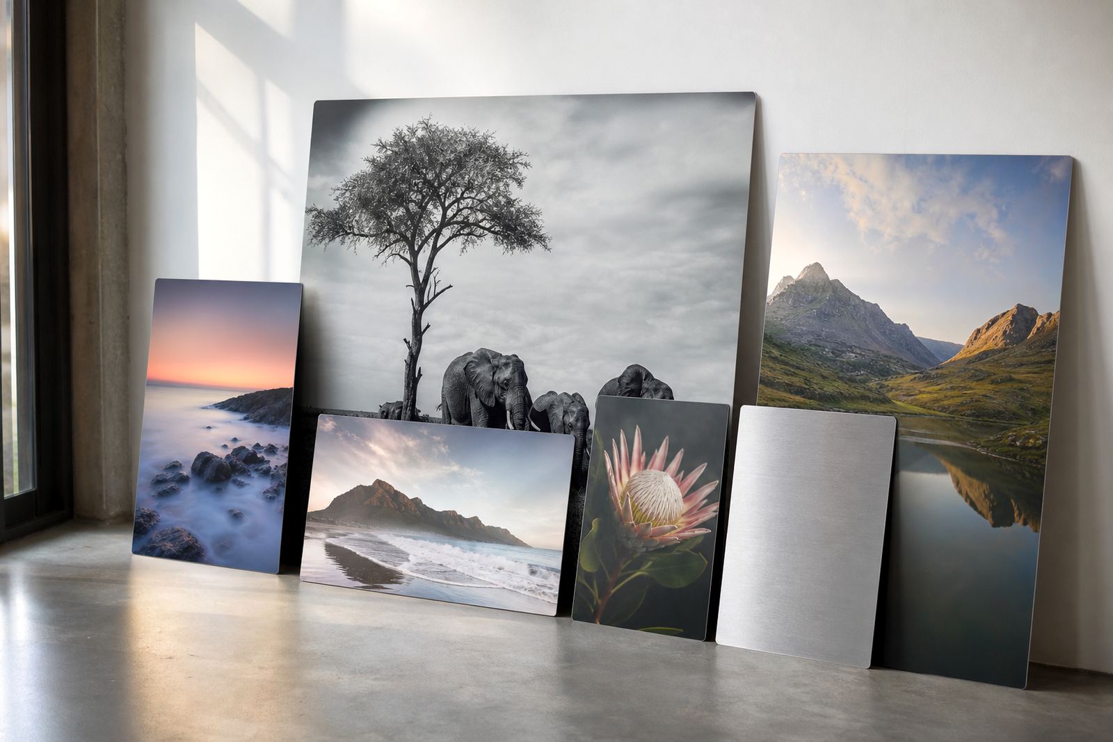
A guesthouse brief with different rooms but one clear visual thread
The owners wanted every room to feel tied together without repeating the same image in each space. The guesthouse sits in Cape Town, where salt air and bright daylight can be tough on printed decor, so the brief leaned toward coated aluminium photo panels rather than paper prints or framed glass. They wanted a polished finish that would hold colour, resist light wear, and sit neatly with the rest of the interior finishes.
We worked from a set of local scenes supplied for the property, including coastal views, street details and softer landscape images that suited the room sizes. The artwork had to feel specific to Cape Town, yet not overpower the rooms. In practice that meant careful crop planning, close colour review and a layout plan for each room so the final result looked intentional across the whole house.
- Client type: guesthouse in Cape Town
- Project scope: coordinated wall art for multiple rooms and common areas
- Finish approach: mixed surface selection to suit different lighting conditions
Why aluminium panels made sense for the building
For hospitality spaces, the material choice matters as much as the image. Dye sublimation onto coated aluminium gives a hard-wearing surface that is easier to maintain than many paper-based products, and it keeps edges neat in high-traffic rooms. In Cape Town, where windows may stay open for fresh air and humidity can shift through the day, that matters. The panels also avoid the heavy look that can come with bulky framing.
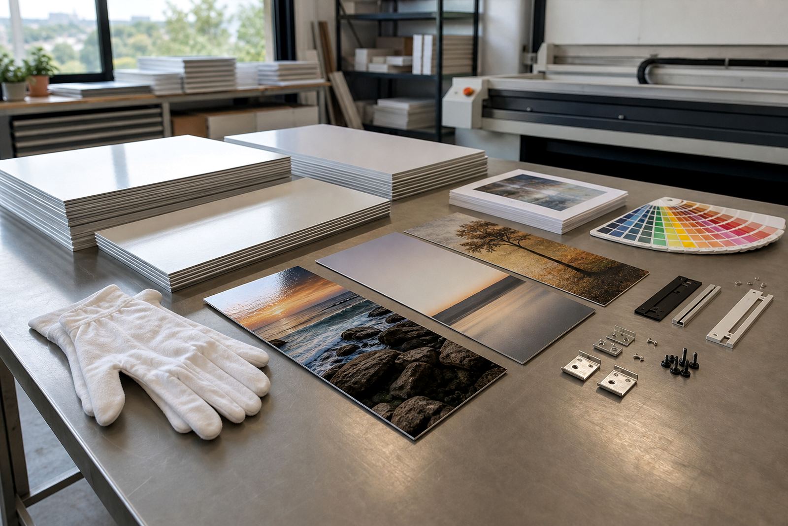
We specified a combination of gloss, matte, white and brushed finishes depending on the image and where it would hang. Gloss worked well for brighter scenes that needed extra punch, while matte was better in rooms with strong natural light. White gave clean colour reproduction for full-colour photographs, and brushed aluminium was used where a more textured, contemporary feel suited the room. The result was practical, tidy and suited to a guesthouse rather than a private gallery.
- Print method: dye sublimation onto coated aluminium
- Surface options: gloss, matte, white and brushed
- Use case: indoor hospitality display with easy upkeep
Getting the files ready before any printing started
The project started with file checks and resolution review. Some images were strong at viewing size but needed crop adjustment for the actual panel dimensions. Others needed colour preparation so shadows did not block up and bright areas stayed balanced after pressing. Because guesthouse rooms often have mixed light from windows and artificial fittings, we checked how each image would read in the space rather than treating every panel the same.
We also confirmed that the client had rights to every image supplied for the job. That is important for any hospitality property, especially when the walls are used in public-facing spaces. Where needed, we adjusted the crop plan to protect key details like horizons, door lines and subject placement. A few test panels were produced before the full run so the guesthouse team could compare sheen and tone against the painted walls and furnishings.
- File checks for image suitability and print safety
- Resolution review for panel sizing
- Test panels for finish and colour confirmation
Room-by-room layout decisions that kept the whole place in step
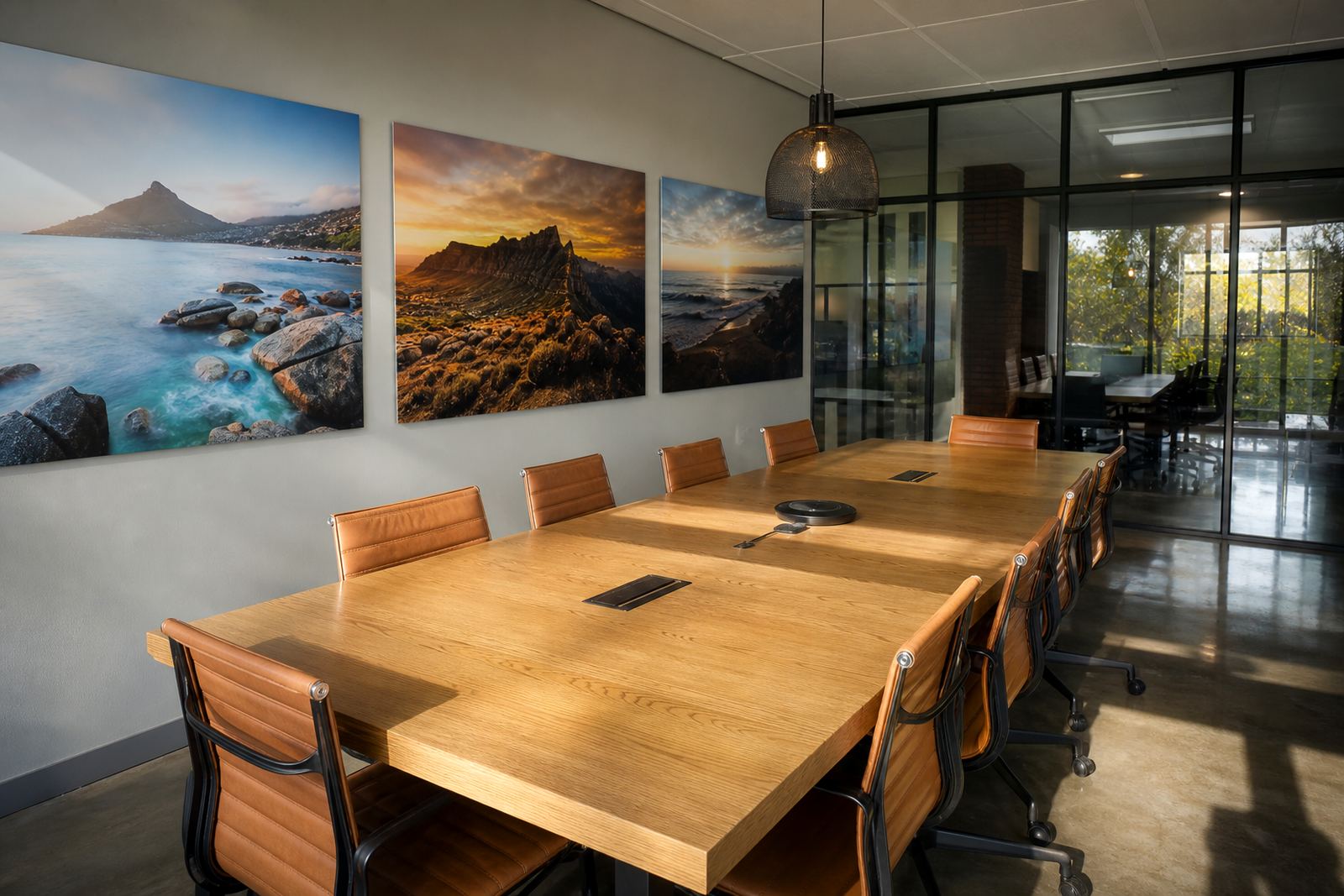
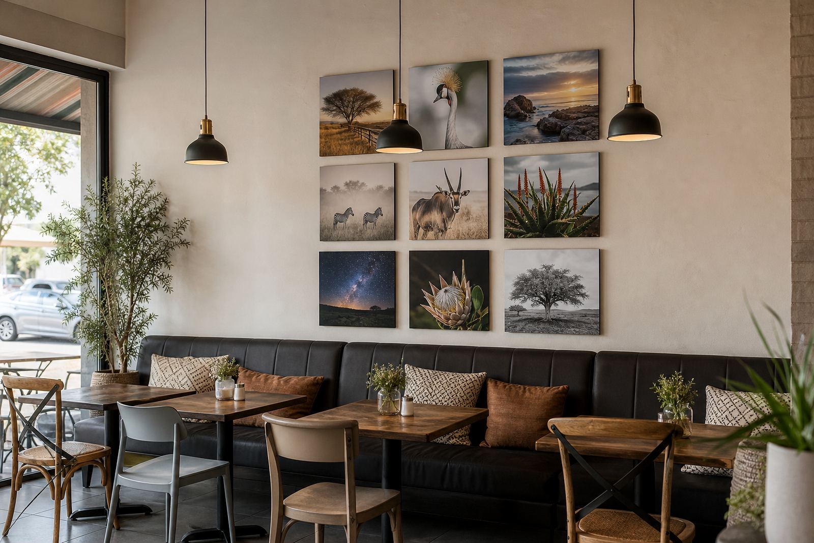
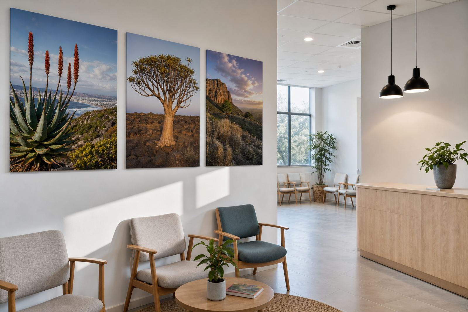
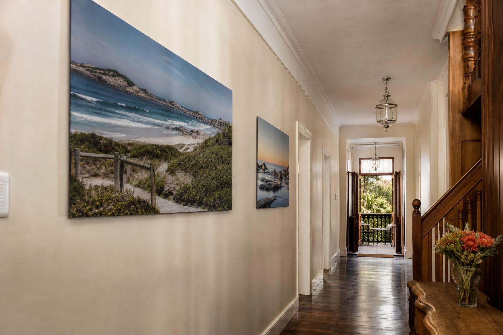
Each room needed its own mood, but the full property still had to feel linked. We created a room-by-room layout plan that matched image tone with wall colour, bedding and daylight levels. Smaller rooms received single feature panels, while larger shared areas were better suited to grouped pieces and multi panel layouts. That helped the guesthouse avoid visual clutter and gave each space its own point of interest.
Mounting options were selected for the wall surface in each area. Some panels were fitted for a flush, low-profile look, while others needed a slight stand-off so the artwork sat cleanly over textured paint. We supplied hanging hardware generically with the panels and packed each piece for safe delivery to Cape Town. Packing had to be careful because a damaged corner on aluminium stands out, and there is no hiding that in a finished room.
- Custom sizing to suit each wall opening
- Mounting options for smooth and textured surfaces
- Multi panel layouts for larger communal spaces
From first file review to delivery in about three weeks
The guesthouse project moved from initial file review to final packing in roughly three weeks. Week one covered image checks, crop planning and finish selection. Week two was used for test panels, final colour preparation and production of the full order. In week three we completed mounting preparation, inspection and dispatch arrangements for Cape Town delivery.
The schedule worked because the client gave clear room notes and responded quickly when we sent finish comparisons. That kept the reprint risk low and let us match each panel to the intended room without unnecessary back and forth. The timelines were practical rather than rushed, which is often the right pace for hospitality work where the walls need to look right the first time.
- Week 1: file checks, crop planning, finish selection
- Week 2: test panels and full production
- Week 3: finishing, packing and Cape Town delivery
What changed once the panels were on the walls
Once installed, the property had a more consistent visual language from room to room. The panels gave each space a local scene without feeling overdone, and the guesthouse owners said the rooms now felt more considered. The aluminium surfaces also suited day-to-day cleaning, which is useful in a place where rooms turn over often and staff need decor that does not demand special handling.
What stood out most was how the different finishes behaved in the various light conditions. Matte reduced glare in sunlit spaces, while gloss added presence in darker corners and shared areas. The mix gave the guesthouse a finished look without forcing every room into the same treatment. It also meant that future additions can be matched more easily if another room needs artwork later on.
If we were doing this type of project again, we would keep the same process: room notes first, then finish matching, then test panels before the full run. That order saves time and helps avoid mismatches, especially in coastal properties where daylight can change quickly through the day. It is a practical way to keep the result steady across a whole building.
The practical choices behind the final set
The project worked because the decisions were based on where the panels would live, not only on how they looked on screen. The guesthouse needed durable indoor decor, clean edges, accurate colour and an orderly fit with the interior finishes. Dye sublimation on coated aluminium gave the right balance of image clarity and handling ease, and the coordinated layouts gave the whole property a more professional presentation. Not flashy, just well judged.
For guesthouses in Cape Town and other coastal towns, that combination makes sense. The material handles humidity better than many paper options, the hanging hardware keeps installation neat, and the finish choices allow each room to be handled on its own terms. The end result was a set of wall art panels that suited the property and supported the guest experience without adding maintenance headaches.
Key facts
| Project type | Hospitality wall art for a Cape Town guesthouse |
|---|---|
| Print method | Dye sublimation onto coated aluminium panels |
| Finish options used | Gloss, matte, white and brushed |
| Artwork planning | Room-by-room scene selection and crop planning |
| Panel support | Generic hanging hardware and mounting options |
| Turnaround | About 3 weeks from file review to delivery |