
A finish should suit the room before it suits the file
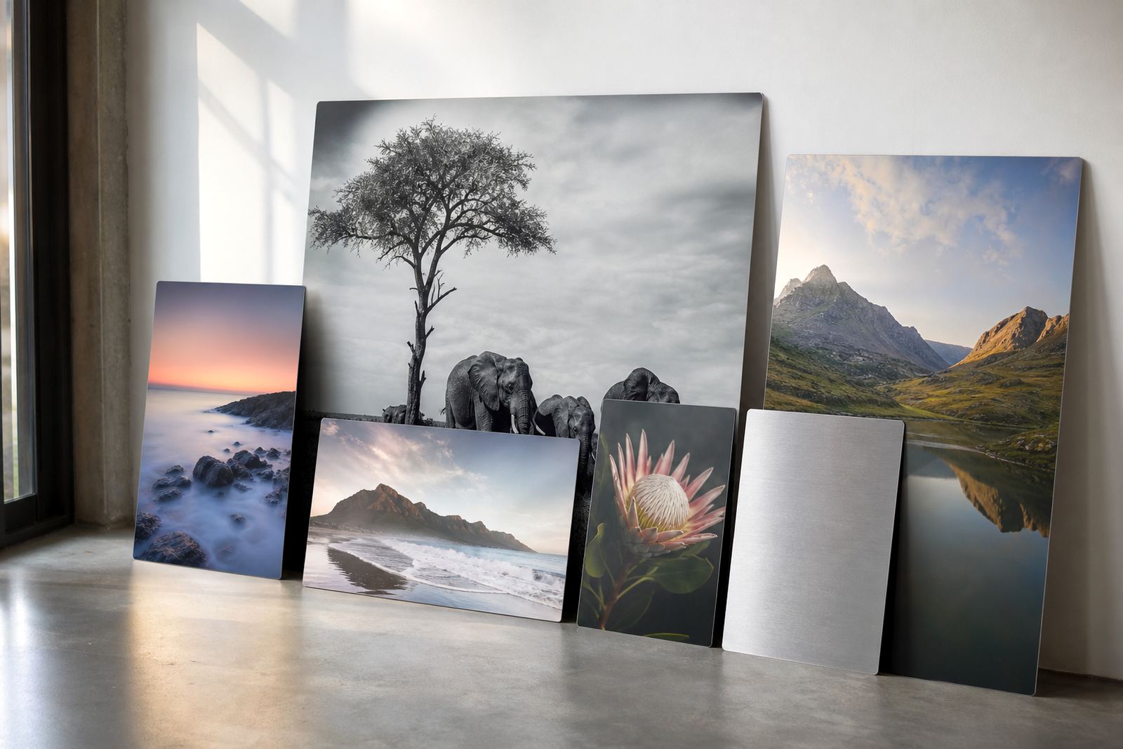
Start with where the panel will hang. A bright office in Sandton, a home in Durban with strong afternoon sun, or a gallery wall in Cape Town all ask for something different. On coated aluminium, the finish affects glare, colour depth and how much texture shows through, so the right choice is practical not just decorative.
If the image will be viewed from close range, spend a moment looking at the room lighting, window position and wall colour. A panel placed near downlights can behave very differently from one hung in a softly lit passage or reception area.
Gloss for pictures that must carry punch
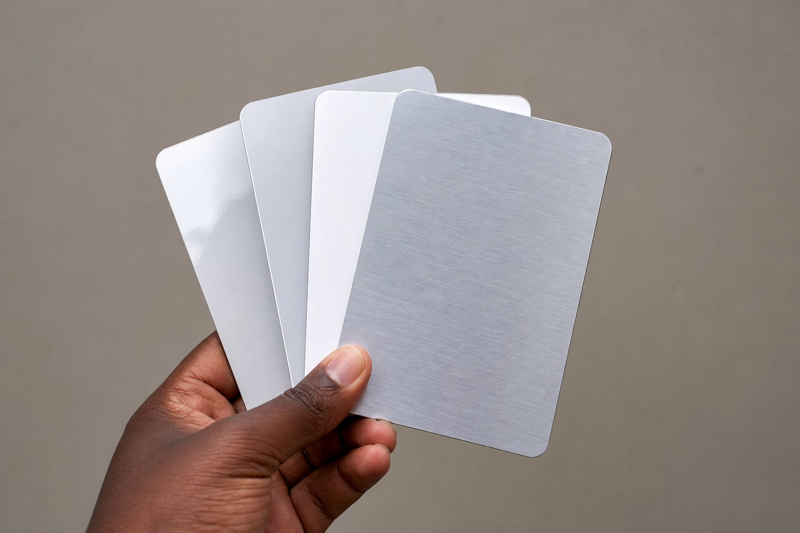
Gloss gives the strongest visual pop. Colours look richer, blacks look deeper and fine detail can appear especially crisp when the file is sharp and well prepared. It suits landscapes, city scenes, product images and high contrast photography where the work needs to stand out across the room.
Gloss does ask for better control over reflections. In a room with direct sunlight or strong overhead lighting, the surface can mirror the space around it. That is useful in some settings, but in others it will compete with the image. If you are hanging in an office boardroom or a retail space with many spotlights, test the placement first.
- Best for bold colour and deep contrast
- Works well when the viewing angle is controlled
- Can show fingerprints more easily during handling
- Needs careful wall positioning to reduce glare
Matte when the image must stay calm under light
Matte has a softer, quieter look. It reduces reflections and is often the safest choice for spaces with mixed lighting, large windows or frequent movement around the artwork. Portraits, black and white work, interiors and documentary images often benefit from the lower shine because the viewer sees the photograph rather than the room around it.
Matte is also helpful in homes and offices where the panel may be viewed from more than one angle. The trade off is that the surface will not have the same intense contrast as gloss, so it suits photographers who prefer a restrained finish over a vivid one.
White aluminium for clean colour and studio style
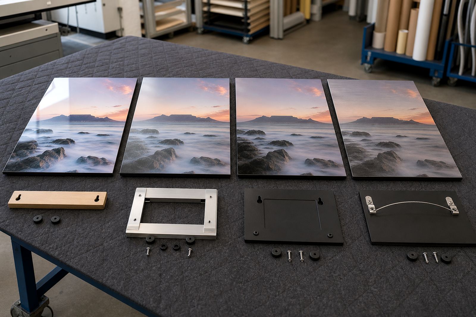
White coated aluminium gives the most neutral base for dye sublimation. It is a strong choice when you want colour accuracy, a clean background and a polished presentation that works in homes, agencies and reception areas. Whites stay clean, skin tones look even and bright artwork does not pick up as much of the metal character visible on brushed surfaces.
This finish suits most photographic subjects, especially when the file has been carefully colour prepared and the crop has been checked. It is a dependable all round option for customers who want the image to read clearly and consistently across multiple panels or a multi panel layout.
- Good for portraits, product images and corporate displays
- Works well with accurate colour preparation
- Offers a neutral surface for most subject matter
- Useful where a tidy, gallery style look is wanted
Brushed aluminium for texture that is part of the picture
Brushed aluminium leaves a fine metallic grain visible in the unprinted areas and in lighter parts of the image. It can add character to industrial subjects, monochrome work, machinery, architecture and modern design pieces. Where the artwork has open highlights or areas of low ink coverage, the metal texture becomes part of the visual language.
It is not the best choice for every photograph. Faces, delicate pastel work and images that need a smooth white background can lose some softness on brushed material. Use it where the surface itself helps the image rather than distracts from it. Coastal humidity is not usually a problem for the panel itself, but mounting and wall conditions still need to be sound, especially in offices near the sea.
The file, the size and the hanging method all matter
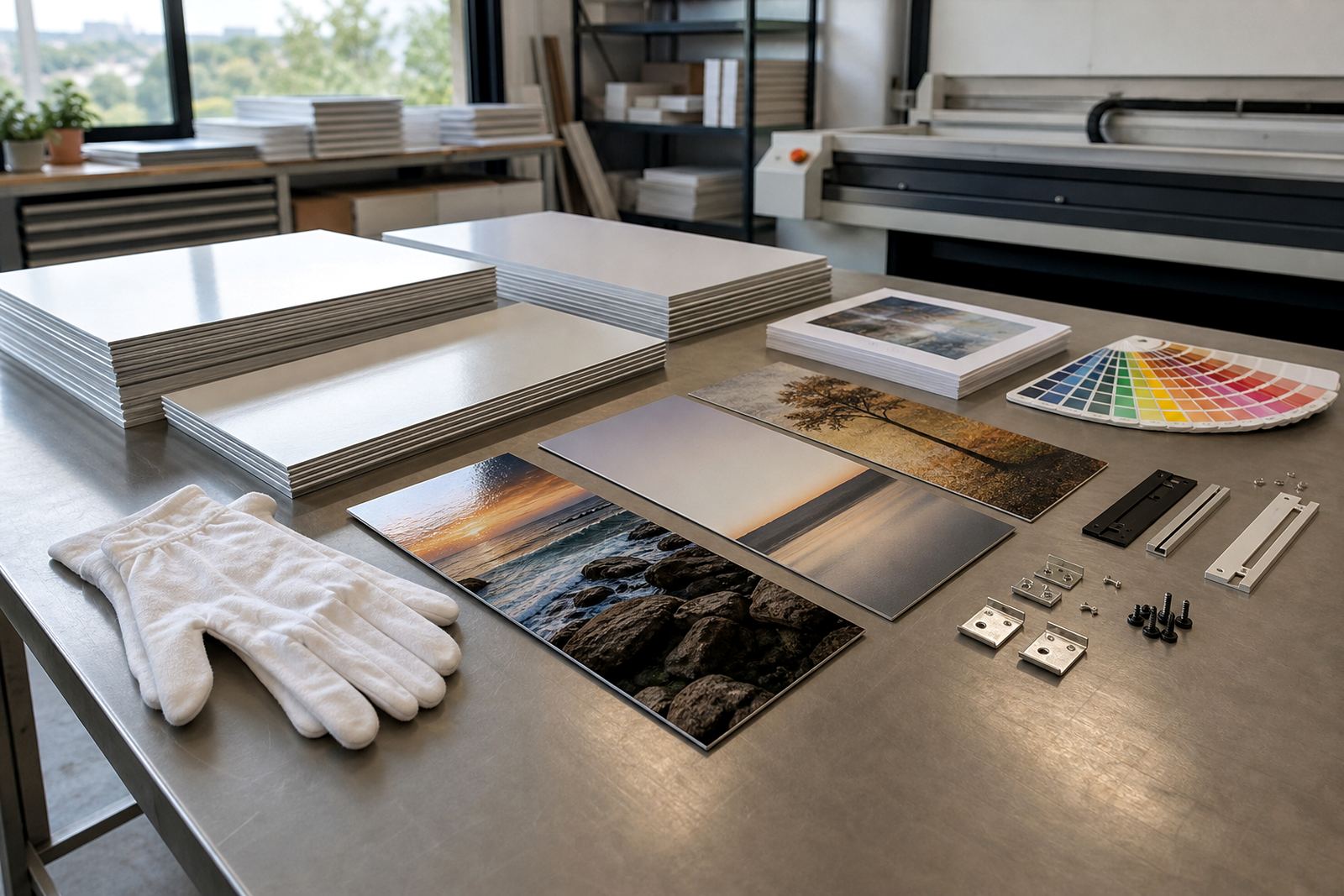
Finish choice works hand in hand with file quality and the way the panel will be mounted. Dye sublimation onto coated aluminium relies on a clean file, proper resolution and the right colour preparation. If the image is soft, over compressed or cropped badly, even a strong finish will not rescue it.
Before ordering, use this quick checklist:
- Confirm that you own the image or have rights to print it
- Check the intended viewing distance and room lighting
- Match the finish to the subject matter and wall colour
- Ask for a resolution review if the file will be enlarged
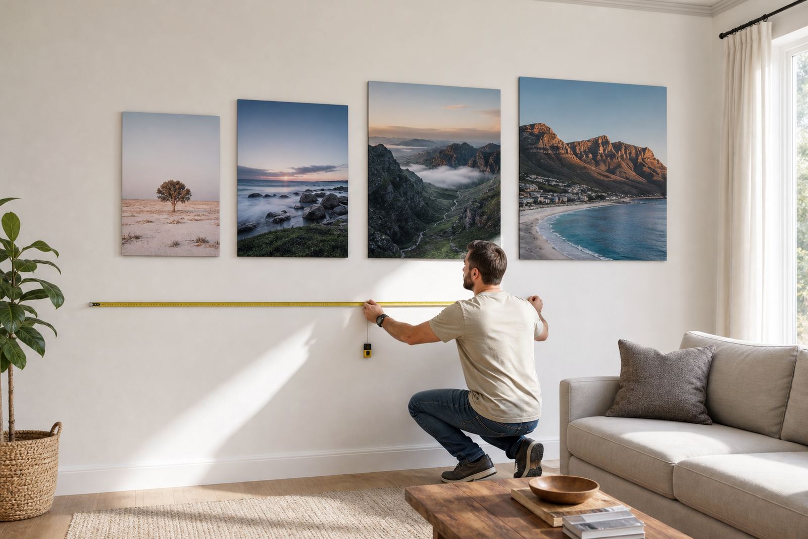
- Decide whether a flush mount, floating look or standoff hanging suits the space
- Plan for packing and delivery if the panel is going to Johannesburg, Pretoria, Midrand, Cape Town, Durban or Gqeberha
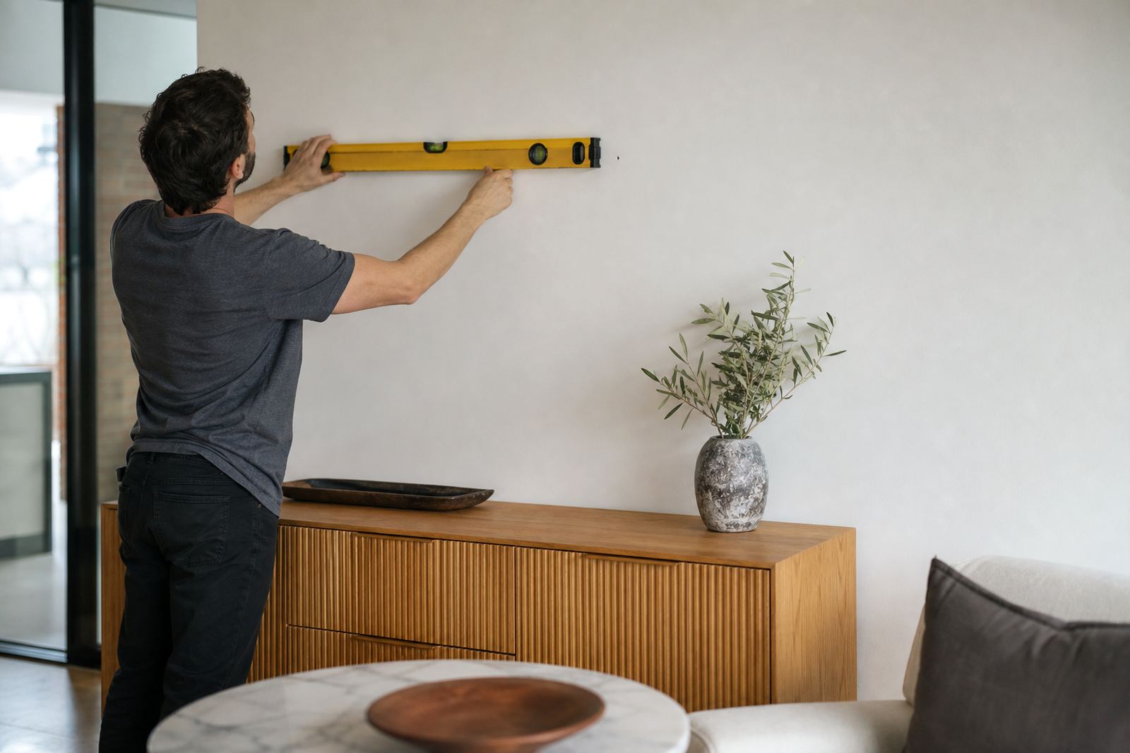
For larger pieces, hardware choice is just as important as finish. A well made hanging system keeps the panel stable on the wall and makes it easier to align a straight row of panels. In commercial spaces, that matters when the install must look neat from day one.
A practical way to decide without second guessing
If the image is full colour, high contrast and meant to attract attention, start with gloss or white. If the space is bright, busy or has changing light through the day, matte is usually safer. If the image benefits from visible metal character, brushed can work very well. There is no fixed rule, but there is a sensible order: look at the room, inspect the file, then choose the surface that supports the image instead of fighting it.
SubAlu handles file checks, finish selection, custom sizing, test panels, mounting options and delivery from Randburg to customers across South Africa. If you are deciding between two finishes, a small test panel often tells you more than theory ever will.