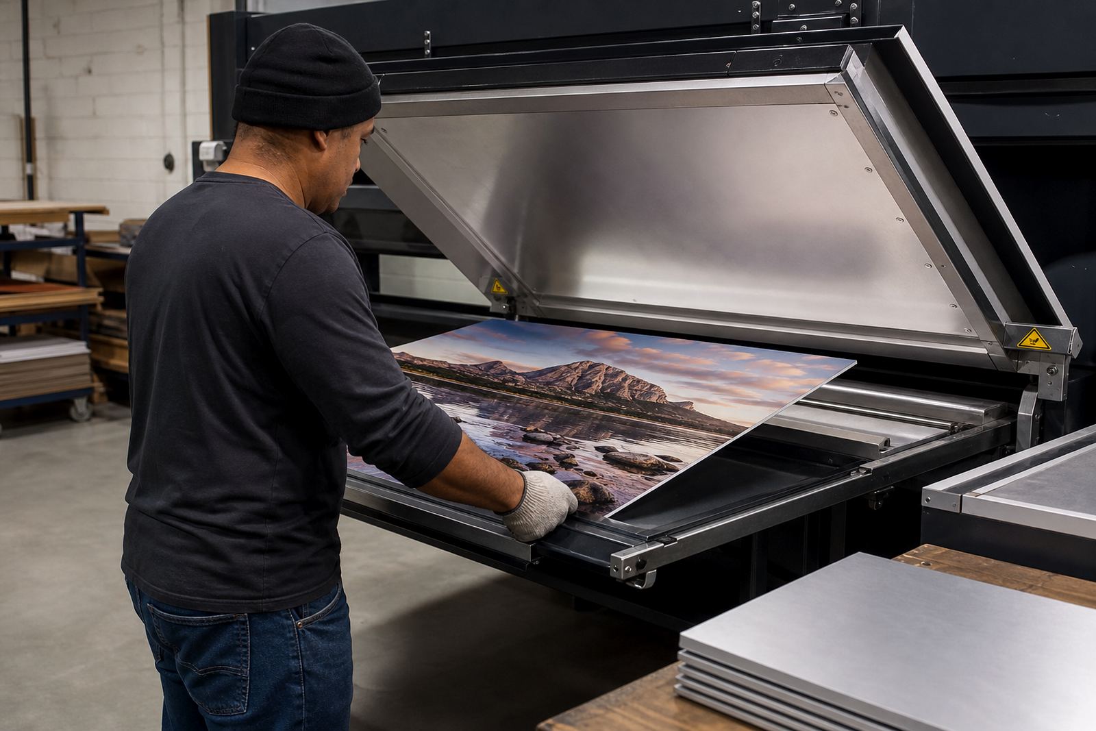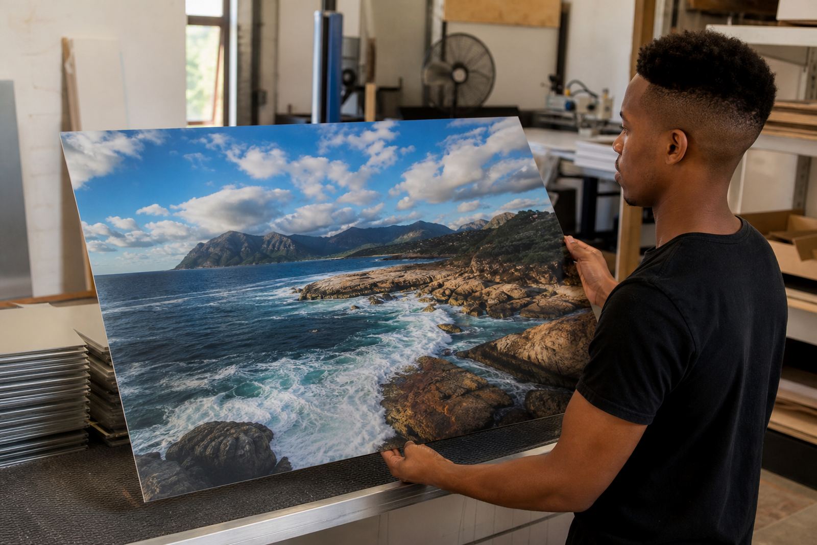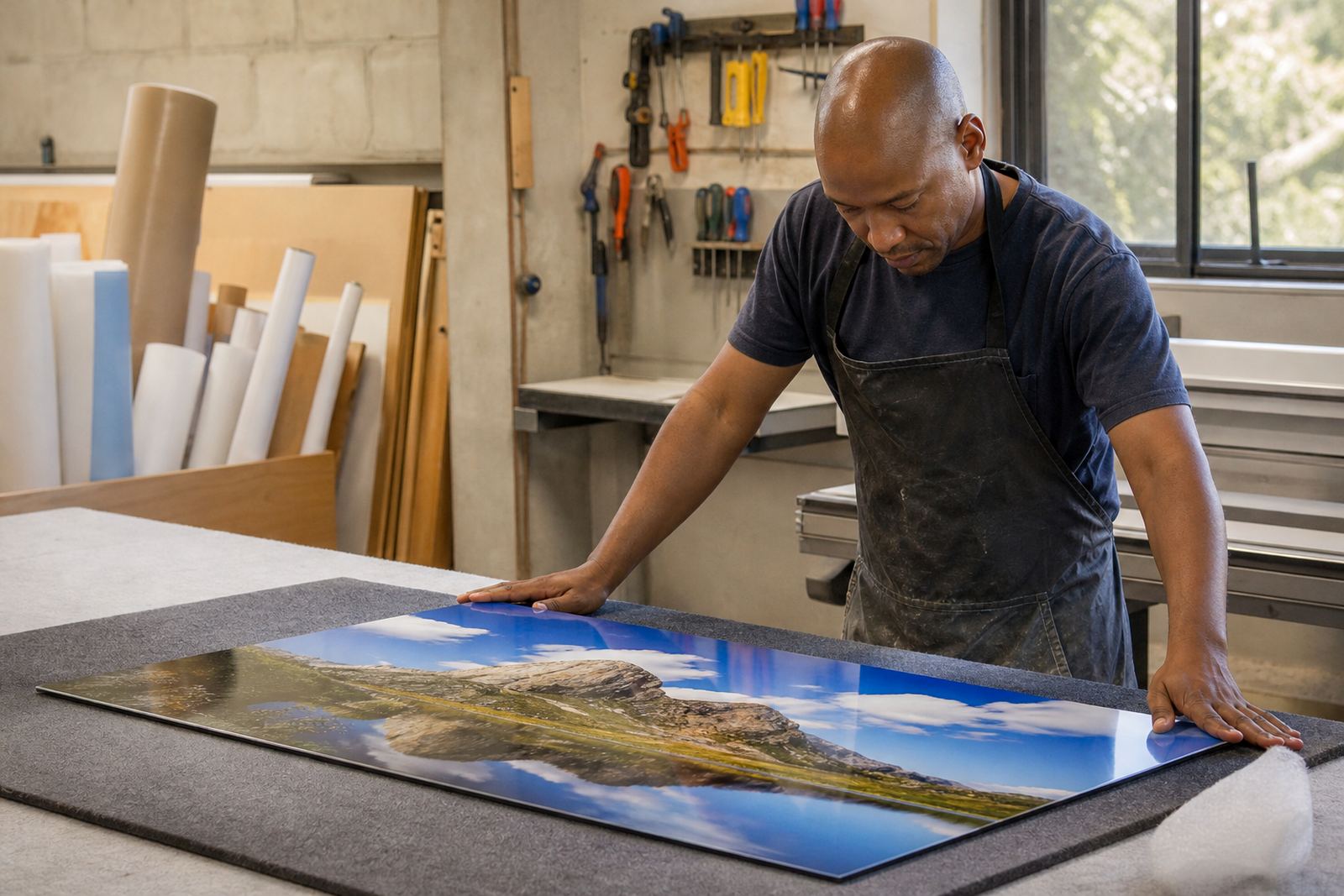

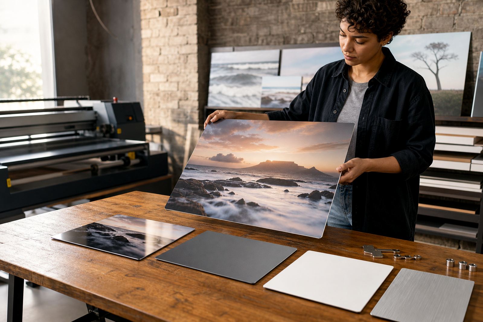
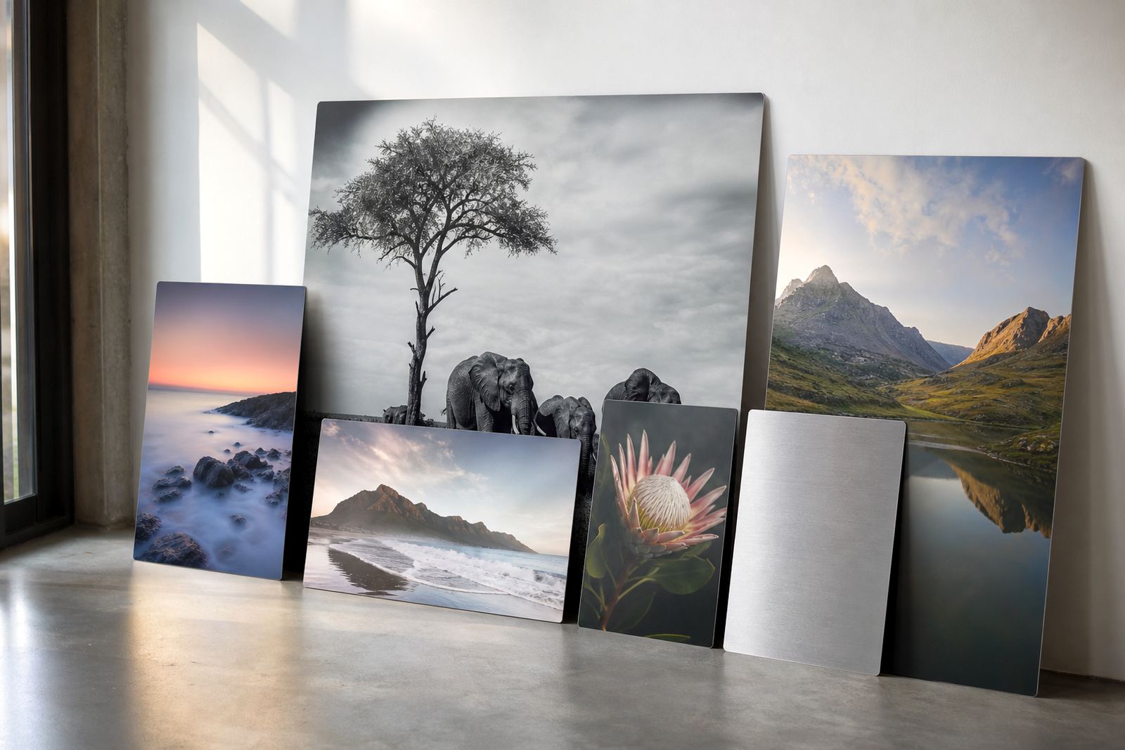
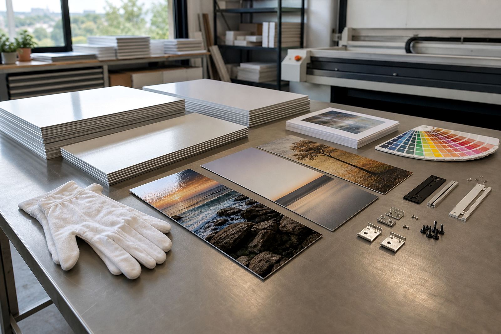
Start with the room before you pick the panel
The best finish depends on where the panel will hang. A bright foyer in Sandton needs a different surface to a boardroom in Pretoria or a shaded passage in Durban where humidity and changing light can affect how the image is seen. We look at the room first, then match the finish to the picture and the viewing distance.
If the panel will face a window, strong office lighting, or coastal glare, the surface choice matters a lot. A glossy finish can give rich colour and depth, but it can also reflect light. Matte reduces reflections. White aluminium suits full colour images and clean product work, while brushed aluminium lets the metal texture show through in the lighter parts of the artwork.
- Bright rooms: matte or white usually works well
- Deep colour images: gloss gives strong punch
- Minimal or industrial interiors: brushed can suit the setting
- Long viewing distances: bold contrast helps the image carry
Gloss when you want colour to hit hard
Gloss finish is often chosen for landscapes, portraits, event images and retail displays where colour needs to stand out. The surface gives a polished look and helps blacks feel deeper, which can make the image look lively from across a room. It does however show reflections, so placement matters.
For offices in Johannesburg or galleries in Cape Town where lighting can be controlled, gloss can work beautifully. If the panel is near a window or under bright downlights, test the viewing angle first. A small test panel is useful when the final image has a lot of dark areas or fine detail, because glare can hide detail if the setting is not right.
- Best for saturated images and high contrast work
- Good for statement pieces and feature walls
- Needs careful placement away from direct glare
Matte for softer viewing and less glare
Matte finish is a practical choice for rooms with strong daylight, client waiting areas, classrooms and places where people will view the panel from different angles. It cuts down on shine and gives a calmer look, which can help with portraits, architectural images and fine art reproductions. It also handles mixed lighting better in many indoor spaces.
Clients often choose matte when the panel will hang in a home with lots of glass, or in a municipal office where overhead light cannot be controlled. The image still looks crisp, just less reflective. If your artwork has delicate tonal work, matte can make it easier to read. It is a steady option, especially where the panel needs to sit quietly in the space and not shout.
- Works well in bright or irregular lighting
- Good for offices, foyers and homes with windows
- Helps reduce reflections on darker images
White aluminium for clean colour and crisp detail
White coated aluminium gives a clean base for dye sublimation, so colour stays true and small details can read clearly. It is often chosen for product photography, logos, exhibition graphics and family images where a bright white base supports the artwork. The printed area keeps a neat, even look and the finish can be gloss or matte depending on the final effect needed.
When a file has pale tones, skin colour or fine lettering, white panels are usually the safest choice. They are also helpful where the image must look consistent across a set of panels. We check the file at working resolution, crop carefully and confirm the image area so the print lands where it should, no nasty surprises after mounting.
- Best for true colour and clean whites
- Suitable for branding, photography and gifts
- Useful when fine detail must remain clear
Brushed aluminium when the metal should show through
Brushed aluminium gives a more industrial finish. The grain in the metal can show through the lighter parts of the image, which works well for monochrome work, architecture, machinery, typography and some modern portrait styles. It suits spaces with exposed steel, concrete or timber because it feels honest and direct.
This finish is not the right pick for every photograph. If the image depends on pale skies, skin tones or soft pastel colour, the brushed texture may change the look more than you expect. For darker artwork, signage or black and white pieces, it can be very striking. We usually suggest a proof or test panel if the final wall treatment is important and the client wants to see how the grain will interact with the image.
- Strong fit for black and white images
- Works with industrial interiors and modern signage
- Not ideal for soft pastel or highly delicate colour work
How we check files before a finish is approved
Finish choice also depends on the file itself. We look at resolution, sharpness, crop and colour balance before anything is sent to production. A high resolution image gives more room for larger panels, especially when the print will be seen close up in a home, gallery or reception area. If the file is too small, the image may still print, but the result can look soft at wall size.
We also check whether the picture has been edited for screen rather than print. Some images look bright on a monitor but print flatter if the colour is not prepared correctly. Where needed we advise on crop planning, colour preparation and reprint matching so a new panel matches a previous one as closely as possible. The customer must own the image or have the rights to use it, and that part matters before any work starts.
- Check image size against final panel size
- Allow for crop changes at the edges
- Confirm colour tone before approval
- Use the right file type and a clean source image
Mounting, hanging and care after the panel leaves Randburg
Once the finish is set, the mounting choice matters just as much. We can advise on hanging hardware that suits the wall and the panel size, whether the job is for a flat plaster wall in Midrand, a tiled office corridor in Cape Town, or a reception area in Gqeberha where the wall surface may vary. Some panels suit concealed standoffs, others need a more direct hanging method, and the weight of the panel should always be matched to the fixings.
For care, keep the panel dry and wipe dust with a soft cloth. Avoid harsh cleaners, strong rubbing and standing moisture, especially near the coast where salt air can build up. If the panel is going into a busy workspace, choose a finish that will be easy to keep clean. A little planning here saves trouble later and keeps the image looking sharp for longer.
- Match the hanging method to the wall type
- Allow for weight and panel size when choosing fixings
- Keep clear of damp corners and direct spray
- Use gentle cleaning only