
A Soweto wall needed to carry a full series, not just one print
The brief came from a visual artist based in Soweto who was preparing a contemporary series for a public-facing space. The work needed to read clearly at viewing distance, hold colour in bright light and still feel refined enough for an exhibition wall. The client wanted a material that would suit urban imagery and layered textures, with a surface that added interest without overpowering the art.
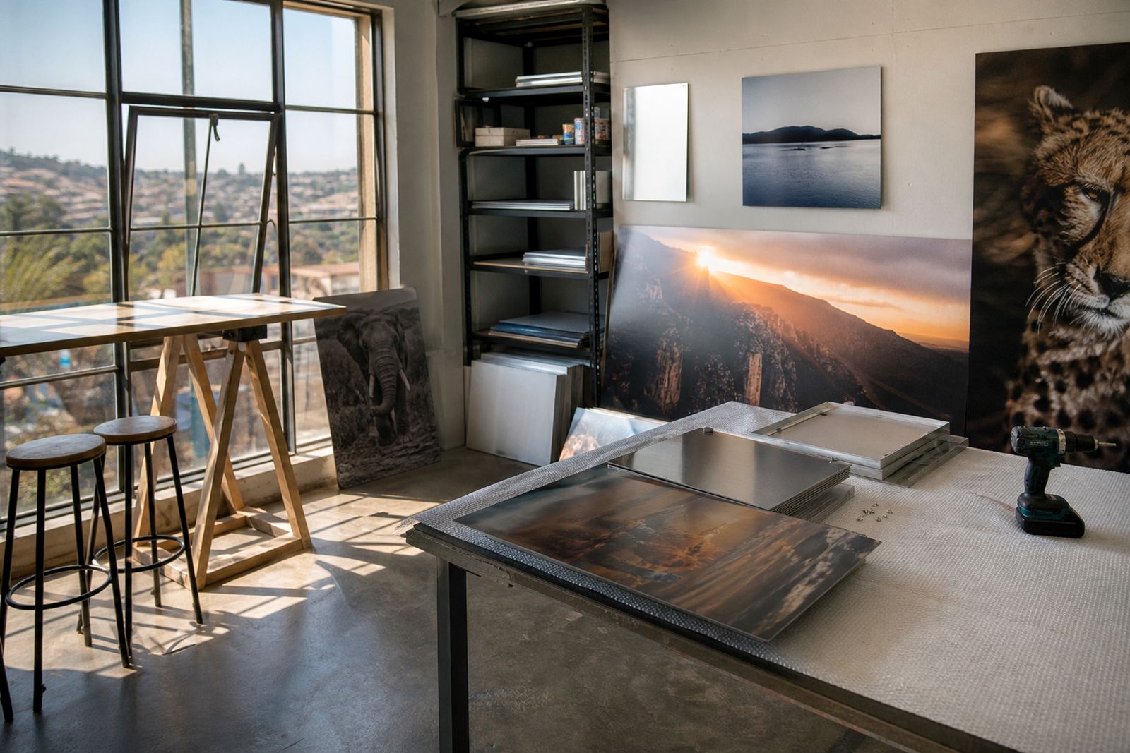
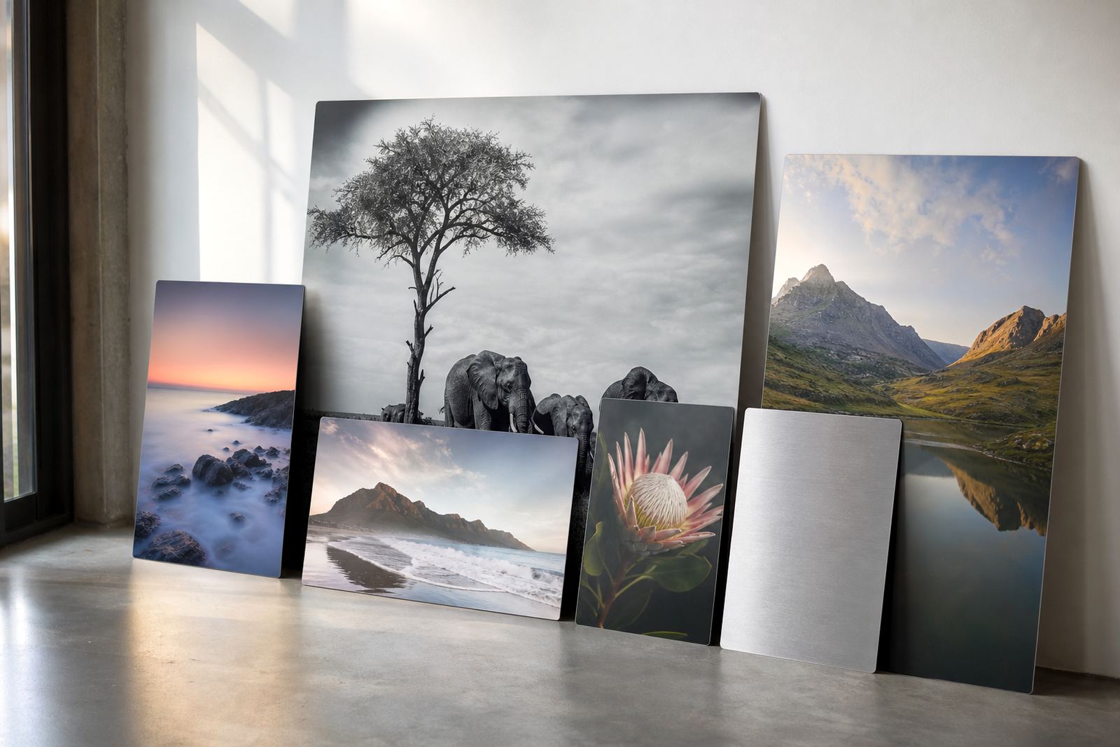
We recommended dye sublimation onto coated aluminium panels with a brushed finish for selected pieces. The brushed base gave the series a metallic character that worked well with the subject matter, especially where the artwork used tonal greys, warm highlights and darker shadows. It also suited a space where the pieces would be viewed from different angles, so the finish could change slightly as people moved past. That sort of variation can be useful, but only when the print files are prepared properly and the panel size is matched to the image.
File handling had to protect detail, edges and the final tone
The project involved a set of artworks with mixed source files, so the first step was a file check and resolution review. A few images were strong enough for larger panels straight away, while others needed crop planning and colour preparation before we could send them into production. Because the series was meant for a clean, contemporary hang, every edge had to be square and every crop line had to respect the original composition.
We worked through the practical limits with the client before printing:
- Image files had to hold detail at final size, especially in faces, linework and fine patterning
- Any file with low resolution was flagged early so it could be resized or reduced to a more suitable panel size
- The tonal range had to stay balanced, because brushed aluminium can change the way dark areas and midtones read
- The client had to own the images or hold the rights to use them for print production
That check saved time later and avoided any awkward surprises once the panels were mounted. It also let us keep the print run consistent across the series, which matters when several works are hung side by side.
Brushed aluminium was the right surface for the lighting in the room
The exhibition space had mixed lighting, with strong daylight in part of the room and focused artificial light on the feature wall. For that reason we tested the finish choice against the artwork before committing to the full set. Brushed aluminium was the best fit because the metallic grain supported the image rather than fighting it. Gloss would have pushed the reflections too hard in that room, while matte would have reduced the sense of depth the artist wanted.
The final set used a mix of brushed and coated white aluminium panels, depending on the image. Brushed stock was chosen for works with metallic accents and darker fields, while white coated panels were used where the client needed cleaner colour and brighter whites. Each piece was produced to the same standard of edge finish and surface consistency, so the collection felt deliberate rather than mismatched.
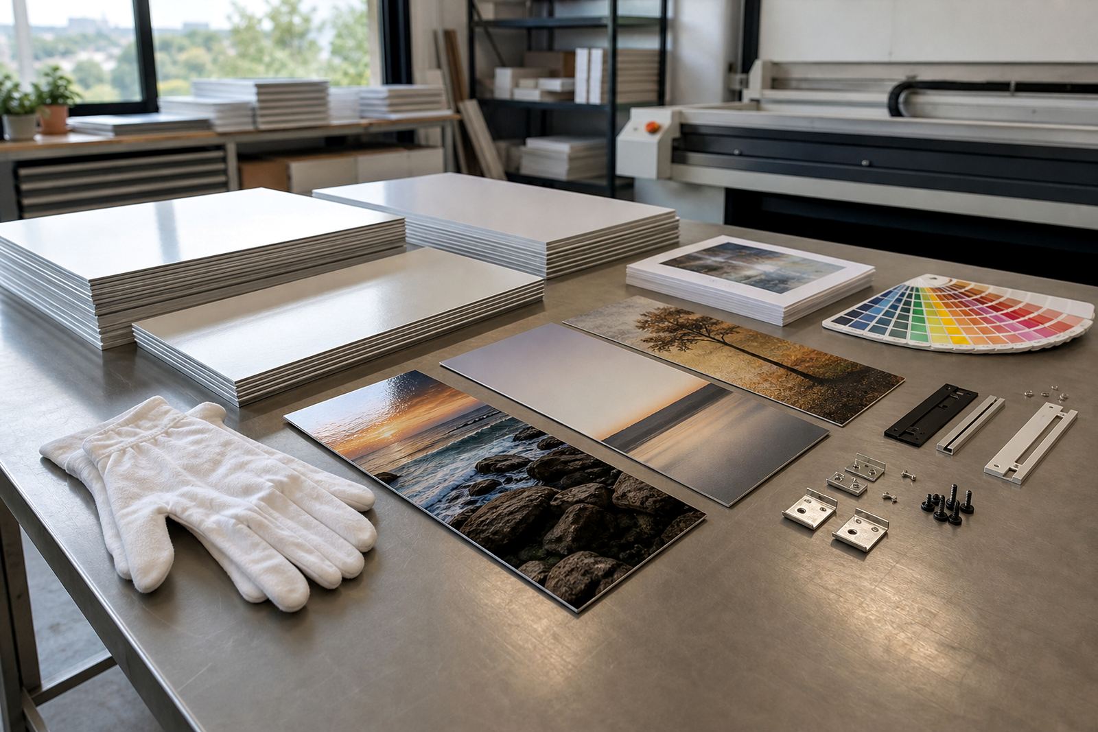
We also checked the hanging approach. The client wanted a clean wall presentation with no visible clutter, so we supplied generic rear hanging hardware suited to the panel sizes and weight. In a busy venue, that makes a difference because the work stays level and secure without drawing attention away from the image itself.
What went into production across the three week run
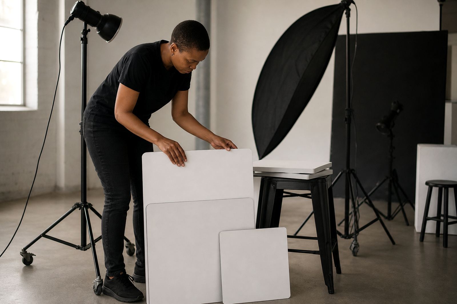
The job moved from file prep to final packing over a three week timeline. Week one was spent on file checks, colour preparation and layout confirmation. Week two covered test panels, finish selection and the main print run. Week three was used for mounting, inspection and packing for delivery.
Nothing in the job was rushed, but the schedule stayed tight because the client had a fixed install date. We kept the sequence practical and the communication clear, so decisions on sizing and finish were made before production started. That avoided reprinting and kept the series aligned from the first panel to the last.
- Custom sizing to suit the wall layout and spacing between panels
- Test panels where the finish needed checking under the same light as the final display
- Mounting options selected to suit a straight, gallery-style installation
- Packing designed to protect corners, edges and printed faces during delivery
The finished panels travelled well and arrived ready for installation. That is important with aluminium because even a small knock can show on an edge if the packing is poor.
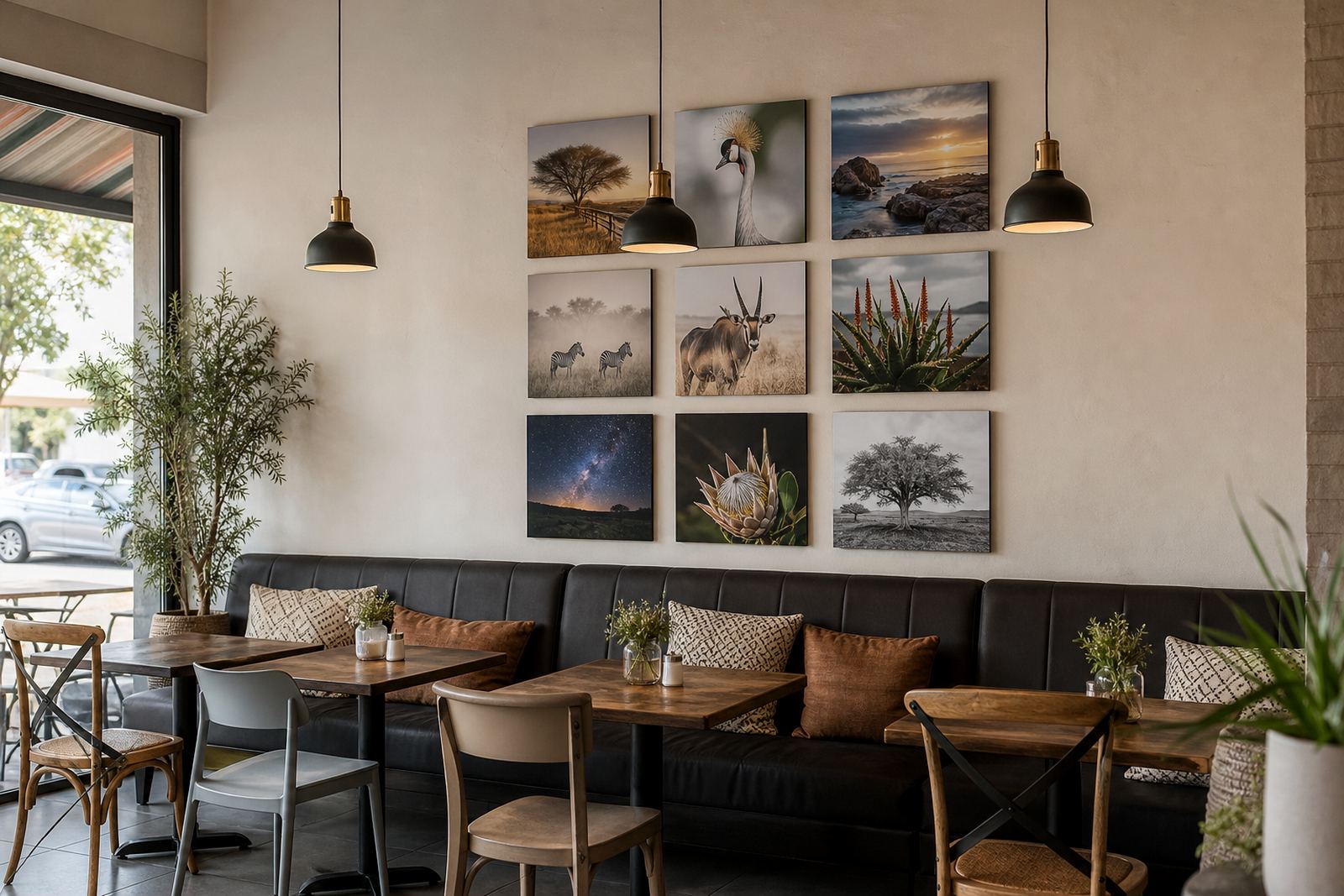
The final series held together as one body of work
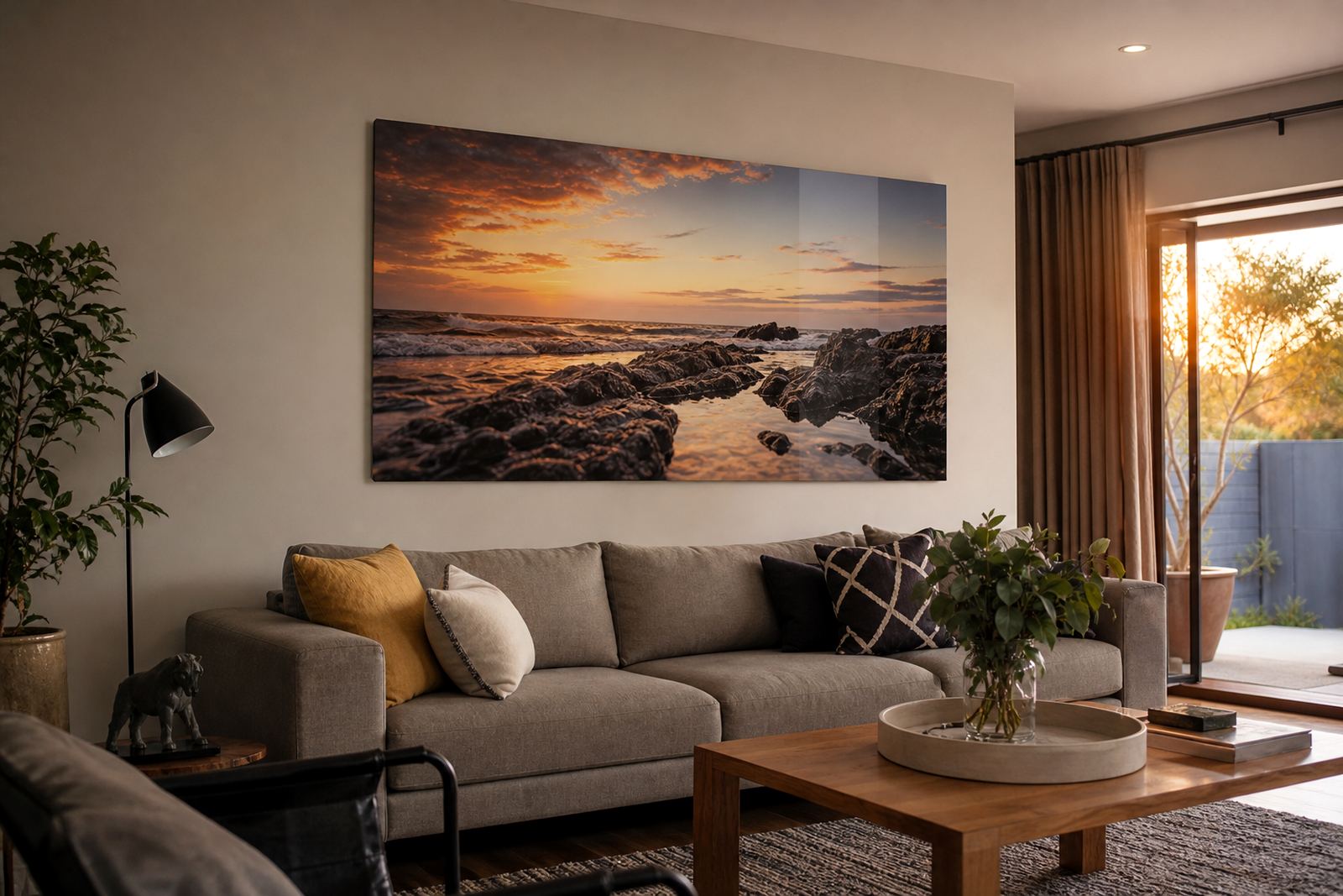
When the panels were installed, the brushed surface did exactly what the client wanted. The metallic highlights sat in the print without making the images feel shiny or overworked. At viewing distance, the series read as a unified body of work. Up close, the brushed texture gave each piece a bit of movement, especially where the artwork used layered colour and light shadowing.
The client also noted that the panels suited the type of space they were working in. In a Soweto setting where the room sees strong light and regular foot traffic, durability matters as much as presentation. Aluminium panels are easier to keep clean than many framed formats and they do not have the same risk of glass breakage. For a public or semi-public installation, that practical side matters a lot.
The result was a series that felt contemporary, stable and well finished. The artwork kept its character, and the display format added value without distracting from the work itself.
What worked well
For a project like this again, we would keep the same order of work: file check first, then crop planning, then a small test on the selected finish before the full run. That is the safest way to handle a series where colour shifts or crop errors would be obvious once the panels are hung. We would also keep the hardware choice matched to the installation method, because a neat rear mount gives the cleanest result on a contemporary wall.
Brushed aluminium is not right for every image, but in this case it fitted the brief well. It handled the metallic accents, matched the urban feel of the series and gave the client a display format that could work across homes, galleries or office spaces. If a future project asks for the same balance of strong colour, controlled reflection and durable presentation, we would use the same approach again.
For clients in Johannesburg and across South Africa, the lesson is straightforward: the right panel finish is not just a visual choice, it is part of how the image behaves in the room. Get that right, and the print carries the work properly.
Key facts
| Project location | Soweto, Johannesburg |
|---|---|
| Client type | Independent artist preparing a contemporary series |
| Panel material | Coated aluminium photo panels |
| Finish used | Brushed aluminium with selected coated white panels |
| Production method | Dye sublimation print onto aluminium |
| Timeline | 3 weeks from file review to packed dispatch |